- Final Forge
Post questions and concerns if any.
Moderator: Cartographers

I still think that this is a concern.yeti_c wrote:I still think this is a concern.yeti_c wrote:I think the Crowns clash a bit - and in Cyprus it almost disappears.
C.
C.

I don't. Now leave alone...you've had three goes at this and i am not going to change it. so.....yeti_c wrote:I still think that this is a concern.yeti_c wrote:I still think this is a concern.yeti_c wrote:I think the Crowns clash a bit - and in Cyprus it almost disappears.
C.
C.
C.

But - IT LOOKS SHIT - it's totally not upto your usual standard of work... - If I were you I wouldn't be proud of it - come on - you KNOW you can do better.cairnswk wrote:I don't. Now leave alone...you've had three goes at this and i am not going to change it. so.....yeti_c wrote:I still think that this is a concern.yeti_c wrote:I still think this is a concern.yeti_c wrote:I think the Crowns clash a bit - and in Cyprus it almost disappears.
C.
C.
C.
No C...i think it looks fine.yeti_c wrote:...
But - IT LOOKS SHIT - it's totally not upto your usual standard of work... - If I were you I wouldn't be proud of it - come on - you KNOW you can do better.
C.
There are other people that also mentioned it so you've refused it more than 3 times - which to me means that something needs to be done about it.cairnswk wrote:No C...i think it looks fine.yeti_c wrote:...
But - IT LOOKS SHIT - it's totally not upto your usual standard of work... - If I were you I wouldn't be proud of it - come on - you KNOW you can do better.
C.
You think it looks shit, and it may not be up to your standard, but since this is subjective, and I am happy with it, then leave it go, for God's sake. I've refused three times now. Let it go.
Sorry cairns. I have not really been following any maps lately but I just decided to glance through the FF and see what was up. I have to agree with yeti here. The crowns look out of place both due to graphic style and blurred fuzziness.yeti_c wrote:There are other people that also mentioned it so you've refused it more than 3 times - which to me means that something needs to be done about it.cairnswk wrote:No C...i think it looks fine.yeti_c wrote:...
But - IT LOOKS SHIT - it's totally not upto your usual standard of work... - If I were you I wouldn't be proud of it - come on - you KNOW you can do better.
C.
You think it looks shit, and it may not be up to your standard, but since this is subjective, and I am happy with it, then leave it go, for God's sake. I've refused three times now. Let it go.
C.

thanks Wm for your comments, but i'll treat them with the same contempt that you so arrogantly treated mine with on P9 of your USA 6pack map...you ignored it completely.WidowMakers wrote:Sorry cairns. I have not really been following any maps lately but I just decided to glance through the FF and see what was up. I have to agree with yeti here. The crowns look out of place both due to graphic style and blurred fuzziness.yeti_c wrote:There are other people that also mentioned it so you've refused it more than 3 times - which to me means that something needs to be done about it.cairnswk wrote:No C...i think it looks fine.yeti_c wrote:...
But - IT LOOKS SHIT - it's totally not upto your usual standard of work... - If I were you I wouldn't be proud of it - come on - you KNOW you can do better.
C.
You think it looks shit, and it may not be up to your standard, but since this is subjective, and I am happy with it, then leave it go, for God's sake. I've refused three times now. Let it go.
C.
1) Based on the colors, textures and feel of you map, the crowns seem to be out of place. They are too red and contrasty (if that is a word)
2) They are blurry and blocky. They just look bad
I mean this is your 19th or 20th map. I think you should be making better images than your first map. or at least attempting to make different style look good.
Cairns Coral Coast is one of the best maps you did. Currently you seem to be favoring quantity of maps regardless of the topic or gamplay quality for QUANTITY of maps.
I know you have said in the past that you have lots of time. Spend soem of that time making a map better instead of making 5 maps. Just my 2 cents
Also your legend colors are very similar and I could easily see people getting confused about what goes where.
WM

I think that you talk abouth me.by oaktown » Fri Dec 19, 2008 4:54 pm
crowns... I don't think the basic design is bad, but I agree that something about them doesn't fit the rest of the map. I would first question the color choice; it's a soft pastels map with high-contrast crowns that pop out too much. Second, I would remove the shadows; nothing else about this map is 3-D, so the drop shadows on the crowns just don't make sense, and it completely changes the experience of looking at this map. The color and the shadow make them look like as afterthought that was added by somebody other than the original mapmaker.
As for Wid's comments about quantity vs. quality, I think this is a bigger issue than just you or this map. Yesterday I commented on another map in which the mapmaker clearly just started with his previous map and changed the layout. I've been accused of making three consecutive maps that look the same, and my competition entries are obviously mine. I think that some of the regular mapmakers around here have discovered styles that have worked for us, and those styles are becoming a bit stale. As CC's most prolific mapmaker you are the one most in danger of this. The challenge from here on out is for us to start doing something entirely original and to start exploring new styles, because personally I want each and every one of my maps to look better than my previous one.
Qwert, i don't think they are talking about you, but this was targeted at me.qwert wrote:...
I think that you talk abouth me.
I think,that you can not say what style is best for map maker,if Cairnswk good with these styles, ofcourse that he will work on these way-every map maker have some specific styles-even WidowMaker have specific style,and people can easy to point with finger what maps he create, so i dont understand why is these now become problem.
I dont want to judge Cairnswk style,its will be to much subjective,because mine style is diferent, like your style Oaktown, and you can not ask that now need to change style.
I belive that every next Cairnswk map become better and better, like mine maps, and Peloponnesian map is much graphicaly better then Imperium romanum.
Also i must say that these is not first time that WM come in last stage and posted first time,when some thing become issue. If he dont have time to visit map for last 3 month,why he even bother to post now.
I would have to agree...but of course you can't make everyone happyyeti_c wrote:Weirdly - I think the Stars were nicer than the crown...
C.
I like the crowns, but the color doesn't seem to fit the map's overall palette. (Says the colorblind gameplay guy!)Gameplay Stamp
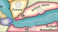
Contrast given at 36.The Neon Peon wrote:If we are keeping the crowns, could you change the constrast between the colors of the crowns slightly to make it a little more? The orange-yellow blends in with the red.
They look fine to me.Also, they seem rather jagged round the edges. Possibly smooth them out a little?
Well done old buddy.Graphics stamp

I must say that nobody are leader over mine oppinion,and i just say what im thinking abouth crown.C. You are the one who is leading this little charge(do you think to Yeti?)
and after your answer i dont say nothing, so i think that you made little mistake adding me in Yeti charge group.by qwert » Sat Nov 22, 2008 10:32 am
hmm,why you change your previious Stars and put crown? Stars look much better then these crowns.
by cairnswk » Sat Nov 22, 2008 11:19 am
Because after putting crowns, i think they look better now
If you read post my post I think it is pretty clear that I didn't ask cairnswk to change the style of the map - sorry to take this thread off-topic, but I want to be clear that this map looks quite good, and should NOT be redone. If the Foundry felt that this map was bad, it wouldn't be in the Forge right now. The only change I support is making the crowns fit the map better, and my specific suggestions were to make the crowns a color that fit the overall palette and losing the drop shadow. It's just a suggestion, and my suggestions have been ignored before... so be it.qwert wrote:and you can not ask that now need to change style.
Ignore? Hey now, I would never ignore one of Cairnswk's maps!qwert wrote:Cairnswk, what is situation here,still in ignore stage from CA. Same situation with mine map to.

Thank-you for the xml stamp Oaktown.oaktown wrote:Ignore? Hey now, I would never ignore one of Cairnswk's maps!qwert wrote:Cairnswk, what is situation here,still in ignore stage from CA. Same situation with mine map to.
Coordinates look good to me. Thanks as always to ForzaAZ for looking over the code.
My position on the crowns stands - it's cairnswk's map, the crowns are a matter of taste/opinion, so if the mapmaker stands behind them as is and doesn't want to make a change then I say we quench this thing. So Cairnswk - if you say this thing is done and there are no other concerns I will give this map over to the monkey in the big chair.
Man, i hope that some day you will support mine map also,and say these words to, that map maker best know what is good for hes map, then i will be most happy here in CC.My position on the crowns stands - it's cairnswk's map, the crowns are a matter of taste/opinion, so if the mapmaker stands behind them as is and doesn't want to make a change then I say we quench this thing. So Cairnswk - if you say this thing is done and there are no other concerns I will give this map over to the monkey in the big chair.
Well, cairnswk has a history of treating his fellow mapmakers respectfully, so I try to return that respect. That doesn't mean I like everything he has done - I offered plenty of criticism to the Cairns Metro map when I thought it lacked style - but I trust that when I offer cairnswk criticism it is accepted in the spirit in which it was intended. And cairnswk also understands that the CAs are human, and occasionally take time off for holidays and the like.qwert wrote:Man, i hope that some day you will support mine map also,and say these words to, that map maker best know what is good for hes map, then i will be most happy here in CC.
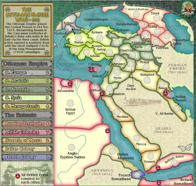
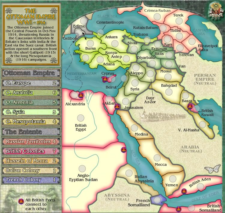
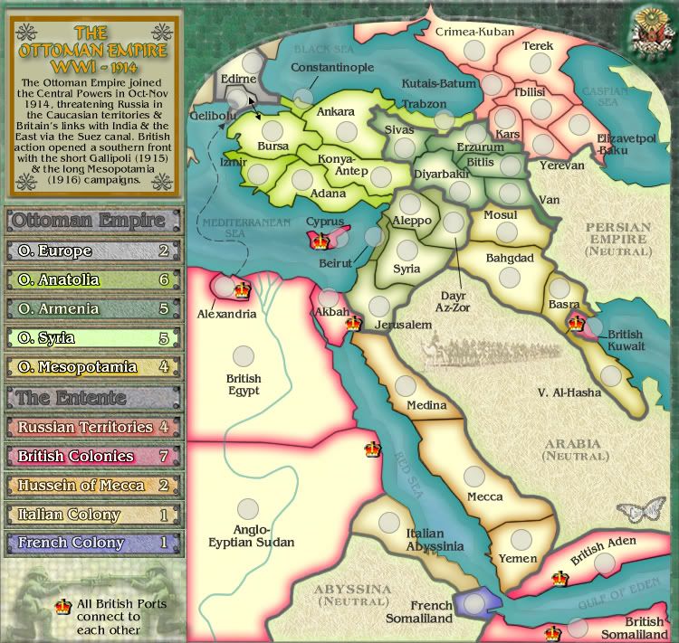
I never had a problem with the shape/style of the crowns, though maybe others did. In fact, I think the style of the crowns are entirely appropriate for CC and the map, especially since they reflect the silhouette of the rank crowns. My hope was that they could be desaturated a touch to fit the color palette of the map, and maybe lose the 3-D effect...cairnswk wrote:I have tested and tried several other versions and colours but nothing appeases me on these. I could use the simple four point gold crown of the earlier English kings, but this would be out of period. I chose this crown because it fits the period even though it is small i still believe it is fitting the map. It is essentially the very same crown that is on one of players ranks except mine has a slight shadow to it. It is not as though it is not visible.
Mmmm, tried that one too, but i don't like it.oaktown wrote:.... My hope was that they could be desaturated a touch to fit the color palette of the map, and maybe lose the 3-D effect...
I wonder of this will appease everyone. Crowns are newly worked and have a royal purple background plate behind them.oaktown wrote:.....
I never had a problem with the shape/style of the crowns, though maybe others did. In fact, I think the style of the crowns are entirely appropriate for CC and the map, especially since they reflect the silhouette of the rank crowns. My hope was that they could be desaturated a touch to fit the color palette of the map, and maybe lose the 3-D effect...