
It may be an aliasing issue with the text. If you are using photoshop pay attention to the alias setting. Sharp and Strong may provide better results.gimil wrote:I am also in agreement, unfortunatly I can't find a better colour to fit with the map.cairnswk wrote:I agree....the numbers are very blurry for these old eyes.edbeard wrote:.... I really need to focus to see the numbers
perhaps with the gold/yellow made the shadow darker so the numbers come out crisper
with the greens I think a different colour and/or larger text would help a lot
Feudal Epic, L&S, Pg. 49 [D, Gp, Gr]
Moderator: Cartographers
Forum rules
Please read the Community Guidelines before posting.
Please read the Community Guidelines before posting.
Re: Feudal Epic *The sequal to Feudal War!* Pg. 19 [I, Gp]
-
gimil

- Posts: 8599
- Joined: Sat Mar 03, 2007 12:42 pm
- Gender: Male
- Location: United Kingdom (Scotland)
Re: Feudal Epic *The sequal to Feudal War!* Pg. 19 [I, Gp]
I am always on one of those two for most of the typography I do. It may come down to changing the text.mibi wrote:It may be an aliasing issue with the text. If you are using photoshop pay attention to the alias setting. Sharp and Strong may provide better results.gimil wrote:I am also in agreement, unfortunatly I can't find a better colour to fit with the map.cairnswk wrote:I agree....the numbers are very blurry for these old eyes.edbeard wrote:.... I really need to focus to see the numbers
perhaps with the gold/yellow made the shadow darker so the numbers come out crisper
with the greens I think a different colour and/or larger text would help a lot
What do you know about map making, bitch?
Top Score:2403natty_dread wrote:I was wrong
-
sailorseal

- Posts: 2735
- Joined: Sun May 25, 2008 1:49 pm
- Gender: Male
- Location: conquerclub.com
Re: Feudal Epic *The sequal to Feudal War!* Pg. 20 [I, Gp]
I would like to see a third type of bonus. Like a town or a villa.
Be back later to add more...
Be back later to add more...
-
rom_tobins
- Posts: 59
- Joined: Wed Jun 28, 2006 12:01 pm
- Gender: Male
Re: Feudal Epic *The sequal to Feudal War!* Pg. 20 [I, Gp]
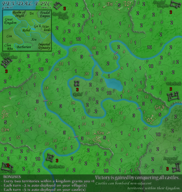
I don't know if this has been mentioned an i don't have the time to look through all 21 pages..but seeing as there is like 2 castle per section, when playing your likely going to go for the other castle in your area, and then move onto fighting the rest. The only problem is imperial and barbarian connect to all 3 other area's giving them 4 bridges to worry about attacks from...an clan rhu and great kingdom, are bound to head there first as it's the only area they connect to, though they could go over another bridge after right away. Not really a huge problem...but depending on how many players i can see some players hoping they don't start there. It always sucks to be stuck in the middle.
-
sailorseal
- Posts: 2735
- Joined: Sun May 25, 2008 1:49 pm
- Gender: Male
- Location: conquerclub.com
Re: Feudal Epic *The sequal to Feudal War!* Pg. 20 [I, Gp]
I would like to see a bonus for holding a entire realm. This way with a higher troop count players could reach another castle quicker.
Very cool map, very cool.
Very cool map, very cool.
-
thenobodies80

- Posts: 5400
- Joined: Wed Sep 05, 2007 4:30 am
- Gender: Male
- Location: Milan
Re: Feudal Epic *The sequal to Feudal War!* Pg. 20 [I, Gp]
wow! good work mates...
only a thing
i can't read easily some territory numbers, i like the yellow one
i'm looking forward to play this map!
great
only a thing
i can't read easily some territory numbers, i like the yellow one
i'm looking forward to play this map!
great
-
Kotaro

- Posts: 3467
- Joined: Sat Mar 03, 2007 2:31 pm
- Location: TheJonah: You`re a fucking ruthless, little cunt!
Re: Feudal Epic *The sequal to Feudal War!* Pg. 20 [I, Gp]
I doubt he's going to be adding that, at least not until the next map.sailorseal wrote:I would like to see a third type of bonus. Like a town or a villa.
Be back later to add more...
Lakad Matataaag!
Normalin, normalin.

Normalin, normalin.
TheJonah wrote:I`m not really that arsed. Just supporting my mucker.
Re: Feudal Epic *The sequal to Feudal War!* Pg. 20 [I, Gp]
I'm telling you, that water needs to be 25 shades darker. It really looks stupid in a Caribbean blue.
-
Kotaro
- Posts: 3467
- Joined: Sat Mar 03, 2007 2:31 pm
- Location: TheJonah: You`re a fucking ruthless, little cunt!
Re: Feudal Epic *The sequal to Feudal War!* Pg. 20 [I, Gp]
I disagree, the water looks profound and jumps out at you, making it easier to see.
Lakad Matataaag!
Normalin, normalin.
Normalin, normalin.
TheJonah wrote:I`m not really that arsed. Just supporting my mucker.
-
The Chosen

- Posts: 328
- Joined: Thu Apr 19, 2007 10:21 am
- Gender: Male
- Location: Halfway up the stairs. (2287 = 447th)
- Contact:
Re: Feudal Epic *The sequal to Feudal War!* Pg. 20 [I, Gp]
Now I might be missing something here but...
The original Feudal War map isn't a triumph of visual design ( ), it is a triumph of gameplay design. (
  )
)
Surely the way that the new Feudal Epic looks is secondary to the way it plays???
It looks like the original - fine, no problem - but for goodness sake it's got to be time to play-test it soon... that is where it will stand or fall!
The original Feudal War map isn't a triumph of visual design (
Surely the way that the new Feudal Epic looks is secondary to the way it plays???
It looks like the original - fine, no problem - but for goodness sake it's got to be time to play-test it soon... that is where it will stand or fall!

IF WE EVOLVED FROM APES... WHY ARE THERE STILL APES?
Re: Feudal Epic *The sequal to Feudal War!* Pg. 20 [I, Gp]
Kotaro wrote:I disagree, the water looks profound and jumps out at you, making it easier to see.
Good design isn't always a matter of personal preference. For something to resonate well it should tap into the shared experience of the audience. The blue color on the first map was a mistake and should not be repeated. I am sure you will find the version below looks more realistic, as well as epic. The palate is also more in line with the subject matter, castles, middle ages, etc.The Chosen wrote:Now I might be missing something here but...
The original Feudal War map isn't a triumph of visual design (
Surely the way that the new Feudal Epic looks is secondary to the way it plays???
It looks like the original - fine, no problem - but for goodness sake it's got to be time to play-test it soon... that is where it will stand or fall!
I even added some beaches/sand erosion.

for comparison

Re: Feudal Epic *The sequal to Feudal War!* Pg. 20 [I, Gp]
I like the darker color more, but the sandy effect just seems to thin...It looks almost stenciled. If the sand reached further, and was more organic and natural, I'd be all for it.
Re: Feudal Epic *The sequal to Feudal War!* Pg. 20 [I, Gp]
Cool. I will try to get another draft up soon. Hopefully I can get this into the Final Forge soon.n00blet wrote:I like the darker color more, but the sandy effect just seems to thin...It looks almost stenciled. If the sand reached further, and was more organic and natural, I'd be all for it.
-
Kotaro
- Posts: 3467
- Joined: Sat Mar 03, 2007 2:31 pm
- Location: TheJonah: You`re a fucking ruthless, little cunt!
Re: Feudal Epic *The sequal to Feudal War!* Pg. 20 [I, Gp]
I don't know what beaches you go to, but normally, the water isn't navy blue, or if it is, I leave that place O.O
Lakad Matataaag!
Normalin, normalin.
Normalin, normalin.
TheJonah wrote:I`m not really that arsed. Just supporting my mucker.
-
gimil
- Posts: 8599
- Joined: Sat Mar 03, 2007 12:42 pm
- Gender: Male
- Location: United Kingdom (Scotland)
Re: Feudal Epic *The sequal to Feudal War!* Pg. 20 [I, Gp]
I have to agree on this one mibi! Your shade of blue is just as (if not more) unnatural than the original colour. I am also pretty sure you don't commonly get that many rivers with miles upon miles of sand banks (Exc. deserts obv).Kotaro wrote:I don't know what beaches you go to, but normally, the water isn't navy blue, or if it is, I leave that place O.O
What do you know about map making, bitch?
Top Score:2403natty_dread wrote:I was wrong
-
The Chosen
- Posts: 328
- Joined: Thu Apr 19, 2007 10:21 am
- Gender: Male
- Location: Halfway up the stairs. (2287 = 447th)
- Contact:
Re: Feudal Epic *The sequal to Feudal War!* Pg. 20 [I, Gp]
It does however make the land stand out... and I'm sure will therefore improve the gameplay. 
Maybe you could replace the sand in places with rocks, trees etc... to break it up a bit.
Maybe you could replace the sand in places with rocks, trees etc... to break it up a bit.
-
the.killing.44

- Posts: 4724
- Joined: Thu Oct 23, 2008 7:43 pm
- Gender: Male
- Location: now tell me what got two gums and knows how to spit rhymes
- Contact:
Re: Feudal Epic *The sequal to Feudal War!* Pg. 20 [I, Gp]
I think something between mibi's and your color, gimil, would be best. and for the sand, I think it should do any/some of the following: be blurred; occur more sparsely; be not as bright a color (but maybe with the reduction of the water color it wouldn't stand out as much?
.44
.44
Re: Feudal Epic *The sequal to Feudal War!* Pg. 20 [I, Gp]
Your joking right?gimil wrote:I have to agree on this one mibi! Your shade of blue is just as (if not more) unnatural than the original colour. I am also pretty sure you don't commonly get that many rivers with miles upon miles of sand banks (Exc. deserts obv).Kotaro wrote:I don't know what beaches you go to, but normally, the water isn't navy blue, or if it is, I leave that place O.O
Find a river, what color is it?
http://maps.google.com/
Anyways, I offered my suggestion, it's your map, do what you like.

Re: Feudal Epic *The sequal to Feudal War!* Pg. 20 [I, Gp]
To be fair - Mibi is closer to real life rivers than the current palate...
C.
C.

Highest score : 2297
-
hecter

- Posts: 14632
- Joined: Tue Jan 09, 2007 6:27 pm
- Gender: Female
- Location: Tying somebody up on the third floor
- Contact:
Re: Feudal Epic *The sequal to Feudal War!* Pg. 20 [I, Gp]
I find the darker colour okay, but the beaches? It just looks like a glow/outline, and kinda hurts my eyes... It's also hard to look at anything else.
In heaven... Everything is fine, in heaven... Everything is fine, in heaven... Everything is fine... You got your things, and I've got mine.

Re: Feudal Epic *The sequal to Feudal War!* Pg. 20 [I, Gp]
lol. you people...


Re: Feudal Epic *The sequal to Feudal War!* Pg. 20 [I, Gp]
mibi - while you're at it, the green is a little too bright also. It looks like day-glow instead of grass/forest. Could you do something with that also?


-
Kotaro
- Posts: 3467
- Joined: Sat Mar 03, 2007 2:31 pm
- Location: TheJonah: You`re a fucking ruthless, little cunt!
Re: Feudal Epic *The sequal to Feudal War!* Pg. 20 [I, Gp]
Nope, not joking. I walked down to the beach today, and picked up a lot of trash, and shockingly, no, it was not Navy blue / near black. Although there was some trash in there that was, the water itself was not reflecting back a blackish color.mibi wrote:
Your joking right?
Find a river, what color is it?
http://maps.google.com/
Anyways, I offered my suggestion, it's your map, do what you like.
Lakad Matataaag!
Normalin, normalin.
Normalin, normalin.
TheJonah wrote:I`m not really that arsed. Just supporting my mucker.
Re: Feudal Epic *The sequal to Feudal War!* Pg. 20 [I, Gp]
Looks better now....but I'd think with that many rivers there would at least be one or two beaches?
Re: Feudal Epic *The sequal to Feudal War!* Pg. 20 [I, Gp]
And I suppose you were pickup up trash several miles in the air and looking down upon water? Because that is the perspective of this map. Next you will tell be that the Caribbean water isn't light blue because you held up a glass of it and it was clear.Kotaro wrote:Nope, not joking. I walked down to the beach today, and picked up a lot of trash, and shockingly, no, it was not Navy blue / near black. Although there was some trash in there that was, the water itself was not reflecting back a blackish color.mibi wrote:
Your joking right?
Find a river, what color is it?
http://maps.google.com/
Anyways, I offered my suggestion, it's your map, do what you like.