Moderator: Cartographers
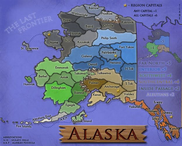
Dublanous1 wrote:Ok, you need to write out the bonuses and put your name somewhere on it, but good atempt tlane
el-presidente wrote:The divisions look really unnatural. Also, I think you could use beter colors that more represent Alaska. More blues, greens, and greys.
pinkflaminko wrote:You're making it on photo shop? Correct me if I am wrong, where did you get your backround? Did you make it on photo shop? And I think a simple non-wavy just plain blue background would work. The waves arent totally necessary.
sailorseal wrote:come on, now i am all sticky
i'd prefer different shadestlane wrote:need to decide if i make the continents all one color or keep it how it is with different shades
I am working on changing the color of inside passage to brown(if there is another color people like i will use it).ustus wrote:Each continent needs its own color, and i like the idea of different shades, since this map has few enough terits. This makes borders more clear. But i think the Southwest continent and the Inside Passage continent look like they are the same color. Changing either of them would be a plus.
Oh, and are the region capitals a +1 or an autodeploy of 1? just curiosity. It looks like the former, but i wanted to check.
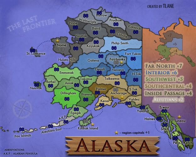
i made the post before your post.Simon Viavant wrote:You need to change a few things, which everyone else have already said.
Otherwise, it looks pretty good.
Take off the background though, that just makes it look cheesy. The background on the original map is good.
sailorseal wrote:come on, now i am all sticky

thanksMrBenn wrote:You've made a good start here.
sully800 wrote:I guess I'm alone so far, but I really like the background!
I am working on a new background and there are more people that think it is overwhelming then people that like it, so I am going to try not to make it overwhelming but also something that the people who like the current background may like too.MrBenn wrote:I'm not sold on the background - it feels a bit overwhelming, and I dislike the blurriness of it.
I am working on expanding the land a little(making use of the empty space), which will help with fit in the army numbers, but I am also going to take out a few territories.MrBenn wrote: The whole map feels a bit compressed, and you have lots of empty space that hasn't been utilised very well. The territories feel a lot too small, and I'm not too sure you're going to fit army numbers in there very easily
You are right about the Aleutian Islands, they are making it hard for me to use all the space, but I have a few ideas to use that space up(possibly an insert of the inside passage), but i have to see how these ideas will look.sully800 wrote: I agree that the space is not used very well, and there is a lot of empty space since the Aleutian Islands stretch so far.
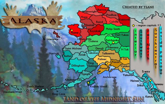
no, the names are the names of the bonus regions, I just haven't come up with bonus numbers, so it is(will be) relevant to gameplay, but if i should change it to something else i will(any ideas).MrBenn wrote: The design element that jumps out the most is the vertical stripes on the right-hand side... Am I right in thinking that this is just a marker that indicates the names of the capitals, and isn't relevant to gameplay?
MrBenn wrote: I'd be interested to see the other colour-scheme you have in mind. Hopefully it captures the heart of the 'Land of the Midnight Sun' theme of your tagline?
i am working on itsully800 wrote: The current color scheme of the territories doesn't thrill me, and I think the font could be spiced up a bit. Also, watch out for areas like "st" in St. Lawrence because the black font is on top of a dark tree and its hard to see. Similarly Nelato Hills is hard to read because it overlaps the territory borders. Those are minor concerns though, compared to the overall look and feel of the map which you need to finalize first.
sailorseal wrote:come on, now i am all sticky