Feudal Epic, L&S, Pg. 49 [D, Gp, Gr]
Moderator: Cartographers
Forum rules
Please read the Community Guidelines before posting.
Please read the Community Guidelines before posting.

Re: Feudal Epic, L&S, Pg. 28 [D, Gp, Gr]
It's not intended to look like a photo - it's gimil's creation and he should be able to take some liberties with the color choice. I'd say as long as the color doesn't make it hard to look at or play let the designer have the last word. After all, he has to stick his name on the thing. 

-
porkenbeans

- Posts: 2546
- Joined: Mon Sep 10, 2007 4:06 pm
Re: Feudal Epic, L&S, Pg. 28 [D, Gp, Gr]
I agree with Oak on that note. Someone tell him for me OK.oaktown wrote:It's not intended to look like a photo - it's gimil's creation and he should be able to take some liberties with the color choice. I'd say as long as the color doesn't make it hard to look at or play let the designer have the last word. After all, he has to stick his name on the thing.

-
gimil

- Posts: 8599
- Joined: Sat Mar 03, 2007 12:42 pm
- Gender: Male
- Location: United Kingdom (Scotland)
Re: Feudal Epic, L&S, Pg. 28 [D, Gp, Gr]
Oaktown pretty much hit it on the head 
What do you know about map making, bitch?
Top Score:2403natty_dread wrote:I was wrong

Re: Feudal Epic, L&S, Pg. 28 [D, Gp, Gr]
Have to say though - Porks rivers look pretty damn good.
C.
C.

Highest score : 2297
-
sully800

- Posts: 4978
- Joined: Wed Jun 14, 2006 5:45 pm
- Gender: Male
- Location: Bethlehem, Pennsylvania
Re: Feudal Epic, L&S, Pg. 28 [D, Gp, Gr]
No doubt he should have the last word, but the reason I'm mentioning changing the green is because I think the current version is too bright, and hence hard to look at. The green in pork's mock up is much more appealing to me, and I think the rivers look better as well. If that version is too light, you could also darken the green a bit (though I really like the contrast near the river banks). I just think that if it is not so bright playing will be more enjoyable.oaktown wrote:It's not intended to look like a photo - it's gimil's creation and he should be able to take some liberties with the color choice. I'd say as long as the color doesn't make it hard to look at or play let the designer have the last word. After all, he has to stick his name on the thing.
-
the.killing.44

- Posts: 4724
- Joined: Thu Oct 23, 2008 7:43 pm
- Gender: Male
- Location: now tell me what got two gums and knows how to spit rhymes
- Contact:
Re: Feudal Epic, L&S, Pg. 28 [D, Gp, Gr]
tbh … I like pork's green but gim's water better. I agree that it looks like a much nicer green hue.
.44
.44
-
porkenbeans
- Posts: 2546
- Joined: Mon Sep 10, 2007 4:06 pm
Re: Feudal Epic, L&S, Pg. 28 [D, Gp, Gr]
Thanx guys,
My intention was to set the water down and the land up, give it a bit more dimension. Those bevels and drop shadows can be played with to give the desired amount of 3-D. And it would look more perfect if you have all the layers to work with.
All I gotta say is, ...sweet ass map.
My intention was to set the water down and the land up, give it a bit more dimension. Those bevels and drop shadows can be played with to give the desired amount of 3-D. And it would look more perfect if you have all the layers to work with.
All I gotta say is, ...sweet ass map.

Re: Feudal Epic, L&S, Pg. 28 [D, Gp, Gr]
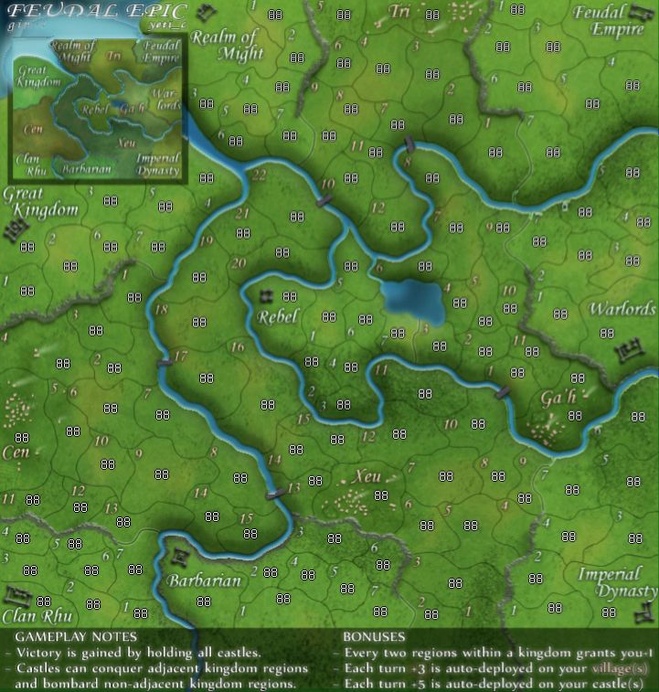
Yeah that's good color for the land. The rivers have a little too much depth, but are other wise an improvement over gimils map. Nice work! It really brings the map to life.porkenbeans wrote:
- Click image to enlarge.
-
porkenbeans
- Posts: 2546
- Joined: Mon Sep 10, 2007 4:06 pm
Re: Feudal Epic, L&S, Pg. 28 [D, Gp, Gr]
Thanx mibi,
Yeah I think I have the land puffed up a touch too much.
I would be honored if gimil adopts any of my ideas.
Yeah I think I have the land puffed up a touch too much.
I would be honored if gimil adopts any of my ideas.
Re: Feudal Epic, L&S, Pg. 28 [D, Gp, Gr]
I dunno, gimli's a stubborn ol' sod.porkenbeans wrote:Thanx mibi,
Yeah I think I have the land puffed up a touch too much.
I would be honored if gimil adopts any of my ideas.
-
Kotaro

- Posts: 3467
- Joined: Sat Mar 03, 2007 2:31 pm
- Location: TheJonah: You`re a fucking ruthless, little cunt!
Re: Feudal Epic, L&S, Pg. 28 [D, Gp, Gr]
I like gimil's better. More basic, less... ugly ass green
Lakad Matataaag!
Normalin, normalin.

Normalin, normalin.
TheJonah wrote:I`m not really that arsed. Just supporting my mucker.
-
porkenbeans
- Posts: 2546
- Joined: Mon Sep 10, 2007 4:06 pm
Re: Feudal Epic, L&S, Pg. 28 [D, Gp, Gr]
@Kataro,
Its the same green, just a little less saturated which brings out a touch more variation in the color. I.E. yellows and reds. Which is why I said it looks like the end of summer verses late spring.
what might look cool is if some of the darker shades of the original shade of green was brought back in to various areas to give it even more variation.
-
gimil
- Posts: 8599
- Joined: Sat Mar 03, 2007 12:42 pm
- Gender: Male
- Location: United Kingdom (Scotland)
Re: Feudal Epic, L&S, Pg. 28 [D, Gp, Gr]
Does this work? I softened up to porkers green colour, and tried to bevel the river a little more, without making it look to muck like the rivers on oasis.
- Click image to enlarge.
- Click image to enlarge.

What do you know about map making, bitch?
Top Score:2403natty_dread wrote:I was wrong
-
the.killing.44
- Posts: 4724
- Joined: Thu Oct 23, 2008 7:43 pm
- Gender: Male
- Location: now tell me what got two gums and knows how to spit rhymes
- Contact:
Re: Feudal Epic, L&S, Pg. 31 [D, Gp, Gr]
Maybe it could be a little less Caribbean blue, but that looks pretty win.
.44
.44
-
Kotaro
- Posts: 3467
- Joined: Sat Mar 03, 2007 2:31 pm
- Location: TheJonah: You`re a fucking ruthless, little cunt!
Re: Feudal Epic, L&S, Pg. 28 [D, Gp, Gr]
I realized as such, however, yours was brighter, and I found that actually less easy on my eyes then the darker one. With the land darker and the words/numbers lighter, I'd find that easier to read.porkenbeans wrote:@Kataro,
Its the same green, just a little less saturated which brings out a touch more variation in the color. I.E. yellows and reds. Which is why I said it looks like the end of summer verses late spring.
what might look cool is if some of the darker shades of the original shade of green was brought back in to various areas to give it even more variation.
Lakad Matataaag!
Normalin, normalin.
Normalin, normalin.
TheJonah wrote:I`m not really that arsed. Just supporting my mucker.
-
sully800
- Posts: 4978
- Joined: Wed Jun 14, 2006 5:45 pm
- Gender: Male
- Location: Bethlehem, Pennsylvania
Re: Feudal Epic, L&S, Pg. 31 [D, Gp, Gr]
Well I guess you can't please everyone. I think the latest version is much more appealing, and looks a lot more realistic. Perhaps you could continue to adjust the water a bit as .44 said, but I'm not sure it is necessary. I really like the new greens, and I think there is much more variation in the land which is nice. Plus, I can look at it for more than a couple of seconds straight Keep up the good work!
-
porkenbeans
- Posts: 2546
- Joined: Mon Sep 10, 2007 4:06 pm
-
gimil
- Posts: 8599
- Joined: Sat Mar 03, 2007 12:42 pm
- Gender: Male
- Location: United Kingdom (Scotland)
Re: Feudal Epic, L&S, Pg. 31 [D, Gp, Gr]
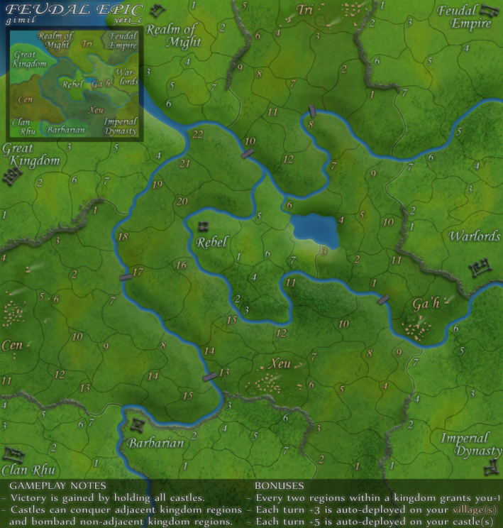
I've decided to stick with the med blue to hold some relation to the old Feudal.the.killing.44 wrote:Maybe it could be a little less Caribbean blue, but that looks pretty win.
.44
What do you know about map making, bitch?
Top Score:2403natty_dread wrote:I was wrong
-
gimil
- Posts: 8599
- Joined: Sat Mar 03, 2007 12:42 pm
- Gender: Male
- Location: United Kingdom (Scotland)
Re: Feudal Epic, L&S, Pg. 31 [D, Gp, Gr]
Kudos to porken for this help.gimil wrote:I've decided to stick with the med blue to hold some relation to the old Feudal.the.killing.44 wrote:Maybe it could be a little less Caribbean blue, but that looks pretty win.
.44
What do you know about map making, bitch?
Top Score:2403natty_dread wrote:I was wrong
-
the.killing.44
- Posts: 4724
- Joined: Thu Oct 23, 2008 7:43 pm
- Gender: Male
- Location: now tell me what got two gums and knows how to spit rhymes
- Contact:
Re: Feudal Epic, L&S, Pg. 31 [D, Gp, Gr]
Well yeah, I like that idea of the carry-over. But the Feudal blue seems more of a grayish-blue variety, against this one.gimil wrote:I've decided to stick with the med blue to hold some relation to the old Feudal.the.killing.44 wrote:Maybe it could be a little less Caribbean blue, but that looks pretty win.
.44

I'm not saying you should make it exactly the same, but a lighter/grayer version of what you have now would be nice.
.44
-
gimil
- Posts: 8599
- Joined: Sat Mar 03, 2007 12:42 pm
- Gender: Male
- Location: United Kingdom (Scotland)
Re: Feudal Epic, L&S, Pg. 31 [D, Gp, Gr]
I don't think a lighter less saturated version will fit the overall colour scheme. I am happy with what I have just now.the.killing.44 wrote:Well yeah, I like that idea of the carry-over. But the Feudal blue seems more of a grayish-blue variety, against this one.gimil wrote:I've decided to stick with the med blue to hold some relation to the old Feudal.the.killing.44 wrote:Maybe it could be a little less Caribbean blue, but that looks pretty win.
.44
I'm not saying you should make it exactly the same, but a lighter/grayer version of what you have now would be nice.
.44
What do you know about map making, bitch?
Top Score:2403natty_dread wrote:I was wrong
Re: Feudal Epic, L&S, Pg. 31 [D, Gp, Gr]
The only concern seems to be the green, and since I'm no color expert I'll leave it to gimil/popular opinion. Let's give folks another day or three to comment and then we can push this map up the ladder. 
-
thenobodies80

- Posts: 5400
- Joined: Wed Sep 05, 2007 4:30 am
- Gender: Male
- Location: Milan
Re: Feudal Epic, L&S, Pg. 31 [D, Gp, Gr]
With gimil...green is ok.
-
porkenbeans
- Posts: 2546
- Joined: Mon Sep 10, 2007 4:06 pm
Re: Feudal Epic, L&S, Pg. 31 [D, Gp, Gr]
This map is looking GOOD. If you are going to make any more changes, I would suggest that you work on its weaker points. ( and I'm really nit-picking here).
1.) The text could be a little more crisp. ( kinda on the fuzzy side).
2.) could stand to be brightened up just a bit more. ( not that it is too dark, but approaching it).
I really like how the texture of the trees and such have been brought out, especially in the middle of the map. Would not hurt to see more of that.
As far as I am concerned, This new Feudal is better than most maps, and is ready for play!
Re: Feudal Epic, L&S, Pg. 31 [D, Gp, Gr]
The map looks great. I can't wait to get a shot at it soon.