
I think the flag looks fine, and considering it is still in use by the Japanese Self Defense navy, I don't see how it could cause offence.
I'd be more concerned about the bushido quote and the hanging lantern which seem to clutter the map unnecessarily.
Just my thoughts.
Mr.P.
Japan - 日本 - Quenched
Moderator: Cartographers
Forum rules
Please read the Community Guidelines before posting.
Please read the Community Guidelines before posting.
-
Industrial Helix

- Posts: 3462
- Joined: Mon Jul 14, 2008 6:49 pm
- Gender: Female
- Location: Ohio
Re: Japan - 8th revision pg5
Well, the actual mpa of Japan looks great. I like the color and the mountains, the gameplay looks pretty good as well. But i think the map has some serious clutter going on, lantern, arch, bushido saying (which is awesome but I think it needs to fit in better), and the many boats (which I know I recommended, but I'll elaborate in below).
The boat, on the whole, is a good addition. I thought it made the sea look like the sea. But now the sea is kind of torn between being a flag or the sea. So then that indecision needs to be resolves as well.
The problem with the lantern, parchment, ships and arch is that they have no unifying characteristics. I'd say pick one and run with it. If you want to run with lanterns, put in a few more lanterns and get rid of the rest. Work them in with the title and use them to coordinate with the red sunset background. If you want to do the arch, then cut the lantern and work the arch in more prominently.
In regards to the arch, I don't like the photoshop filter you used on it. It kind of looks tacky.
The Bushido saying is quite cool, but the parchment is too much I think. If you want to go with a Japanese text theme (similar to the oaktown approach) then parchment might be something you want to expand on but you're gonna have to make it more prominent and encompassing of more of the map, I think. Right now its just kind of hanging out down in the corner.
As for the sea and the flag. I think what you're going for can be done quite well, but you're going to have to play with it. Someone mentioned removing some of the blue from over the flag, this is good. Maybe you could make the flag area something like a rules area, then use the sea to surround the islands and give them a setting. Might even be able to fit the quote in the flag area as well.
As for the ships, I think they're good to give the sea area some life... but you're going to have to find a balance between too few and too many. I thought the single ship worked great actually.
Hope this helps! You're making great progress on this map.
Sketchblog [Update 07/25/11]: http://indyhelixsketch.blogspot.com/
Living in Japan [Update 07/17/11]: http://mirrorcountryih.blogspot.com/
Russian Revolution map for ConquerClub [07/20/11]: http://www.conquerclub.com/forum/viewto ... 1&t=116575
Living in Japan [Update 07/17/11]: http://mirrorcountryih.blogspot.com/
Russian Revolution map for ConquerClub [07/20/11]: http://www.conquerclub.com/forum/viewto ... 1&t=116575
-
RedBaron0

- Posts: 2657
- Joined: Sun Aug 19, 2007 12:59 pm
- Gender: Male
- Location: Pennsylvania
- Contact:
Re: Japan - 8th revision pg5
Good feedback guys. From your suggestions, I'll tell you what I'm thinking about doing in the next update which will most likely get done tomorrow night sometime.
Graphics:
The "wave" background should constitute the majority of the background. I put the flag up there in the top corner since the wave design only filled about 60% of the background, the top corner was basically blank. So I figure I should get the background to fill in more of the background texture. The flag can be used still, but needs to be a smaller addition. Maybe a fluttering flag behind the mini-map, but nothing too static. I should also pick a overall graphical theme. Couple knick-knacks here and there, a boat, perhaps bring the dragon back, but say the major (ie larger images) are all lanterns of some sort. I'm thinking the red hanging lantern stays on the image somewhere, maybe more in conjunction with the title than the mini map, and say I get a number of floating lanterns representing the Toro Nagashi ceremony, its a funeral ceremony. (Remember Karate Kid II, where they floated the lanterns down the river after Mr. Miyagi's father died) Say I color the various lanterns to the 8 basic colors of the CC armies (red, green, blue, yellow, pink, cyan, orange, gray) floating down the east coast at various sizes, shapes and, with a little kanji text on the lantern. (I'd probably find the symbol(s) for that color and use that)
Gameplay:
Draw a connection between Osaka and Izu-Oshima, and adjust bonuses accordingly. Reposition army circles for better clarity.
Anything else pressing?


-
Balsiefen

- Posts: 2299
- Joined: Wed Aug 30, 2006 6:15 am
- Gender: Male
- Location: The Ford of the Aldar in the East of the Kingdom of Lindissi
- Contact:
Re: Japan - 8th revision pg5
I agree with Helix on all that.
I like the ships, I think you should try to keep them.
I think people are seeing the map as more cluttered than it is (though the lamp should probably go) because of the textures you are using. The texture for your territories is ever so slightly migraine inducing so I'd suggest making it lighter or, preferably, replacing it with something which isn't as bitty.
Gameplay-wise, you're pretty good. However, Shikoku is disproportionately easy for a 2 bonus (3 terr, 2 bord as oppose to kanto's 4 terr 3 bord) I would suggest changing the oita-kochi sea route to oita-okinawa to give it 3 borders.
also, at the moment a player can hold a 7 bonus with 2 boarders at fukui and osaka. I know this is inevitable with your map shape and part of the gameplay but I would still suggest adding another sea route (perhaps from okinawa)
Even better would be to add connecting ports similar to Philippines to get more movement around the map and make sure no-one can sit at one end and expand without ever increasing the number of borders they have to defend. I'm not sure exactly where you would want to place them but three or four around the map (especially in the smaller continents) would help gameplay a lot, though I suggest you make them territories which already have boarders so you don't change gameplay too much. Actually, your ships would make good symbols for the ports which'll give them a use apart from decorative.
-
RedBaron0
- Posts: 2657
- Joined: Sun Aug 19, 2007 12:59 pm
- Gender: Male
- Location: Pennsylvania
- Contact:
Re: Japan - 9th revision pg6
Alright it's off to bed for me, here's the update:
Adjusted a few bonus values to reflect the addition of the "ships" and the extra connection.
Adjusted some army circles, I probably need to move Ishikawa too, but other than that I think I'm good...
Removed the hanging lantern.
Added clearer, smaller Japanese naval ensign.
Added instructions on parchment paper.
Added floating lanterns with shadow ripple effect.
This should cover everyone's concerns to this point. I didn't re-add the dragon, yet since it would make clutter. I want to gauge the floating lanterns before adding it back. I still have to think about the texture behind the territories, but it's bedtime, so many thanks for your input!
- Click image to enlarge.
Adjusted some army circles, I probably need to move Ishikawa too, but other than that I think I'm good...
Removed the hanging lantern.
Added clearer, smaller Japanese naval ensign.
Added instructions on parchment paper.
Added floating lanterns with shadow ripple effect.
This should cover everyone's concerns to this point. I didn't re-add the dragon, yet since it would make clutter. I want to gauge the floating lanterns before adding it back. I still have to think about the texture behind the territories, but it's bedtime, so many thanks for your input!
Last edited by RedBaron0 on Mon Jul 20, 2009 3:14 am, edited 1 time in total.
-
Industrial Helix
- Posts: 3462
- Joined: Mon Jul 14, 2008 6:49 pm
- Gender: Female
- Location: Ohio
!
Nice update! I really like what you did with the flag and the minimap, I think it works quite well. The rules on the paper is also nice, though I think the dark marks or tears in the middle need to be lightened and I'm gonna suggest maybe putting a drop shadow in to make it look less like its tacked on there.
The lanterns... I could go either way. It's a better approach than before, but there's some problems with it I think. I wasn't entirely sure what they were when I saw the update, I was confused if they were boats cause they were on the sea and then I started thinking maybe they were lanterns. Then I wasn't sure if it was a playable item either. It's well put together, i think, the little white waves of air work nicely with it and the color helps break up some of that monotonous blue. On the other hand, I think there needs to be some adjustments to them if you're going to run with it.
The ships as a playable item seem unnecessary to me, I think you have more than enough playable areas on the map to work with that adding ships isn't really going to make it any better. Plus it conflicts with the dotted line approach to sea travel. I think it ought to be one or the other, dotted lines or ships. In which case the dotted lines work best in my opinion. I think as far as terrs. attacking terrs. that the map graphics should make it obvious, as opposed to having to read the rules to know that they're playable in the game and where they attack to and from. Personally, I'm in favor of moving the ships back to a decorative item.
The text about the ships is worded a bit strangely. If you want to keep the ships playable, you're going to have to find a better way to say what's there. If not, no big deal.
Otherwise, yeah, looks good. I wonder if there might be a better way to integrate the words Pacific Ocean and East Sea better into the background. Maybe change them to a different shade of blue, change the font, make it bigger. Something to experiment with I guess.
Sketchblog [Update 07/25/11]: http://indyhelixsketch.blogspot.com/
Living in Japan [Update 07/17/11]: http://mirrorcountryih.blogspot.com/
Russian Revolution map for ConquerClub [07/20/11]: http://www.conquerclub.com/forum/viewto ... 1&t=116575
Living in Japan [Update 07/17/11]: http://mirrorcountryih.blogspot.com/
Russian Revolution map for ConquerClub [07/20/11]: http://www.conquerclub.com/forum/viewto ... 1&t=116575
Re: Japan - 9th revision pg6
I agree with Helix, the ships don't look great as a playable item. The other thing about the ships is that they are positioned awkwardly. The one in the south looks like it could be more for Kagoshima than for Nagasaki. The one in the north looks like it could belong to any one of three territories. The one in the middle looks like it is more for Akita than for Yamagata. I like the new positioning of the flag and the rest of the gameplay looks good to my untrained eye. As to the colors, I kinda like the washed out color, but I am not sure of the color you were actually trying to get.
-
RedBaron0
- Posts: 2657
- Joined: Sun Aug 19, 2007 12:59 pm
- Gender: Male
- Location: Pennsylvania
- Contact:
Re: Japan - 9th revision pg6
I kinda just picked 3 territories that seemed the most logical for this boat/port connection. I do see that fit awkwardly in each spot.
Alright, how about this for an idea then, I put back the one boat pretty much in the center of the map. I make that a territory, call it "East Sea" or "Sea of Japan" (The name of the sea is disputed between Japan, and both North and South Korea. I've been using "East Sea" to this point, but I may switch as I read about the dispute. Sea of Japan is currently the reconized name by the UN) The junk represents that territory and would connect via dashed line to Nagasaki, Yamagata, and Hakodate. +1 bonus holding the territory always starts a neutral 3.
I'll probably will have to make the title a bit smaller and reposition it.
I'll see what I can do with the "Pacific Ocean" and I think I might have found a use for my Bushido quote by putting it with the floating lanterns.
The washed out, lighter colors is the direction I was going in, if you look at the earliest versions, the colors were much stronger.(and didn't have texture)
Re: Japan - 9th revision pg6
Hmm, the ships... I think you were better off without them. I really think this map will be most successful if you keep it simple - in terms of both gameplay and graphics. In Japan you have a geographic region that is both visually stunning and very challenging from a practical design point of view. Work with the land, and don't throw anything else in there that could be confusing like long range attacks and routes that need a special explanation in the legend.
Bonus regions look pretty good, but as you proceed think about which region you'd like to start in when playing this map and consider whether or not that bonus is too high. Shikoku is by far the best +2 region, and kanto is a much more powerful +3 than its neighbor which has two more territories it has to take to score a bonus.
Connections could be a bit more clear... Tochigi and Fukushima could have the mountain protrude between them to avoid any possible misread.
Overall I think it's coming along nicely, but it's still not particularly 'Japanese' looking. The bits you've added are indeed Japanese - like the flag - but they rather than adding to the overall look they're just creating more to distract the eye. It could be the colors? Right now they aren't very zen. Your feng shui is all off.


Re: Japan - 9th revision pg6
RedBaron0, i agree with oaktown on the ships.oaktown wrote:Hmm, the ships... I think you were better off without them. I really think this map will be most successful if you keep it simple - in terms of both gameplay and graphics. In Japan you have a geographic region that is both visually stunning and very challenging from a practical design point of view. Work with the land, and don't throw anything else in there that could be confusing like long range attacks and routes that need a special explanation in the legend...
I've skimmed the thread and see people are in favour of the flag as a added touch.
Can i suggest that perhaps you identify the period of your map, and then look
here to see if there is any specific flag that would be better than the current flag. From the inclusion of the "junks" as a graphic enhancement, perhaps the current flag is out of it's historical context.
Just a suggestion

* Pearl Harbour * Waterloo * Forbidden City * Jamaica * Pot Mosbi
-
RedBaron0
- Posts: 2657
- Joined: Sun Aug 19, 2007 12:59 pm
- Gender: Male
- Location: Pennsylvania
- Contact:
Re: Japan - 9th revision pg6
The thing that is most worrisome to me gameplay wise at the moment is the west coast. Right now anyone can jump up and down the east coast and effect almost every bonus with the right amount of armies. Going south you can hold 2 territories and defend 2 bonuses worth 5. Going north you could defend with 2 territories 3 bonuses worth 9!
Maybe I don't need to put the ship there, but this connection, I think needs to be there to balance out the entire map. I see what you're saying about adding explanations about stuff that need explaining. I don't need a neutral +1 bonus floating out there.
The flag is identifiable with Japan, past and present, even if you don't know it was a symbol of the era around WWII, Japan is the Land of the Rising Sun... which could be added to the title, or as a subtitle.
Identifying a specific historical period I think is a bad idea, because there will be a certain expectation from the map. This is just JAPAN. Japan is a land where they value their culture and history while embracing the future. I could add in technological marvels from Japan, but I don't think anything specific will scream at you "JAPAN" more than the actual islands themselves, unless I missed my mark. I'll take the ships out entirely before taking off the flag at this point.
The lanterns... maybe I'm trying to hard to make a link to CC with the colors, so I can fiddle with that to add a graphical enhancement that doesn't look like a playable part of the map.

Re: Japan - 9th revision pg6
If you can spare the pixels, maybe the place to put the lanterns would be in a decorative border to the map, with the lanterns placed at the corners and centres of the sides?
Re: Japan - 9th revision pg6
I think that the ship shouldn't be playable. I like the smaller flag, and I would rather the ships go instead of the flag (if one of them has to go). I couldn't really tell what the lanterns were at first, too
Re: Japan - 9th revision pg6
You're right about the gameplay, I had noticed that too. Regards the name, I agree it is too big. Perhaps lose the ships and reposition the name bottom right in a smaller size.
Great to see this coming along.
Mr P.
Great to see this coming along.
Mr P.
-
mattosaurus
- Posts: 73
- Joined: Thu Feb 26, 2009 1:38 pm
- Gender: Male
- Location: North Carolina
Re: Japan - 9th revision pg6
If you're going to have a triple territory bonus, then make those stand out in some way such as putting a symbol or making the color different than the others.
Nagasaki
Yamagata
Hakodate
Nagasaki
Yamagata
Hakodate
Check out my map in the making: Testosterone VS Estrogen
http://www.conquerclub.com/forum/viewto ... 41&t=85196
http://www.conquerclub.com/forum/viewto ... 41&t=85196
-
RedBaron0
- Posts: 2657
- Joined: Sun Aug 19, 2007 12:59 pm
- Gender: Male
- Location: Pennsylvania
- Contact:
Re: Japan - 9th revision pg6
I've got a new update ready to go, I would have posted it this morning, but photobucket was being difficult...  and I'm off to work now, so I'll have a new image uploaded and ready to go tonight.
-
captainwalrus
- Posts: 1018
- Joined: Sun Nov 11, 2007 3:19 pm
- Location: Finnmark
Re: Japan - 9th revision pg6
The anticipation is killing me!RedBaron0 wrote:I've got a new update ready to go, I would have posted it this morning, but photobucket was being difficult...
Also, The internal baorders are still too sharp and level. It is like it is made out of just a lot of small straight lines rather than curves in places. If you use the path tool you can get nice smooth borders.
~ CaptainWalrus
-
RedBaron0
- Posts: 2657
- Joined: Sun Aug 19, 2007 12:59 pm
- Gender: Male
- Location: Pennsylvania
- Contact:
Re: Japan, Land of the Rising Sun - 10th revision pg7
- Click image to enlarge.
Kanto down to 2, again... it keeps yo-yoing, how about 2½?
An extra mountian has been added to better separate Tochigi and Fukushima
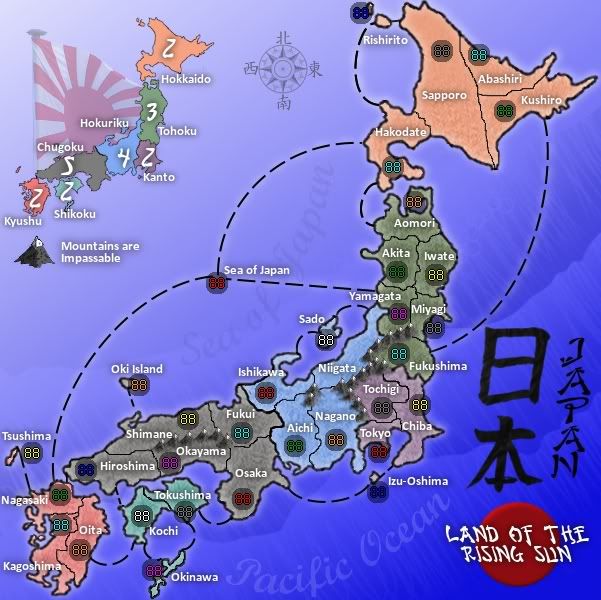
The big addition here is a new territory has been added that is not a part of any bonus, Sea of Japan. This allows the majority of the west coast to be accessible via this territory. I may have to think about another territory connection, and possibly moving the connection to different territories since I've started the connections into territories that are already borders.
Graphics:
Lanterns - out
parchment - out
boats - out
Shrunk and repositioned titled
added subtitle with beveled red circle accent (resembles the modern flag)
added compass rose with kanji symbols on the cardinal points(and yes they mean, North, South, East, and West)
redid names for bodies of water; larger, different font, curved, and dropped the opacity way down.
There's still some fiddling to do, I feel like there's a hole in the top corner and I may have to think about explaining that the "Sea of Japan" isn't a part of a bonus. And the "Mountains are impassible seems to be floating out in the middle of nowhere... and maybe, I hate to say it, the flag is redundant since there is another red circle on the map. What do you guys think?
Last edited by RedBaron0 on Mon Jul 20, 2009 3:26 am, edited 1 time in total.
-
Industrial Helix
- Posts: 3462
- Joined: Mon Jul 14, 2008 6:49 pm
- Gender: Female
- Location: Ohio
Re: Japan, Land of the Rising Sun - 10th revision pg7
I like the changes, the sea of Japan territory works better than the boats. I presume it deploys normally and all that (Reminds me of my Indian bonus in 13 Colonies)?
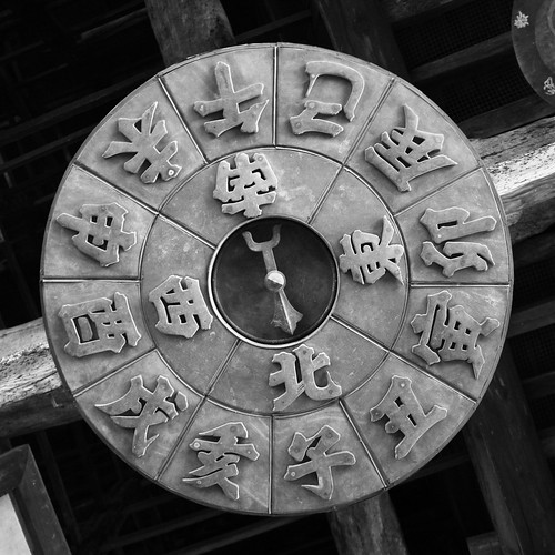
The ocean text looks good as well, as does the compass. Ok, I just researched the history of the magnetic compass according to wikipedia, there should be a more distinctive Japanese compass out there, should you choose to pursue it. I thought this one had a little flair to it:
But its up to you, though I like the inclusion of more Japanese language characters in the map. Ah, I know this is getting excessive, but what if you added/replaced "Sea of Japan" and "Pacific Ocean" with Japanese text?
As for the Land of the Rising Sun thing, why is it italicized to the left and not the right? It seems a little tacked on there and outside the basic theme of the map. Everything has a subdued, rustic feel and then there's this red button. Keep it if you like, but I think you're going to have to address the style of it.
As for the duel flags.... you make a good point about there being two. OK, here's what I would do: leave the minimap flag, drop the "Land o the rising sun", drop the opacity on the red dot and merge it with some old paper texture or something, darken the edges and move it behind the Japan logo. Just big enough to pop out beyond the left and right edges of the text and yet have the vertical aspects of the text overlap considerably, centered. Hope this makes sense.
In that case, i don't think the flags are redundant. At the moment, yes, they look a bit redundant. But I really like how the minimap flag works and I'm inclined to hang on to it, but as always, your call.
The ocean text looks good as well, as does the compass. Ok, I just researched the history of the magnetic compass according to wikipedia, there should be a more distinctive Japanese compass out there, should you choose to pursue it. I thought this one had a little flair to it:
- Click image to enlarge.
As for the Land of the Rising Sun thing, why is it italicized to the left and not the right? It seems a little tacked on there and outside the basic theme of the map. Everything has a subdued, rustic feel and then there's this red button. Keep it if you like, but I think you're going to have to address the style of it.
As for the duel flags.... you make a good point about there being two. OK, here's what I would do: leave the minimap flag, drop the "Land o the rising sun", drop the opacity on the red dot and merge it with some old paper texture or something, darken the edges and move it behind the Japan logo. Just big enough to pop out beyond the left and right edges of the text and yet have the vertical aspects of the text overlap considerably, centered. Hope this makes sense.
In that case, i don't think the flags are redundant. At the moment, yes, they look a bit redundant. But I really like how the minimap flag works and I'm inclined to hang on to it, but as always, your call.
Sketchblog [Update 07/25/11]: http://indyhelixsketch.blogspot.com/
Living in Japan [Update 07/17/11]: http://mirrorcountryih.blogspot.com/
Russian Revolution map for ConquerClub [07/20/11]: http://www.conquerclub.com/forum/viewto ... 1&t=116575
Living in Japan [Update 07/17/11]: http://mirrorcountryih.blogspot.com/
Russian Revolution map for ConquerClub [07/20/11]: http://www.conquerclub.com/forum/viewto ... 1&t=116575
-
RedBaron0
- Posts: 2657
- Joined: Sun Aug 19, 2007 12:59 pm
- Gender: Male
- Location: Pennsylvania
- Contact:
Re: Japan, Land of the Rising Sun - 10th revision pg7
Yeah, the compass rose I have is probably as far as I'll take it. I have seen a couple floating around like the one you have there Helix, the extra text (16 symbols in total) of course refer to the 16 major and minor cardinal points. I just have the 4 major cardinal points (NSEW) marked, but all 16 points are there. If you look at a full Japanese naval ensign, it has 16 alternating red and white stripes so its a fairly common symbols used in Japan, the common chrysanthemum in Japan, the Imperial seal, has 16 pedals.
And yeah, the Sea of Japan is just a regular territory, no killer neutrals. It just isn't part of any bonus, just a path.
I've got an update poised and ready to go with the suggestions Helix has given me, but before I post it up, I'd like to see if there is any other commons on the current version.
And yeah, the Sea of Japan is just a regular territory, no killer neutrals. It just isn't part of any bonus, just a path.
I've got an update poised and ready to go with the suggestions Helix has given me, but before I post it up, I'd like to see if there is any other commons on the current version.
-
RedBaron0
- Posts: 2657
- Joined: Sun Aug 19, 2007 12:59 pm
- Gender: Male
- Location: Pennsylvania
- Contact:
Re: Japan, Land of the Rising Sun - 10th revision pg7
- Click image to enlarge.
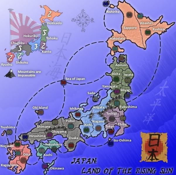
Graphics:
Title revamped
Sea of Japan and Pacific Ocean text changed from English to Kanji.
Gameplay:
New connections from 'Sea of Japan' to Shimane and Akita. The extra connections alter the bonus current bonus structure, and has been adjusted accordingly.
I've also changed my signature to drum up a little support, so I'll go and post out the General forums a little bit and see about getting some traffic through here to make more comments.
Last edited by RedBaron0 on Mon Jul 20, 2009 3:29 am, edited 1 time in total.
Re: Japan, Land of the Rising Sun - 10th revision pg7
I am not seeing anything major, just two little suggestions. I saw the first instance of the Sea of Japan territory and was thinking you should make another connection to Fukui, but Shimane looks good. I was thinking that maybe you could have the Sea of Japan start as a neutral, maybe even a neutral 2 instead of 3. This might cause people to use that path, instead of avoiding it. My other thought was that the word "Japan:" in the title should be shifted to the right and either lined up with the subtitle or centered over it. It looks a little awkward right now.
Re: Japan, Land of the Rising Sun - 10th revision pg7
I disagree. Lining up the two lines of the title would make it look blocky, I think. I see the two lines as a heading and subheading, and the indentation of the second line looks right to me. Centered would just crowd the parchment. You might consider increasing the font size of the first line, "JAPAN:", to fill more of the space next to the parchment, but it's not a must-do in my eyes. The whole thing looks pretty good at this point.lancehoch wrote:My other thought was that the word "Japan:" in the title should be shifted to the right and either lined up with the subtitle or centered over it. It looks a little awkward right now.
Maybe I shouldn't ask this, as I have no real clue about these matters nor your skill set, and no disrespect intended, but are you sure about your kanji inscriptions? You (and CC) would not want to post a map that you think says "Sea of Japan" but in fact says something like "Japan bites". (I can see that the kanji for "Japan" is consistent at least.)
Here's hoping we can play this map soon.
-
Industrial Helix
- Posts: 3462
- Joined: Mon Jul 14, 2008 6:49 pm
- Gender: Female
- Location: Ohio
Re: Japan, Land of the Rising Sun - 10th revision pg7
Looks pretty good. I def like the red sun on the parchment, though maybe the parchment could go a little whiter? And the Japanese characters for the oceans looks great as well. I think you're starting to find that Japanese character you were looking for.
I echo lancehoch on the Japan: Land of the Rising sun, it looks a tad off.
What if you put the graphic more towards the middle of the height of the picture and put the text under it so it reads something like this:
[Graphic]
JAPAN
LAND
OF THE
RISING
SUN
Then just scoot the Pacific Ocean text a little more north.
I also just noticed that the terr borders on Hokkaido look a little pixelated, especially the long vertical one... same for a lot of the interior borders, actually. It might be the way you save the file or perhaps its just the way it is. Maybe run the blur tool over it and see what happens. Or you could try doing an outer glow effect onthe borders to try and fuzz it out a little without getting too thick of lines. I'd hate for you to have to trace over all the borders though... but something, i think ought to be done about that at some point.
Sketchblog [Update 07/25/11]: http://indyhelixsketch.blogspot.com/
Living in Japan [Update 07/17/11]: http://mirrorcountryih.blogspot.com/
Russian Revolution map for ConquerClub [07/20/11]: http://www.conquerclub.com/forum/viewto ... 1&t=116575
Living in Japan [Update 07/17/11]: http://mirrorcountryih.blogspot.com/
Russian Revolution map for ConquerClub [07/20/11]: http://www.conquerclub.com/forum/viewto ... 1&t=116575
-
RedBaron0
- Posts: 2657
- Joined: Sun Aug 19, 2007 12:59 pm
- Gender: Male
- Location: Pennsylvania
- Contact:
Re: Japan, Land of the Rising Sun - 10th revision pg7
I'll try text along the right side like that, Helix. I think I'll look to make the text a little bigger and then shift the "Pacific Ocean" Kanji to the south in the spot where the word "Japan" is now. I agree about the borders, and captain walrus's suggestion about using the paths tool will, in the end, probably give a better look. So redrawing the lines will probably be best in the long run.
A neutral deploy to "Sea of Japan" will probably be best, I can see in just about any type of game, that the person gets it in the deploy has an advantage over the entire west coast, with the ability to choose a bonus area to set up camp. Lets say neutral 3 start for "Sea of Japan."
ender, I am thoroughly researching all kanji text going onto the map, and if and when CC requires a translation of the text, I will be happen to provide it. In fact... lets just do that now.
http://www.kanjidic.com/
http://www.freedict.com/onldict/jap.html
http://nihongo.j-talk.com/parser/search/kanjisearch.php
日 - (hi)day, sun
本 - (hon) book, main, head, this, our, counter for long cylindrical things
日本 - (nippon) Japan
海 - (umi) sea, beach
日本海 - (nihonkai) Sea of Japan
太 - (futoi) thick, fat
平 - (heiki) coolness, calmness, composure, unconcern
洋 - (en'you)ocean
太平洋 - (taiheiyou)Pacific Ocean
One last thing, my "88's" just don't translate well when it gets uploaded, am I doing something wrong with them that screws them up?