
- Click image to enlarge.

Conqueropoly [Back!]
Moderator: Cartographers
Forum rules
Please read the Community Guidelines before posting.
Please read the Community Guidelines before posting.
Conqueropoly [Back!]
Old thread  http://www.conquerclub.com/forum/viewtopic.php?t=34774
Older version http://i238.photobucket.com/albums/ff55 ... opoly2.png
Older version
Last edited by Gilligan on Tue Aug 18, 2009 7:00 pm, edited 7 times in total.


Re: Conqueropoly V.13 Pg 1+40 Back on track?
Previous development of the Conqueropoly map can be seen here http://www.conquerclub.com/forum/viewto ... 41&t=34774
PB: 2661 | He's blue... If he were green he would die | No mod would be stupid enough to do that
-
Juan_Bottom

- Posts: 1110
- Joined: Mon May 19, 2008 4:59 pm
- Location: USA RULES! WHOOO!!!!
Re: Conqueropoly [New Thread]
Yes, good...Gilligan wrote:--Change 'Attack Multis' to 'Hunters'
The font on the top of the board is driving me crazy. It looks soooo wrong to me. The deck I can overlook.Gilligan wrote:--There were comments about flipping the Dice Deck, but I disagree. No font should be upside-down.
I think that you should stick to using the color of the dice deck. It's more uniform and therefore, more aproachable.Gilligan wrote:--Different color of 'Cards Deck' so it doesn't clash with the blue or vice versa?
--Same thing with 'Dice Deck' and orange
But how you mak e that work with the territory bonus, I don't know.... maybe everything can have really high values?
'Assassin' (orange territory) needs to be caps also.
There's also something strange about the font in the top row. The other writing all comes though a bit blurry for me, but the top font doesn't. And I've refreashed a couple of times now.
-
wcaclimbing

- Posts: 5598
- Joined: Fri May 12, 2006 10:09 pm
- Location: In your quantum box....Maybe.
- Contact:
Re: Conqueropoly [New Thread]
Why is this thread stickied?
I know that this map is pretty far along and was already developed by someone else, but there have only been two comments within 9 days. that doesn't seem worthy of a sticky.
No offense, but this doesn't seem like a very popular idea...
I know that this map is pretty far along and was already developed by someone else, but there have only been two comments within 9 days. that doesn't seem worthy of a sticky.
No offense, but this doesn't seem like a very popular idea...

Re: Conqueropoly [New Thread]
Come on man, read the thread!wcaclimbing wrote:Why is this thread stickied?
I know that this map is pretty far along and was already developed by someone else, but there have only been two comments within 9 days. that doesn't seem worthy of a sticky.
No offense, but this doesn't seem like a very popular idea...
MrBenn wrote:Previous development of the Conqueropoly map can be seen here
-
lgoasklucyl
- Posts: 526
- Joined: Mon Apr 07, 2008 8:49 pm
- Gender: Male
- Location: Somewhere in the 20th century.
Re: Conqueropoly [New Thread]
Pretty interested in the map myself- looked into the font issue that Juan has for ya:
http://www.googlecommunity.com/about10277.html
May also be of help, provides concise answers and direct link to font dl:
http://ask.metafilter.com/47780/Whats-t ... poly-board
http://www.googlecommunity.com/about10277.html
May also be of help, provides concise answers and direct link to font dl:
http://ask.metafilter.com/47780/Whats-t ... poly-board
-
reggie_mac

- Posts: 299
- Joined: Fri Nov 30, 2007 4:06 pm
- Location: Queenstown, NZ
- Contact:
Re: Conqueropoly [New Thread]
UCP (User Control Panel) - Its whats its referred to in other places on the siteGilligan wrote: --As for hyphenated words, maybe change 'Private Messaging' to 'Control Panel'?
Soviet Invaders: Space Invaders, it's not just a game
New Zealand Map - Foundry
"You can please all of the people some of the time, or some of the people all of the time, but not all of the people all of the time"
New Zealand Map - Foundry
"You can please all of the people some of the time, or some of the people all of the time, but not all of the people all of the time"
Re: Conqueropoly [New Thread]
/me votes for all the font that should be upside down to be upside down...maybe you should do a poll?
PERSONAL BEST...
Rank: Colonel
Score: 2802
Place: 120
Date: 16 / 2 / 2009
Rank: Colonel
Score: 2802
Place: 120
Date: 16 / 2 / 2009
-
Pedronicus
- Posts: 2080
- Joined: Tue Jan 24, 2006 2:42 pm
- Gender: Male
- Location: Busy not shitting you....
Re: Conqueropoly [New Thread]
stop hi jacking existing board games for a map idea. chinese checkers and connect 4 didn't make for a good game to play, so why the f*ck is everyone in the map foundry, who are desperate to make another map, failing to find an original 'map'
This looks like another shit map. don't take it any further. throw it in the bin. find a new ORIGINAL idea
This looks like another shit map. don't take it any further. throw it in the bin. find a new ORIGINAL idea
Re: Conqueropoly [New Thread]
I appreciate your opinion, Pedronicus, but there's absolutely no need to be that negative about it.
-
BaldAdonis

- Posts: 2334
- Joined: Fri Aug 24, 2007 1:57 am
- Location: Trapped in Pleasantville with Toby McGuire
Re: Conqueropoly [New Thread]
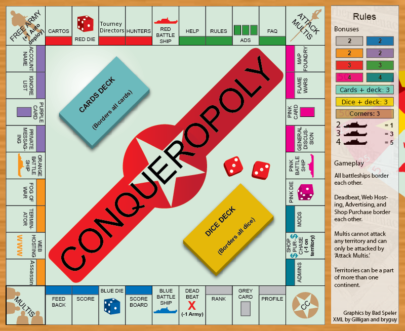
So if this were a constructive complaint, you might've said the layout is too linear, the connectivity is very low (most territories only have two borders), there are three dead ends out of 42 territories, and the bonuses make more sense in Monopoly. Light blue holds 5 territories for 2 armies, and teal holds 3 for 4. Because it's all linear, the territories are essentially the same, except that Feedback is a dead end, while Dice and Battle Ships can be attacked from more than 2 places! All of these make for really brutal gameplay.Pedronicus wrote:stop hi jacking existing board games for a map idea. chinese checkers and connect 4 didn't make for a good game to play, so why the f*ck is everyone in the map foundry, who are desperate to make another map, failing to find an original 'map'
This looks like another shit map. don't take it any further. throw it in the bin. find a new ORIGINAL idea
If you wanted to fix all these things:
- I remember seeing a set up that went beyond the board, including territories like money and deed cards, which were scattered haphazardly to make things less linear and more connected. It looked more like Poker Club than Connect 4.
- The bonuses should strive to be realistic bonuses, instead of proportional to Monopoly rent values. I realize it balances out if there is enough competition for the territories (4 or more players), but a good number of games are not made that way. Compare with 1v1 on City Mogul.
- If you're going to include Multis as a way-one, you might want to put in an exit (like a "Get out of Jail Free card" territory). Think about how much everyone hates Alcatraz, and it actually gives you a bonus.
-
Pedronicus
- Posts: 2080
- Joined: Tue Jan 24, 2006 2:42 pm
- Gender: Male
- Location: Busy not shitting you....
Re: Conqueropoly [New Thread]
you want constructive criticism ?
search the internet for other ideas instead of just ripping off famous board games. how about a shipyard?
http://www.titanicinbelfast.com/templat ... arent=154#
search the internet for other ideas instead of just ripping off famous board games. how about a shipyard?
http://www.titanicinbelfast.com/templat ... arent=154#

Re: Conqueropoly [New Thread]
Does anyone else see the problem with this?
Not that I don't like the map, but seeing as Hasbro owns Risk and Monopoly.....Might be risky
Not that I don't like the map, but seeing as Hasbro owns Risk and Monopoly.....Might be risky
-
Pedronicus
- Posts: 2080
- Joined: Tue Jan 24, 2006 2:42 pm
- Gender: Male
- Location: Busy not shitting you....
Re: Conqueropoly [New Thread]
wcaclimbing wrote:No offense, but this doesn't seem like a very popular idea...
Pedronicus wrote:This looks like another shit map. don't take it any further. throw it in the bin.
BaldAdonis wrote:But really I also think you're better off starting anew with an idea that is not already constrained so much.
So you don't get a great deal of positive feedback, someone points out there may well be copyright issues and gilligan takes it all on board....n00blet wrote:Does anyone else see the problem with this?
Not that I don't like the map, but seeing as Hasbro owns Risk and Monopoly.....Might be risky
Gilligan wrote:I am working on a draft, but my life has been hectic as of late.
Yes there is. your idea is terrible.Gilligan wrote:I appreciate your opinion, Pedronicus, but there's absolutely no need to be that negative about it.
just how ignorant can you be? you name the map 'Conqueropoly' because it's instantly recognizable as the monopoly board. big deal that you changed the names.Gilligan wrote:The image nor names are the same.
This is the work and actions of a spoilt teenager who can't accept being told he's wrong.
-
thenobodies80

- Posts: 5400
- Joined: Wed Sep 05, 2007 4:30 am
- Gender: Male
- Location: Milan
Re: Conqueropoly [New Thread]
This map would create some rights problems!
It's the same classic map and middle earth map.
Monopoly is an hasbro product and your map, that i find very well developed, could be a problem for CC because it is a "copy".
Have you contacted the admin for this map?
Have a nice Day
Thenobodies80
It's the same classic map and middle earth map.
Monopoly is an hasbro product and your map, that i find very well developed, could be a problem for CC because it is a "copy".
Have you contacted the admin for this map?
Have a nice Day
Thenobodies80

Re: Conqueropoly [New Thread]
i know theres a lot of neg comments on this but, ive loved this map since i saw it
gilligan id say you should ask someone high up as they will be the deciders on whether it is too risky to use or if its fine
if hasbro has a problem with it then technically:
1) all the names are different from monopoly board
2) the game/map doesnt play the same as either risk or monopoly and if they havnt decided to combine the 2 then youre the owner of the idea not them
(might want to add the second point if an admin trys to tell ya no )
)
gilligan id say you should ask someone high up as they will be the deciders on whether it is too risky to use or if its fine
if hasbro has a problem with it then technically:
1) all the names are different from monopoly board
2) the game/map doesnt play the same as either risk or monopoly and if they havnt decided to combine the 2 then youre the owner of the idea not them
(might want to add the second point if an admin trys to tell ya no

-
Pedronicus
- Posts: 2080
- Joined: Tue Jan 24, 2006 2:42 pm
- Gender: Male
- Location: Busy not shitting you....
Re: Conqueropoly [New Thread]
ffs
wikipedia copyright....
wikipedia copyright....
For example, the copyright to a Mickey Mouse cartoon restricts others from making copies of the cartoon or creating derivative works based on Disney's particular anthropomorphic mouse, but doesn't prohibit the creation of other works about anthropomorphic mice in general, so long as they're different enough to not be judged copies of Disney's
Re: Conqueropoly [New Thread]
Lack says it is fine, but I must wait three months to continue the project. Therefore this map is on a three month vacation.

Re: Conqueropoly [New Thread]
why?Gilligan wrote:Lack says it is fine, but I must wait three months to continue the project. Therefore this map is on a three month vacation.
Re: Conqueropoly [New Thread]
In which case, this map will be moved to the scrap heap for the next 3 months.Gilligan wrote:Lack says it is fine, but I must wait three months to continue the project. Therefore this map is on a three month vacation.
When the relevant time has passed, and you have an update to post, one of the CAs will be able to get you back into the foundry system.
MrB
PB: 2661 | He's blue... If he were green he would die | No mod would be stupid enough to do that
Re: Conqueropoly [Necessary 3 Month Vacation]
So, Conqueropoly LIVES!!!!!!!!
Discuss Gameplay, and bonuses need to be worked out.
I was thinking of renaming the Battleships (Therefore removing them from their respective color bonus) to Assault, Bombardment, Reinforcement, Deploy. Or even unique ways of attacking in several maps - Such as the Dunnys (Madness), Diamonds (Conquer Man), Sub Stations (City Mogul), Ports (AoR), etc
- Click image to enlarge.
I was thinking of renaming the Battleships (Therefore removing them from their respective color bonus) to Assault, Bombardment, Reinforcement, Deploy. Or even unique ways of attacking in several maps - Such as the Dunnys (Madness), Diamonds (Conquer Man), Sub Stations (City Mogul), Ports (AoR), etc