Old Deutchland
Ich Bin Ein Berliner.
Ugh.
[Official] Germany Revamp
Moderator: Cartographers
Forum rules
Please read the Community Guidelines before posting.
Please read the Community Guidelines before posting.
-
nesterdude

- Posts: 1006
- Joined: Fri Dec 01, 2006 5:32 pm
- Location: Babylon aka Washington, DC
Re: [Official] Germany REVAMP - POST CONCERNS HERE
High: 08 Dec. 08; Pts: 3141 Ranking: 57 Rank: Brig

Lordhaha is my hero too.
Lordhaha is my hero too.

Re: [Official] Germany REVAMP - POST CONCERNS HERE
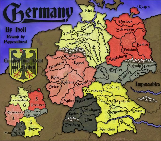
I agree, when you first open up this thread and the maps at the beginning show, the one hoff gave where all the different colors was the best one. It is easy to read, and the color scheme made it easy to differentiate continents and borders. Also it was very asthetic.Bruceswar wrote:tyche73 wrote:laddida wrote:like i thought it is pointless to post in any of these cause never really makes a difference just wasting my time
i agree
we are here because we're not happy with the map it's not clean and sharp
it's not easy to read,it looks muddled and too much happening in the colours
While it will take some getting used to I do have one major complaint. That font used to name the territories is absolutely an eye sore. I find myself struggling to read what the names are. Being that I do not speak German these names do not come easy to me. With that said I am sure there could have been a better font chose and better bonus colors chosen.
BTW I liked Version 1 of this revamp much better. Those bright colors made it easy to see it all, rather than now which is hard to see.
I will quote what someone told me on MSN about this map in one word... "Clusterf*ck" I happen to agree with them on this one. While I have been a fan of most of the revamps this is not one I can support. This is nothing personal at you, just my views on the map as it stands.
J
-
pepperonibread

- Posts: 954
- Joined: Sun Jan 28, 2007 4:33 pm
- Location: The Former Confederacy
Re: [Official] Germany REVAMP - POST CONCERNS HERE
Hey guys, what do you mean by the one that Hoff made? He created the old map, but he hasn't been on CC for years except to stop by this thread once or twice I think.jghost7 wrote:I agree, when you first open up this thread and the maps at the beginning show, the one hoff gave where all the different colors was the best one. It is easy to read, and the color scheme made it easy to differentiate continents and borders. Also it was very asthetic.Bruceswar wrote:tyche73 wrote:laddida wrote:like i thought it is pointless to post in any of these cause never really makes a difference just wasting my time
i agree
we are here because we're not happy with the map it's not clean and sharp
it's not easy to read,it looks muddled and too much happening in the colours
While it will take some getting used to I do have one major complaint. That font used to name the territories is absolutely an eye sore. I find myself struggling to read what the names are. Being that I do not speak German these names do not come easy to me. With that said I am sure there could have been a better font chose and better bonus colors chosen.
BTW I liked Version 1 of this revamp much better. Those bright colors made it easy to see it all, rather than now which is hard to see.
I will quote what someone told me on MSN about this map in one word... "Clusterf*ck" I happen to agree with them on this one. While I have been a fan of most of the revamps this is not one I can support. This is nothing personal at you, just my views on the map as it stands.
J

-
captainwalrus
- Posts: 1018
- Joined: Sun Nov 11, 2007 3:19 pm
- Location: Finnmark
Re: [Official] Germany REVAMP - POST CONCERNS HERE
Lol, it is funny when people decide to never go in the foundery then are annoyed when something changes with a map and nobody asked them.
~ CaptainWalrus
-
pepperonibread
- Posts: 954
- Joined: Sun Jan 28, 2007 4:33 pm
- Location: The Former Confederacy
Re: [Official] Germany REVAMP - POST CONCERNS HERE
laddida, you've posted no constructive criticism whatsoever, so I don't know what I'm supposed to do with your post. While other people have got specific concerns about the borders, or the font, or the areas that are tough to look at, this really doesn't help me make the map better at all.tyche73 wrote:i agreeladdida wrote:like i thought it is pointless to post in any of these cause never really makes a difference just wasting my time
we are here because we're not happy with the map it's not clean and sharp
it's not easy to read,it looks muddled and too much happening in the colours
tyche, your post was perfectly fine. It wasn't my intention to dismiss your comment entirely, like I said I had to disagree with your opinion that the map isn't clean enough, but that we should wait for more comments on the issue anyway. I won't change the map based on one opinion, as the foundry process works best when you can get a significant discussion going and see what people want most.
Obviously though, I understand that you aren't you only one with feelings against the new map. But I also have to take into account that prior to the map's quenching, nearly everyone who looked over the map saw few or no problems with it (otherwise it wouldn't have been quenched). So though it seems like there's been a huge unanimous outcry over this map as soon as it was released, we really have to wait for all opinions to come in and then strike a fair compromise based on that.
I'll look at some different fonts to possibly replace the current one, I think it looks quite good stylistically though I can see how it could make reading tougher.Bruceswar wrote:While it will take some getting used to I do have one major complaint. That font used to name the territories is absolutely an eye sore. I find myself struggling to read what the names are. Being that I do not speak German these names do not come easy to me. With that said I am sure there could have been a better font chose and better bonus colors chosen.
BTW I liked Version 1 of this revamp much better. Those bright colors made it easy to see it all, rather than now which is hard to see.
I will quote what someone told me on MSN about this map in one word... "Clusterf*ck" I happen to agree with them on this one. While I have been a fan of most of the revamps this is not one I can support. This is nothing personal at you, just my views on the map as it stands.
Secondly, what is it exactly about the current colors that make it hard to see? Certainly, all maps don't need to be brightly colored to differentiate bonuses, in fact sometimes this is actually hindering to players. If you look at the original draft, if you can picture different colored army numbers besides the yellow I used, you can imagine how red numbers would be hard to see on Prussia, blue could be tough in Bavaria, and so on. So if anything, the pale colors on the left of the new map should aid visibility during games.
Or is it more an issue of distinguishing the pairs of bonuses which are similar in color to one around? If that's the case, I could slightly lighten the leftmost bonuses and/or thicken the lines between bonuses, to make them more distinct.
-
the.killing.44

- Posts: 4724
- Joined: Thu Oct 23, 2008 7:43 pm
- Gender: Male
- Location: now tell me what got two gums and knows how to spit rhymes
- Contact:
Re: [Official] Germany REVAMP - POST CONCERNS HERE
Now that it has gone live I can only see one thing that could help it, and that would be to add army shadows (and by that I mean take the dodge tool and put specks under the coords) in the north bonus regions. It is a bit hard to read the darker colors up there.
But not a pressing issue, it's perfectly fine as is.
.44
But not a pressing issue, it's perfectly fine as is.
.44

Re: [Official] Germany REVAMP - POST CONCERNS HERE
- Click image to enlarge.

i hope this helps to solve the issue
please note green 5 up north and yellow 7 on nurnberg just as examples because they actually effected my next move

Re: [Official] Germany REVAMP - POST CONCERNS HERE
I will chime in that although the map is attractive graphically I think functionally it is very tough on play. The prime example is yellow armies on the yellow southeastern region, and god forbid if grey/steel is on the northeast. I like the color scheme and font in the original post a lot though.
-
pepperonibread
- Posts: 954
- Joined: Sun Jan 28, 2007 4:33 pm
- Location: The Former Confederacy
Re: [Official] Germany REVAMP - POST CONCERNS HERE
Thanks killing, tyche, and danryan. So it seems that a primary visibility concern is distinguishing army numbers from some of the more saturated backgrounds. I think this can be basically remedied by tweaking a few colors and adding army shadows on some of the territories. Like killing suggested, I'm thinking a light shadow or glow will work best under the numbers, as using the circles many maps have would clutter this map too much.

Re: [Official] Germany REVAMP - POST CONCERNS HERE
When I look at a map I always look at it from the view of I am a brand new person to CC and this is my first time on it. I can verify this quickly by asking for a friend's opinion on this map who does not play CC. Which is what I usually do. I ask him(different people) a series of quick questions and see how many he gets right or wrong or has trouble with. This time he told me those 2 yellow bonuses he could not tell apart much and the map was overall hard to read. I had to agree with him. He also noted that those slate areas were not great either.pepperonibread wrote:I'll look at some different fonts to possibly replace the current one, I think it looks quite good stylistically though I can see how it could make reading tougher.Bruceswar wrote:While it will take some getting used to I do have one major complaint. That font used to name the territories is absolutely an eye sore. I find myself struggling to read what the names are. Being that I do not speak German these names do not come easy to me. With that said I am sure there could have been a better font chose and better bonus colors chosen.
BTW I liked Version 1 of this revamp much better. Those bright colors made it easy to see it all, rather than now which is hard to see.
I will quote what someone told me on MSN about this map in one word... "Clusterf*ck" I happen to agree with them on this one. While I have been a fan of most of the revamps this is not one I can support. This is nothing personal at you, just my views on the map as it stands.
Secondly, what is it exactly about the current colors that make it hard to see? Certainly, all maps don't need to be brightly colored to differentiate bonuses, in fact sometimes this is actually hindering to players. If you look at the original draft, if you can picture different colored army numbers besides the yellow I used, you can imagine how red numbers would be hard to see on Prussia, blue could be tough in Bavaria, and so on. So if anything, the pale colors on the left of the new map should aid visibility during games.
Or is it more an issue of distinguishing the pairs of bonuses which are similar in color to one around? If that's the case, I could slightly lighten the leftmost bonuses and/or thicken the lines between bonuses, to make them more distinct.
Highest Rank: 26 Highest Score: 3480

Re: [Official] Germany REVAMP - POST CONCERNS HERE
There is obvious discontent with this map... an antrocity in comparison to the original and yet with disapproval from the community the map still gets forged through.. I b
can begin to pick at all the things i do not like . just to sum it up.. A revamp is supposed to be an improvement and this map definitly does not reflect that..
can begin to pick at all the things i do not like . just to sum it up.. A revamp is supposed to be an improvement and this map definitly does not reflect that..

-
samuelc812

- Posts: 2215
- Joined: Sun Dec 30, 2007 6:56 am
- Gender: Male
Re: [Official] Germany REVAMP - POST CONCERNS HERE
Why is everyone complaining, this map has been moving through the foundry for a long time, everyone has had ample opportunity to voice their opinion of concern for the map, yet no one has.
I suggest people start following especially revamp threads if they enjoy the map being revamped, so that they don't get dissappointed when it does finally go up for beta play. A classic example of why more people should come in the foundry and look at threads that interest them
I suggest people start following especially revamp threads if they enjoy the map being revamped, so that they don't get dissappointed when it does finally go up for beta play. A classic example of why more people should come in the foundry and look at threads that interest them
Re: [Official] Germany REVAMP - POST CONCERNS HERE
samuelc812 wrote:Why is everyone complaining, this map has been moving through the foundry for a long time, everyone has had ample opportunity to voice their opinion of concern for the map, yet no one has.
I suggest people start following especially revamp threads if they enjoy the map being revamped, so that they don't get dissappointed when it does finally go up for beta play. A classic example of why more people should come in the foundry and look at threads that interest them
95% of CC never has visited the forums. Don't you think when a map that is already out is being redone 100% of CC should know? With that said everybody looks at their my games page. Simple messages scrolling at the top would save lots of grief. The way it is now many feel maps are being taken away at the leisure of CC. If such messages were to warn people of a revamp there would be far less out cry. So for now people vote with their play. They boycott maps they do not like or play them very little. This goes into that bin for me and many others.
Highest Rank: 26 Highest Score: 3480
-
pepperonibread
- Posts: 954
- Joined: Sun Jan 28, 2007 4:33 pm
- Location: The Former Confederacy
Re: [Official] Germany REVAMP - POST CONCERNS HERE
The discontent you mention came up only after the revamp was quenched. So there's an essential problem here: Only by way of quenching a map could the foundry bring in the outside community to express their opinions on it. I'm reluctant to place blame on anyone in regards to this dilemma, as it has been argued about with every revamp and won't help us with anything here. However, neither can you place blame on the foundry for "forging it through" when nearly all voiced opinions prior to quenching were positive.danfrank wrote:There is obvious discontent with this map... an antrocity in comparison to the original and yet with disapproval from the community the map still gets forged through.. I b
can begin to pick at all the things i do not like . just to sum it up.. A revamp is supposed to be an improvement and this map definitly does not reflect that..
As for you concerns with the map, if you can come up with something specific I'll see what I can do with suggestions you might have, but right now unfortunately you haven't given me much to work with.
So far, nonCCer's I've asked have had problems distinguishing the two yellow continents, and one had an issue with the font. And this is if they had any problems at all. As for the slate continents, to be honest I can't cross my eyes or blur my vision in any way that would make them look the same.Bruceswar wrote:When I look at a map I always look at it from the view of I am a brand new person to CC and this is my first time on it. I can verify this quickly by asking for a friend's opinion on this map who does not play CC. Which is what I usually do. I ask him(different people) a series of quick questions and see how many he gets right or wrong or has trouble with. This time he told me those 2 yellow bonuses he could not tell apart much and the map was overall hard to read. I had to agree with him. He also noted that those slate areas were not great either.
I'm fine with working on the font, and the similarly colored continents, as well as army number visibility issues in tough areas. But I'm very reluctant to revert back to the old color scheme. The current palette works very well aesthetically and thematically with the rest of the map: it works together well with the blue ocean and brown dead land, and of course it's the German colors. But more important than that, I think we need to give the noobs some credit here.
First of all, compare this map with some of the other maps that a noob might start out on. Some of the more complicated maps are exponentially more confusing than this one if we have to take everything from a new-player standpoint. Secondly, we've got two types of noobs here: previously R-I-S-K players, and those that have never played the original game. Seasoned players will have relatively little trouble after understanding the CC interface - I'd venture to say that anyone who has played the game before will look first toward prospective bonuses (boni?) prior to making a move. This leads them straight to the minimap, were they see that there are indeed six zones: after this they'll have little trouble distinguishing them. Then we have the double noobs, who haven't even tried the board game. For them... maybe I'm pessimistic, but I'm pretty sure that they're gonna get confused anyway - so that's kind of a lost cause.
Long story short, I'm confident that we can resolve many of these visibility issues while still keeping the color scheme. Essentially my point buried beneath all the rambling is that though "catering to new players/making maps clear" is important, at some point there's a tradeoff of art vs clarity and IMO reverting the color scheme would add no clarity that can't be added with other methods, and would take the aesthetics down a notch.
Off to bed for me.
Re: [Official] Germany REVAMP - POST CONCERNS HERE
So out of curiosity why was this one rejected as far as color schemes go??
I will say this. I am glad you are willing to listen to people and hear them out. Sure maps are works of art, but this is a game and it needs to be a functional work of art. We must remember this is a game and thus it does not have to be 100% accurate as far as geography goes. As long as it plays well there can be whatever in the way for an impassable. Also where are the army circles? That might help with a lot of the confusion.
I will say this. I am glad you are willing to listen to people and hear them out. Sure maps are works of art, but this is a game and it needs to be a functional work of art. We must remember this is a game and thus it does not have to be 100% accurate as far as geography goes. As long as it plays well there can be whatever in the way for an impassable. Also where are the army circles? That might help with a lot of the confusion.
Highest Rank: 26 Highest Score: 3480
-
pepperonibread
- Posts: 954
- Joined: Sun Jan 28, 2007 4:33 pm
- Location: The Former Confederacy
Re: [Official] Germany REVAMP - POST CONCERNS HERE
As for that old draft, I believe that a few people wanted the colors on the map in the order of the German flag, and then after that it followed naturally the all the darker colors should be to the right, as the saturated continents there would balance well with the title, minimap, and coat of arms on the left. I believe the positive response at the time was quite large.Bruceswar wrote:So out of curiosity why was this one rejected as far as color schemes go??
I will say this. I am glad you are willing to listen to people and hear them out. Sure maps are works of art, but this is a game and it needs to be a functional work of art. We must remember this is a game and thus it does not have to be 100% accurate as far as geography goes. As long as it plays well there can be whatever in the way for an impassable. Also where are the army circles? That might help with a lot of the confusion.
Regarding army circles - as per recent criticisms, I'm now working on add army shadows to some or all of the territories. What I mean here is instead of traditional army circles, which are hard to fit in some of the more tight maps like this, I'm going to try a slightly blurred shadow or glow under each army number. This will hopefully make numbers easier to see in areas like Preussen, but won't clutter the map as army circles would.
I can't find a good example of this... though I'm sure it was on some other maps.
-
pepperonibread
- Posts: 954
- Joined: Sun Jan 28, 2007 4:33 pm
- Location: The Former Confederacy
Re: [Official] Germany REVAMP - POST CONCERNS HERE
The map above, or the original draft on pg. 1 of this thread?tyche73 wrote:i gotta agree with bruce
thats a nice map
-
Industrial Helix

- Posts: 3462
- Joined: Mon Jul 14, 2008 6:49 pm
- Gender: Female
- Location: Ohio
Re: [Official] Germany REVAMP - POST CONCERNS HERE
Personally I love the revamp and will actually play the Germany map now. I've got one gripe though: Ewickau is Zwickau in the deployment menu. I think it is supposed to be Zwickau but the font is a weird and looks like a E, so could this be changed to look more like a Z?
Sketchblog [Update 07/25/11]: http://indyhelixsketch.blogspot.com/
Living in Japan [Update 07/17/11]: http://mirrorcountryih.blogspot.com/
Russian Revolution map for ConquerClub [07/20/11]: http://www.conquerclub.com/forum/viewto ... 1&t=116575
Living in Japan [Update 07/17/11]: http://mirrorcountryih.blogspot.com/
Russian Revolution map for ConquerClub [07/20/11]: http://www.conquerclub.com/forum/viewto ... 1&t=116575
Re: [Official] Germany REVAMP - POST CONCERNS HERE
pepperonibread wrote:The map above, or the original draft on pg. 1 of this thread?tyche73 wrote:i gotta agree with bruce
thats a nice map
I am sure he means the one above which also keeps the German theme.
Highest Rank: 26 Highest Score: 3480
-
pepperonibread
- Posts: 954
- Joined: Sun Jan 28, 2007 4:33 pm
- Location: The Former Confederacy
Re: [Official] Germany REVAMP - POST CONCERNS HERE
Ah, I see what you mean. I'll fix all the Z's on the map (it should be Zwickau).Industrial Helix wrote:Personally I love the revamp and will actually play the Germany map now. I've got one gripe though: Ewickau is Zwickau in the deployment menu. I think it is supposed to be Zwickau but the font is a weird and looks like a E, so could this be changed to look more like a Z?
Glad you like the map.
Re: [Official] Germany REVAMP - POST CONCERNS HERE
Not an improvement over the original - having the "better" map switched in halfway during a doubles game was further irritating.
Just two negatives: 1) the font is so gothic, I can barely read it. 2) the colors of the diff. bonuses are not as distinguishable as the original map.
Just two negatives: 1) the font is so gothic, I can barely read it. 2) the colors of the diff. bonuses are not as distinguishable as the original map.

Re: [Official] Germany REVAMP - POST CONCERNS HERE
Okay why did we have to change Germany?
Sorry but the new map sucks. The original was way better!
Another map ruined by the revamp. I liked this map but now I can't see me playing it again
Sorry but the new map sucks. The original was way better!
Another map ruined by the revamp. I liked this map but now I can't see me playing it again
Best Score: 2799, Best Rank: Colonel, Best Scoreboard Spot: 126
Funniest Game:Game 1675072
Sickest Game:Game 2975352
Funniest Game:Game 1675072
Sickest Game:Game 2975352
-
pepperonibread
- Posts: 954
- Joined: Sun Jan 28, 2007 4:33 pm
- Location: The Former Confederacy
Re: [Official] Germany REVAMP - POST CONCERNS HERE
Sorry about the sudden switch, though there was unfortunately nothing any of us could really do to make the transition any easier.Razz54 wrote:Not an improvement over the original - having the "better" map switched in halfway during a doubles game was further irritating.
Just two negatives: 1) the font is so gothic, I can barely read it. 2) the colors of the diff. bonuses are not as distinguishable as the original map.
Regarding the font, I'm considering alternatives in hopes that we can find a clearer script the nevertheless meshes with the map's theme. And as for the colors, I'll accentuate the differences between similar colors but I still hope to keep the current general color scheme.
Thanks for your voicing your concerns.

Re: [Official] Germany REVAMP - POST CONCERNS HERE
the only problem with this map is the colour are the same for colourblind people mainly the to in the middle but this is so much more legible the the current one even thou the current one is awesome with the dark grundge this one is so much more eye friendly imhopepperonibread wrote:As for that old draft, I believe that a few people wanted the colors on the map in the order of the German flag, and then after that it followed naturally the all the darker colors should be to the right, as the saturated continents there would balance well with the title, minimap, and coat of arms on the left. I believe the positive response at the time was quite large.Bruceswar wrote:So out of curiosity why was this one rejected as far as color schemes go??
I will say this. I am glad you are willing to listen to people and hear them out. Sure maps are works of art, but this is a game and it needs to be a functional work of art. We must remember this is a game and thus it does not have to be 100% accurate as far as geography goes. As long as it plays well there can be whatever in the way for an impassable. Also where are the army circles? That might help with a lot of the confusion.
Regarding army circles - as per recent criticisms, I'm now working on add army shadows to some or all of the territories. What I mean here is instead of traditional army circles, which are hard to fit in some of the more tight maps like this, I'm going to try a slightly blurred shadow or glow under each army number. This will hopefully make numbers easier to see in areas like Preussen, but won't clutter the map as army circles would.
I can't find a good example of this... though I'm sure it was on some other maps.