in the last version, the borders are much more better and clear.
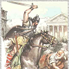
the bloodstains are badder than the others.. their prospective is totally failed..

and i don't like that they seems crystal drops..
the dark/light effect that you gave to the arena is incorrect too and give a failed prospective effect.
but you had understand the way, so don't be afraid and keep working!

i will try to give you some suggestion using some draft to be more clear.
this is how it seems now the section of your arena looking at your dark-light effect:

and this is the real section that an arena will have:

so, don't abuse of your program's effect and try to make it more realistic only using colours. something like this:
- Click image to enlarge.

if you see, in this draft the outer circle is the more lighting cause it's the more up and every circle is more dark when the arena goes more down. yhea, this is not too realistic, cause we will must suppose one light direction and then change the colour of every circles with an half more light and one more dark.. but give a realistic prospective to circle shapes it's quite hard, so i think you can be happy to give just a feeling of the right prospective.
looking at the correct arena section, you can probably understand what i mean when i say that the bloodstains are incorrect.. in the draft i drawn an example of a stain that give a feeling of the right prospective (not the perfect effect, but a more realistic feeling than your stains..).
in any case, i had the idea to use some little stair to connect circle-to-circle, and i tried to put an arrow inside them. that help to be more clear that they are connections, and you can easily use it to make one-way connection or two-way connection using the same stair.
in this mode you can use the stains (or whatever you will ideate) only to connect in the same circle. in any case, don't use special effect for the stains, but work on their shape making it irregular and similar to a real squirting-blood-stain.
finally, i think that the curve borders are too unrealistic and give a wrong prospective feeling, so i would prefer something like my draft (maybe not only lines, but something with a corpe..). in that mode you can tell that blue borders are one-way clockwise and red borders are one-way counter-clockwise. one thing: don't draw it willy-nilly like i did, make every line from the center of the arena to the edge of the circle, and then cut the excess. that will help to increase the prospective feeling.
keep in mind that my draft sucks and i make it only to explane you the focal concept. i hope that my draft will give you some inspiration and show you the way, but starting from it there is a lot of work to do.
edit: Oh my god! my draft really sucks!


