Jamaica
Moderator: Cartographers
Forum rules
Please read the Community Guidelines before posting.
Please read the Community Guidelines before posting.
-
natty dread

- Posts: 12877
- Joined: Fri Feb 08, 2008 8:58 pm
- Location: just plain fucked
Re: Jamaica [D.GP.GR] V27 (P19) Nearly There :-)
I'd suggest trying a dark outline on the icons, making them stand out more.


Re: Jamaica [D.GP.GR] V28
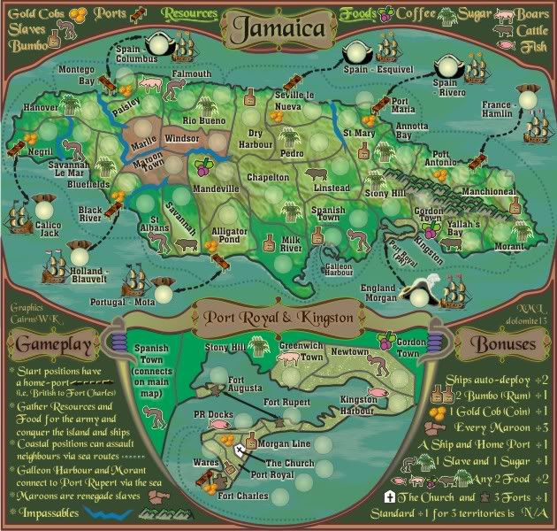
porkenbeans wrote:I am talking about all of the rum bottles and food stuffs and such. If you are looking at the small version, the viewer will not be able to tell just what they are. The large map it is not a problem. I suggest just changing the size of the icons to what they are on the large version. And then those on the large version can be even larger than they are now, which will add to the beauty of this map. those icons are wonderful, just make them larger so that they can be seen and appreciated more.cairnswk wrote:porkenbeans wrote:...
I can make out the icons on the large version, but not so much on the small. Maybe you would consider enlarging them a bit cairns. There seems to be plenty enough room to me.
Where exactly are you referrring to?
Also the sugar and the gold need a drop shadow like the other icons have. Maybe experiment a little with that drop shadow. I think that you can make the icons stand up a little more from the map surface.
OK, i've enlarged the icons so that they stand out more.natty_dread wrote:I'd suggest trying a dark outline on the icons, making them stand out more.
But i also experimented with the drop shadow, outer contours etc, and that made them stand out too much, to the extent that i wasn't happy with them, so....
Version 28.
- Click image to enlarge.

* Pearl Harbour * Waterloo * Forbidden City * Jamaica * Pot Mosbi
-
natty dread
- Posts: 12877
- Joined: Fri Feb 08, 2008 8:58 pm
- Location: just plain fucked
Re: Jamaica [D.GP.GR] V28 (P21) Enlarged Map Icons
Why don't you try to surround the icons with a slight glow of the opposite colour... You know opposite colours, right? 
Re: Jamaica [D.GP.GR] V28 (P21) Enlarged Map Icons
I did and as i say it looks like crapnatty_dread wrote:Why don't you try to surround the icons with a slight glow of the opposite colour... You know opposite colours, right?
* Pearl Harbour * Waterloo * Forbidden City * Jamaica * Pot Mosbi
-
natty dread
- Posts: 12877
- Joined: Fri Feb 08, 2008 8:58 pm
- Location: just plain fucked
Re: Jamaica [D.GP.GR] V28 (P21) Enlarged Map Icons
natty...refresh and have another look at those icons...are these better?natty_dread wrote:Ah, ok then... carry on.
* Pearl Harbour * Waterloo * Forbidden City * Jamaica * Pot Mosbi
-
natty dread
- Posts: 12877
- Joined: Fri Feb 08, 2008 8:58 pm
- Location: just plain fucked
Re: Jamaica [D.GP.GR] V28 (P21) Enlarged Map Icons
Well, the one sugar cane icon with a white-ish glow looks nice. Perhaps you could try that style...
Re: Jamaica [D.GP.GR] V28 (P21) Enlarged Map Icons
the rest of them have that style...natty_dread wrote:Well, the one sugar cane icon with a white-ish glow looks nice. Perhaps you could try that style...
* Pearl Harbour * Waterloo * Forbidden City * Jamaica * Pot Mosbi
-
natty dread
- Posts: 12877
- Joined: Fri Feb 08, 2008 8:58 pm
- Location: just plain fucked
Re: Jamaica [D.GP.GR] V28 (P21) Enlarged Map Icons
What? No, look here:

The glow on the lower icon there. It's clearly different from the other one. Apply that on all the icons and they should look great.
The glow on the lower icon there. It's clearly different from the other one. Apply that on all the icons and they should look great.
Re: Jamaica [D.GP.GR] V28 (P21) Enlarged Map Icons
I don't like that glow, it makes the icons look like they are pasted on, and not part of the map.

Re: Jamaica [D.GP.GR] V28 (P21) Enlarged Map Icons
I like the icons better now. They are as visible now on the small map as they were formerly on the large. However the gold cobs in the legend (upper left corner) are different from all the others on the map and bonus legend.
-
porkenbeans

- Posts: 2546
- Joined: Mon Sep 10, 2007 4:06 pm
Re: Jamaica [D.GP.GR] V28 (P21) Enlarged Map Icons
An outer glow can be used to make a dark object stand out on a dark background.
A drop shadow can be used to make a light object stand out on a light background.
you have both light and dark icons, so you are in a pickle here, if you want them all to be the same. There is no rule that says they have to have the same treatment. You can use them both. Glow for the dark icons, and shadow for the light icons. If you do not want to do that, then maybe you could just make the icons all dark, or all light.
There are 3 icons that are problematic at this point. The wheat, the gold, and the fish or whatever that is.
The wheat- Not only is it a light icon, on a light background, it is a similar color as well. This is what is causing the main problem there.
The gold- same as the wheat. But it has an additional problem in that the picture is not decipherable on the small map. Maybe a gold bar would work better.
The multi-colored fish looking thing- I can't figure out just what it is, so I can't really give a good suggestion for that, other than, try to make it more clear as to what it is.
The top and bottom legend areas are superb. They frame the picture well, and really give a nice feel to the map. I have 2 suggestions that I think would make them even better.
1.) give them a drop shadow to raise them up from the canvas a bit, (like a frame of sorts). Make the light source from 2, 4, 8, or 10 o'clock.
2.) Make those swards separate, not joined together at the bottom like that. The tips could just overlap maybe.
The hats in the sea only detract from those very nice ships. they are not needed. I would nix them.
Also, you can make those islands larger so they look more like islands.
Keep on keeping on, and I hope that my suggestion are helpful.

Re: Jamaica [D.GP.GR] V28 (P21) Enlarged Map Icons
You clearly haven't refreshed your browser...f5 please.natty_dread wrote:What? No, look here:
The glow on the lower icon there. It's clearly different from the other one. Apply that on all the icons and they should look great.
* Pearl Harbour * Waterloo * Forbidden City * Jamaica * Pot Mosbi
-
natty dread
- Posts: 12877
- Joined: Fri Feb 08, 2008 8:58 pm
- Location: just plain fucked
Re: Jamaica [D.GP.GR] V28 (P21) Enlarged Map Icons
Oh yeah, now I see. That's kinda confusing, you should just post the images again so we wouldn't get misunderstandings like these... 
But the bottom line was, I do like those white glows.
But the bottom line was, I do like those white glows.
Re: Jamaica [D.GP.GR] V28 (P21) Enlarged Map Icons
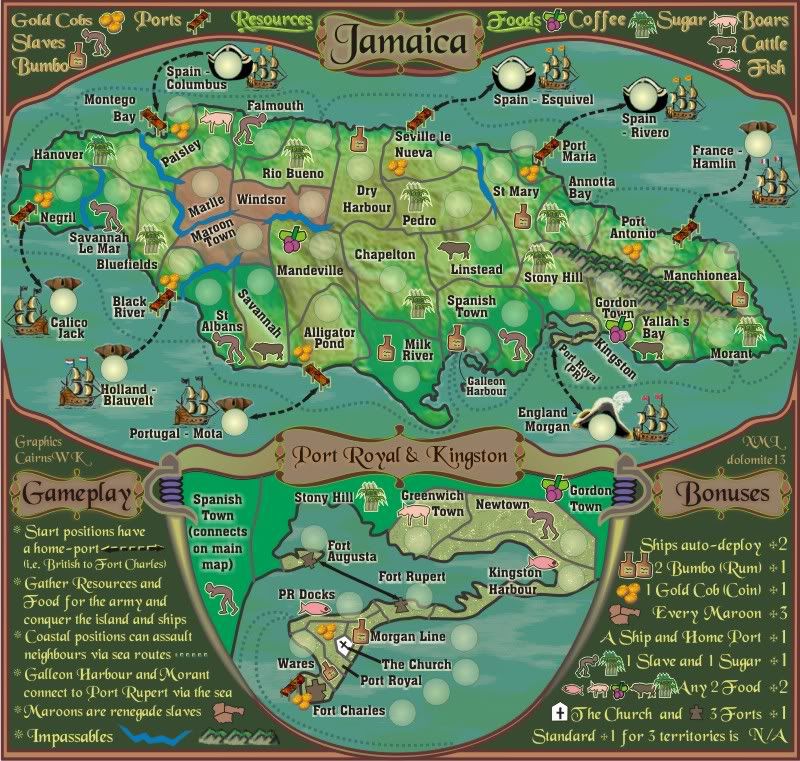
pnb...i am beginning th think that your eyes are worse than mine....it is sugar dear sir, the legend tells you that, not wheat.porkenbeans wrote:An outer glow can be used to make a dark object stand out on a dark background.
A drop shadow can be used to make a light object stand out on a light background.
you have both light and dark icons, so you are in a pickle here, if you want them all to be the same. There is no rule that says they have to have the same treatment. You can use them both. Glow for the dark icons, and shadow for the light icons. If you do not want to do that, then maybe you could just make the icons all dark, or all light.
There are 3 icons that are problematic at this point. The wheat, the gold, and the fish or whatever that is.
OK. i'll try a dard background but if that doesn't work for me then it won't get up...The wheat- Not only is it a light icon, on a light background, it is a similar color as well. This is what is causing the main problem there.
The gold- same as the wheat. But it has an additional problem in that the picture is not decipherable on the small map. Maybe a gold bar would work better.
A Gold bar does not tell this story, pnb, cobs were used in this time period, not gold bars.
I will see what i can do about a dark background or darkening the outliness of the cobs.
Maybe it needs to be just one colour instead of multicoloured.The multi-colored fish looking thing- I can't figure out just what it is, so I can't really give a good suggestion for that, other than, try to make it more clear as to what it is.
If the top and bottom legends are superb, pnb, why do you want to throw a light source on them.The top and bottom legend areas are superb. They frame the picture well, and really give a nice feel to the map. I have 2 suggestions that I think would make them even better.
1.) give them a drop shadow to raise them up from the canvas a bit, (like a frame of sorts). Make the light source from 2, 4, 8, or 10 o'clock.
If you look several versions back, you'll see that the background was lighter and i changed it to make the legend stand out even better. If they're superb, why raise the issue.
If you look more closely, the swords are actually spearate, and end about 4 o'clock2.) Make those swards separate, not joined together at the bottom like that. The tips could just overlap maybe.
The hats are the differentiation to priates and colonials, They stay.The hats in the sea only detract from those very nice ships. they are not needed. I would nix them.
Nah, i'm happy with them.Also, you can make those islands larger so they look more like islands.
Mmmm. not quite.Keep on keeping on, and I hope that my suggestion are helpful.
When the original thing that you decided needed fixing was the icons, you seem to have gone on a nitpick rampage.
Remember, lots of this stuff was sorted by others before you arrived on the scene, so please bear that in mind with your attempted positive contributions.
* Pearl Harbour * Waterloo * Forbidden City * Jamaica * Pot Mosbi
Re: Jamaica [D.GP.GR] V28 (P21) Enlarged Map Icons
Why post the images again to waste 1MB of space on my photobucket for the sake of small changes.natty_dread wrote:Oh yeah, now I see. That's kinda confusing, you should just post the images again so we wouldn't get misunderstandings like these...
But the bottom line was, I do like those white glows.
Besides my photobucket is almost full.
* Pearl Harbour * Waterloo * Forbidden City * Jamaica * Pot Mosbi
-
natty dread
- Posts: 12877
- Joined: Fri Feb 08, 2008 8:58 pm
- Location: just plain fucked
Re: Jamaica [D.GP.GR] V28 (P21) Enlarged Map Icons
Start an imageshack account?
Anyway, you could also try the opposite colour glows. There are two ways to define opposite colours, the RGB system and the CMYK system...
In RGB system, opposite colours for green and yellow are purple and blue, respectively. In the CMYK system, they are green->red and yellow->purple. Using opposite colours is the most effective form of colour contrast.
So it's something you could try. I'd suggest going with a blue glow for the golds and a purple glow for the sugar canes. But don't overdo it, or it easily becomes messy. I'm not sure if this would work here, but it's worth a shot.
Re: Jamaica [D.GP.GR] V28 (P21) Enlarged Map Icons
Imageshack, OK, i'll see.natty_dread wrote:Start an imageshack account?
Anyway, you could also try the opposite colour glows. There are two ways to define opposite colours, the RGB system and the CMYK system...
In RGB system, opposite colours for green and yellow are purple and blue, respectively. In the CMYK system, they are green->red and yellow->purple. Using opposite colours is the most effective form of colour contrast.
So it's something you could try. I'd suggest going with a blue glow for the golds and a purple glow for the sugar canes. But don't overdo it, or it easily becomes messy. I'm not sure if this would work here, but it's worth a shot.
Now i've tried fiddling with the icons and backgrounds etc even further, and they only become lost and confused in amongst everything that is happening on the map.
To that extent, i am happy with the latest version below of V28, where the icons have similar treatment...
I have reduced the gold cobs to three so they stand out more...and i don't think the cobs need any treatment as they stand out on the map very well.
and outlined the icons in the legend and increased their size slightly.
Oh, and fish are changed.
Please ensure to f5
- Click image to enlarge.
* Pearl Harbour * Waterloo * Forbidden City * Jamaica * Pot Mosbi
-
natty dread
- Posts: 12877
- Joined: Fri Feb 08, 2008 8:58 pm
- Location: just plain fucked
Re: Jamaica [D.GP.GR] V28 (P21) Enlarged Map Icons
That looks very good.
Btw the good thing about imageshack is that they don't seem to limit how much stuff you can upload there. At least I don't think they do, I've uploaded a ton of stuff on my imageshack account and there seems to be no limit.
Also they won't re-compress your JPG:s like photobucket does. Ask porkenbeans how his JPG:s got all smudgy in photobucket.
Although using PNG:s instead of JPG:s is always a good idea.
-
porkenbeans
- Posts: 2546
- Joined: Mon Sep 10, 2007 4:06 pm
Re: Jamaica [D.GP.GR] V28 (P21) Enlarged Map Icons
When I am evaluating a map for the first time, I never read the previous posts. This is not out of laziness. Rather, it is because I want to try to avoid any bias or pre conceptions that I will incur. I want to look at, and evaluate it with new eyes. Haven't you ever worked on a map for many hours, and then the next day when you first look at it, you say to yourself, WTF, What was I thinking. Your eyes are fresh and can immediately see where you veered off, and what needs to be changed. It is a little like that. New Eyes are your friends. 
All the nitpicks were just my attempt to use them, before they became not so new.
I am confused a bit as to why you pointed out some of my suggs, and said you would try them, but then the last thing you said was, none of my suggs were helpful.
All the nitpicks were just my attempt to use them, before they became not so new.
I am confused a bit as to why you pointed out some of my suggs, and said you would try them, but then the last thing you said was, none of my suggs were helpful.
-
the.killing.44

- Posts: 4724
- Joined: Thu Oct 23, 2008 7:43 pm
- Gender: Male
- Location: now tell me what got two gums and knows how to spit rhymes
- Contact:
Re: Jamaica [D.GP.GR] V28 (P21) Enlarged Map Icons
porkenbeans wrote:I never read the previous posts.
Looks good, cairns.Raskhavolishnikov 47 wrote:No Incandeza, all you did is give me a huge headache because you didn't bother to actually read this thead
-
natty dread
- Posts: 12877
- Joined: Fri Feb 08, 2008 8:58 pm
- Location: just plain fucked
Re: Jamaica [D.GP.GR] V28 (P21) Enlarged Map Icons
the.killing, please don't bring crap from other threads to this one. We don't need another flame war in the foundry.
Can't we all just get along?
Can't we all just get along?
Re: Jamaica [D.GP.GR] V28 (P21) Enlarged Map Icons
i appreciate your "new" eyes, but not reading a thread can only lead you to a potential "not-so-nice" point with the mapmaker because you haven't taken the time to see what the history is. Sometimes if you know this, then you might understand where things have come from and why they are like they are...point being the pirate hats etc.porkenbeans wrote:When I am evaluating a map for the first time, I never read the previous posts. This is not out of laziness. Rather, it is because I want to try to avoid any bias or pre conceptions that I will incur. I want to look at, and evaluate it with new eyes. Haven't you ever worked on a map for many hours, and then the next day when you first look at it, you say to yourself, WTF, What was I thinking. Your eyes are fresh and can immediately see where you veered off, and what needs to be changed. It is a little like that. New Eyes are your friends.
All the nitpicks were just my attempt to use them, before they became not so new.
I am confused a bit as to why you pointed out some of my suggs, and said you would try them, but then the last thing you said was, none of my suggs were helpful.
i agree, that somtimes looking at a map the next day or days after does give that feeling, but that also happens when you look at something several weeks after and question "can i do better". I have let a lot of this alone for several weeks now due to study RL, and have returned to your issues and nattys and others and yes i agree there was some issues with the icons, which i have fixed to a point where i am now happier with them that i was before, and i was hoping that you guys would have been happier also...alas not everyone will agree. I have even tried those things that natty gave up and for me they didn't work...on an already crowded map adding more aspects often makes things worse,,,,and i have seen this many times on my maps. i beleive however, now that the icons do stand out more in their version 28.
pnb, i pointed out some suggs because i didn't think you had looked at the history (which you admit you hadn't read) and didn't understand what was trying to be conveyed. I appreciate you were trying to help, but some of them made no sense to me and only left me more confused with what you were saying. And i wasn't angry with anything you'd written, just didn't make sense to me. Sorry.
* Pearl Harbour * Waterloo * Forbidden City * Jamaica * Pot Mosbi
-
natty dread
- Posts: 12877
- Joined: Fri Feb 08, 2008 8:58 pm
- Location: just plain fucked
Re: Jamaica [D.GP.GR] V28 (P21) Enlarged Map Icons
the.killing.44 wrote:porkenbeans wrote:I never read the previous posts.Looks good, cairns.Raskhavolishnikov 47 wrote:No Incandeza, all you did is give me a huge headache because you didn't bother to actually read this thead
Yes guys, i too am aware of other outside this map threads, but let's all try to get along...i hope i am doing something decent towards that at least.natty_dread wrote:the.killing, please don't bring crap from other threads to this one. We don't need another flame war in the foundry.
Can't we all just get along?
* Pearl Harbour * Waterloo * Forbidden City * Jamaica * Pot Mosbi