The Neon Peon wrote:There appears to be a layer with a very low opacity that has not been completely erased.

It's a rough outline, but I think you can see it. There is an almost triangular area where the sea is a slightly darker shade.
Sorry about the weird colors, the online gif creator I used is very low quality. You can still see it on the actual map, though.
Edit: there also appears to be a similar thing going on in the Pacific beneath North America in the shape of a large rectangle. Although that one may just be the texture.
I don't see the artifact that you do, and there are no partial layers in that region. I think you are just seeing pictures in the clouds like everyone else said

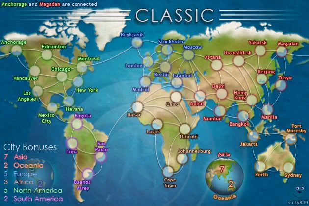
jiminski wrote:ender516 wrote:jiminski wrote:(in passing, I think the typeface or likely just the colouring of 'Anchorage and Magdan..' (top left corner) detracts from the image. I realise that it is somewhat lurid in order to attract the eye ... but can it be more organic to the general colour scheme of the mother image? the 'Anchorage' is ok in fact, it is the neon red of 'Magdan' i don't feel comfortable with.)
The colours of those cities in the legend are identical to the ones used in the map itself -- that's the point. It's intended to make it easier to find the actual locations which have the wraparound connection.
not quite, they are more vivid -- that's the point. It's intended to draw attention to the actual note i assume or it may well just be an accidental trick due to the darker blue in the north. Whichever, they are slightly too much; the text shadow should be toned down a to allow for the contrast.
jim, I think this is indeed just a trick of the eye. The note in the top left uses the exact same size, text, color and glow (and any other effects) as the regular territory names. You are correct that it contrasts a bit more on the dark ocean background, so I can tone it down a LITTLE bit - but I intend the legend to match the labels on the map, so it will be a very small adjustment to keep the overall contrast similar.
porkenbeans wrote:Two things,
1.) I love the globes, however they are scaled way too large. They are taking over the main focus from the map. Same thing with the title. These elements should be much smaller, then the game would jump to the foreground and be the main focus.
2.) The colored glow around the text is not working. It is acting in a counterproductive way, as It is not making the text easier to read. I think that if you try just using a black drop shadow on all of the text, you will see what I mean.
1 - You're right, the globes could be a bit smaller. If I remember right I started to have scaling issues beyond their current size (the edges get flat or pixelated) and if I can't fix that issue then it will look better to have them at the current scale.
2 - I also disagree here. The colored outerglow compliments the inner color and sets each region's label apart. If all the outerglows were black it would be very difficult to distinguish the pale text of the labels from one region to another.
The reason the red looks red is more to do with the outerglow than the font color, and that holds true for each label.