I'm not really feeling the glow around the territory text. It's ok when in a territory by itself, but when crossing lines or colors it really has a blended effect that doesn't look good. The fonts I like though, very official/train station/older type that does look good. Fiddle with colors/shading or maybe erase stuff under the text. Corsica looks really bad on the dark blue see color, might have to do something special there...
To add to the theme issue, think about making, at least, your Orient express stations be connected by some sort of track.
AOS: Orient Express 1883 [quench'd]
Moderator: Cartographers
Forum rules
Please read the Community Guidelines before posting.
Please read the Community Guidelines before posting.

Re: AOS: Orient Express 1883 <v9> p1,15 [GP] - slight gfx up
Its Serbia. Not Servia.
-
natty dread

- Posts: 12877
- Joined: Fri Feb 08, 2008 8:58 pm
- Location: just plain fucked
Re: AOS: Orient Express 1883 <v9> p1,15 [GP] - slight gfx up
Servia [ˈsɜːvɪə]omiljeni wrote:Its Serbia. Not Servia.
n
(Placename) the former name of Serbia
http://www.thefreedictionary.com/Servia
Serbia (common, English), Servia (archaic, English), Srbija (common, Serbian), Republika Srbija (official, Serbian), Serbia and Montenegro (former common, English), Yugoslavia (former common, English)
http://en.wikipedia.org/wiki/List_of_al ... ry_names#S
I've been looking into this. There's surprisingly little information about it, but apparently at the time (19th century and before?) Serbia was commonly called "Servia" in english. I have a map from 1883 which has the country written as "Servia".
Yeah, you have any suggestions? About Corsica I mean. I'll see what I can do about the territory font.RedBaron0 wrote:I'm not really feeling the glow around the territory text. It's ok when in a territory by itself, but when crossing lines or colors it really has a blended effect that doesn't look good. The fonts I like though, very official/train station/older type that does look good. Fiddle with colors/shading or maybe erase stuff under the text. Corsica looks really bad on the dark blue see color, might have to do something special there...
Yeah they kinda already are... well sort of... in a very abstract, cubistic way... anyway I'm not sure if I have the room to make a fancier track. Also I feel it might distract from the stations themselves...RedBaron0 wrote:To add to the theme issue, think about making, at least, your Orient express stations be connected by some sort of track.

-
natty dread
- Posts: 12877
- Joined: Fri Feb 08, 2008 8:58 pm
- Location: just plain fucked
Re: AOS: Orient Express 1883 <v9> p1,15 [GP] - slight gfx up
What I'd really like would be an image to put in the upper left corner of the sea, as there is the train image in the bottom corner - I tried a picture of the Gare d'est train station but it didn't quite work out... I'd love to put in a picture of a 19th century factory with smoke coming from the pipes - would kinda fit the industrial theme of the map - but haven't found a suitable picture yet...
If anyone wants to help me find a picture I could put in there it'd be nice. (needs to be public domain though)
If anyone wants to help me find a picture I could put in there it'd be nice. (needs to be public domain though)
-
RedBaron0

- Posts: 2657
- Joined: Sun Aug 19, 2007 12:59 pm
- Gender: Male
- Location: Pennsylvania
- Contact:
Re: AOS: Orient Express 1883 <v9> p1,15 [GP] - slight gfx up
Just delete England then, no one will miss it; put the title in the Med.


-
natty dread
- Posts: 12877
- Joined: Fri Feb 08, 2008 8:58 pm
- Location: just plain fucked
Re: AOS: Orient Express 1883 <v9> p1,15 [GP] - slight gfx up
Eh.... I can't see this being a good idea. Background pictures are not that important that I'd go deleting entire countries for them...RedBaron0 wrote:Just delete England then, no one will miss it; put the title in the Med.
Ok sure England is non-playable, but still... I don't feel comfortable with doing this. If I was to delete it I should remove all other non-playable lands from the map and that wouldn't be nice at all.
-
natty dread
- Posts: 12877
- Joined: Fri Feb 08, 2008 8:58 pm
- Location: just plain fucked
Re: AOS: Orient Express 1883 <v9> p1,15 [GP] - slight gfx up
Ok I figured out something to do with the upper corner. Looks kinda neat IMO. I don't think anybody is going to mind that england & the title are covering it.
Also fixed some if not all issues with text and stuff.
Also fixed some if not all issues with text and stuff.
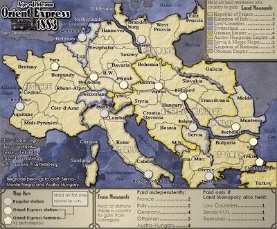
- Click image to enlarge.

-
natty dread
- Posts: 12877
- Joined: Fri Feb 08, 2008 8:58 pm
- Location: just plain fucked
Re: AOS: Orient Express 1883 <v9> p1,15 [GP] - slight gfx up
Surprise surprise... natty makes small map!
Anyone wanna XML?
- Click image to enlarge.

-
natty dread
- Posts: 12877
- Joined: Fri Feb 08, 2008 8:58 pm
- Location: just plain fucked
Re: AOS: Orient Express 1883 <v9> p1,16 [GP] -gfx up & small
Here's the small map with 888:s in place just to show they all fit. (tbh I'm a bit surprised/relieved they fit so well, myself...)
ps. yes, I know, Hungary is missing a territory label.
- Click image to enlarge.

-
Industrial Helix

- Posts: 3462
- Joined: Mon Jul 14, 2008 6:49 pm
- Gender: Female
- Location: Ohio
Re: AOS: Orient Express 1883 <v9> p1,16 [GP] - gfx bling bli
I've been waiting to comment on the graphics of this for a while and I havea few ideas/suggestions.
1. Remove the British Isles from the map and but in a stronger logo, perhaps something with a train or something. Right now, with the words overlaying the British Islands, the title suggests England when that is far from true. OR, there is that train in the background that you could possibly use.
2) I want rails over dotted lines. It's more work, but it would go far.
3) Could you reduce the dropshadow of the continent against the sea? You mentioned earlier that you were imitating the publications of the period, which in my mind mean the map should look like a sort of train flyer or poster. But the way that it looks now is that it is a cutout of the map sitting on top of another poster. So perhaps exchange the dropshadow for a thicker outline or just get rid of the drop shadow all together.
4) Lastly, I'm not sure how I feel about the empire names over the actual playable countries... I think they should go because they just take up space and makes things unclear, and the legend is perfectly fine in pointing out what belongs where.
5) nitpicks... alter the borders around Vienna so the name fits. Paris and Constantinople stations are pixelated.
Berlin needs some spacing out cause the letters are all smashed together on the small map (or increase the font a pixel or two for them all for that matter).
Austro-Hungary should be Austria-Hungary when used without the word Empire.
The word Austria could be lowered a tad so its not muddied by the border.
I'd like to see Bucharest, Belgrade and Amsterdam centered over their stations.
Sketchblog [Update 07/25/11]: http://indyhelixsketch.blogspot.com/
Living in Japan [Update 07/17/11]: http://mirrorcountryih.blogspot.com/
Russian Revolution map for ConquerClub [07/20/11]: http://www.conquerclub.com/forum/viewto ... 1&t=116575
Living in Japan [Update 07/17/11]: http://mirrorcountryih.blogspot.com/
Russian Revolution map for ConquerClub [07/20/11]: http://www.conquerclub.com/forum/viewto ... 1&t=116575
-
natty dread
- Posts: 12877
- Joined: Fri Feb 08, 2008 8:58 pm
- Location: just plain fucked
Re: AOS: Orient Express 1883 <v9> p1,16 [GP] - gfx bling bli
Thanks IH for your suggestions. Here's my response...
1) like I told redbaron, I don't see this as a good idea. Removing britain will give me no extra space for the title. Zero. As for the background images, they are just background, they aren't really relevant to the map so I don't really mind that they are covered by the non-playable land.
Ok, I can see your arguments that it's non-playable land and isn't really needed in the game. And yes I know the necessity of fudging geography to make gameplay clearer. But this is not an issue of gameplay clarity, so I think I'm allowed to use my personal judgement here. I feel that removing an entire country altogether is just too much. If I was to do this I would have to remove all the non-playable areas.
But actually I have a compromise in mind, which will hopefully satisfy everyone. Worth a try anyway... I intend to attach the neutral lands to the same "height" or "poster" as you so eloquently expressed, so the background images can go over the neutral lands as well as the seas. To do this I will have to make the texture and colour of the neutral lands more similar to the seas - which won't be a problem, thanks to layers, and of course remove the dropshadow from the neutral land.
2) I suck at drawing rails. I've been trying for weeks to find a convenient way to do it in paint.net (convenient = anything else but doing it all pixel-by-pixel) but so far all my attempts looked like crap. I have registered on paint.net forums trying to ask someone to code a plugin for me that could be used for drawing railways, but so far there hasn't been any response, and either way I don't think it can be done fast enough for this project...
Another concern is space. There are a few areas that would worry me, I'm not sure if the rails would fit in those...
3) I think you misunderstood... my intention wasn't really to make the map look like it was a publication of 19th century, more like acquire inspiration from the style of 19th century publications. The drop shadow just helps so much with the clarity of the map that I won't be removing it. But I will remove the drop shadow from the non-playable land, like I already mentioned.
4) the country names are there for the colourblind. If I remove them how will they play the map? Is it possible to find 9 colours that all look unique to both normal-sighted and colourblind? I'm asking seriously. If you can find such colours for me then I have no problem with removing the country names.
5) I'll see what I can do about these.
-
natty dread
- Posts: 12877
- Joined: Fri Feb 08, 2008 8:58 pm
- Location: just plain fucked
Re: AOS: Orient Express 1883 <v9> p1,16 [GP] - gfx bling bli
So how about this? I only made a large version for now...
v10
v10
- Click image to enlarge.


Re: AOS: Orient Express 1883 <v10> p1,16 [GP] - gfx bling bl
Generally, I like the move of the non-playables to the background layer. I think, though, that there are too many things in the upper left now: British Isles, plus (locomotive facing left?) plus small locomotives (either side of 1883), plus the title itself. The locomotive facing left looks like a very nice picture, but it is not visible enough to do more than put clutter behind the text in the North Sea.
I'm also a little bothered by the lower right (Train Monopoly) legend. Perhaps if the lines of text were lined up all the way across, it would look better, but you might then need a vertical divider between the independent and dependent stuff.
To be honest, I much prefer the font in the upper right (Land Monopoly) legend, but I see you using sans-serif for trains and and serif for lands, so I don't expect this will change. I guess I just wish you had two distinct serif fonts. Sans-serif looks too modern to me for 1883, and I find serif fonts generally more legible. I mean, the Roman monument carvers took the time and effort to put the serifs in stone, and I doubt that they would have if it wasn't a big improvement.
-
natty dread
- Posts: 12877
- Joined: Fri Feb 08, 2008 8:58 pm
- Location: just plain fucked
Re: AOS: Orient Express 1883 <v10> p1,16 [GP] - gfx bling bl
Thanks for your comments ender.
Actually, I think sans serif fonts were fairly common in 19th century, especially in advertisements, posters and such... Also I feel the font is very fitting for station names.
I agree the upper corner is too busy. I'll do something about it...
Actually, I think sans serif fonts were fairly common in 19th century, especially in advertisements, posters and such... Also I feel the font is very fitting for station names.
I agree the upper corner is too busy. I'll do something about it...
-
natty dread
- Posts: 12877
- Joined: Fri Feb 08, 2008 8:58 pm
- Location: just plain fucked

-
natty dread
- Posts: 12877
- Joined: Fri Feb 08, 2008 8:58 pm
- Location: just plain fucked
Re: AOS: Orient Express 1883 <v10> p1,16 [GP] - gfx bling bl
Ok, since the rails were requested, I started thinking of a technique to draw them. Here's what I came up with, does any of them look decent?

-
porkenbeans

- Posts: 2546
- Joined: Mon Sep 10, 2007 4:06 pm
Re: AOS: Orient Express 1883 <v10> p1,16 [GP] - gfx bling bl
#1 and #3, with #3 being my favorite. If you could space out the ties a bit more, it would be perfect.
I still like this map, but there is one thing that I am not very fond of. The mountains look like crap. They do not go with the rest of the map at all. I suggest that you try other methods that are not in relief. The standard teepies, or even a solid black or something, would be much better IMHO.
I still like this map, but there is one thing that I am not very fond of. The mountains look like crap. They do not go with the rest of the map at all. I suggest that you try other methods that are not in relief. The standard teepies, or even a solid black or something, would be much better IMHO.

-
natty dread
- Posts: 12877
- Joined: Fri Feb 08, 2008 8:58 pm
- Location: just plain fucked
Re: AOS: Orient Express 1883 <v10> p1,16 [GP] - gfx bling bl
A bit harsh, but honest...The mountains look like crap.
Well, since the map graphics took a turn to embrace this "industrial" theme, I thought it'd be cool to have the mountains resemble clouds of smoke...
I don't really want to go with the "grey teepees with frosting" thing here. And a solid black isn't very descriptive. But I'll try to think of something.
-
porkenbeans
- Posts: 2546
- Joined: Mon Sep 10, 2007 4:06 pm
Re: AOS: Orient Express 1883 <v10> p1,16 [GP] - gfx bling bl
Yeah something, ANYTHING but those ugly things. lol. They look like bad weld beads. Sorry, but its just that it is such a pretty map, but those mountains really crap it up. Try out different things, I am sure that you will find something that fits better.natty_dread wrote:A bit harsh, but honest...The mountains look like crap.
Well, since the map graphics took a turn to embrace this "industrial" theme, I thought it'd be cool to have the mountains resemble clouds of smoke...
I don't really want to go with the "grey teepees with frosting" thing here. And a solid black isn't very descriptive. But I'll try to think of something.
BTW, I see that you decided to go with the higher contrasting dark back.
-
RedBaron0
- Posts: 2657
- Joined: Sun Aug 19, 2007 12:59 pm
- Gender: Male
- Location: Pennsylvania
- Contact:
Re: AOS: Orient Express 1883 <v10> p1,16 [GP] - gfx bling bl
The vischeck isn't really that bad if you want to try the map without the bonus names on the map. France/Italy would need a tweak as well as A-H/Ottoman Empire.
Maybe a red for Italy and a brown for the Ottoman's?
Maybe a red for Italy and a brown for the Ottoman's?
-
natty dread
- Posts: 12877
- Joined: Fri Feb 08, 2008 8:58 pm
- Location: just plain fucked
Re: AOS: Orient Express 1883 <v10> p1,16 [GP] - gfx bling bl
Uh, are you sure you got the right countries Rb0?
The thing is, if I take away the country names, then all the colours must be clearly distinguishable, not just adjacent ones.
I would need a larger copy of the vischecked image to really see the colours, but from what I can see there Ottoman & Italy really aren't the main problem... The colour of france turns invisible, Switzerland / Low countries look the same, and Germany seems a bit similar to Ottoman.
-
natty dread
- Posts: 12877
- Joined: Fri Feb 08, 2008 8:58 pm
- Location: just plain fucked
Re: AOS: Orient Express 1883 <v10> p1,16 [GP] - gfx bling bl
Ok, I accomplished two things. Firstly, I figured out how to do a colourblind filter in paint.net. It was surprisingly easy, only required 2 effects. Soon after that, by trial-n-error method, I found a set of colours that should work with or without colourblindness.
Normal image:
Colourblinded image:
(legend not updated yet)
Normal image:
- Click image to enlarge.

- Click image to enlarge.

(legend not updated yet)
-
natty dread
- Posts: 12877
- Joined: Fri Feb 08, 2008 8:58 pm
- Location: just plain fucked
Re: AOS: Orient Express 1883 <v10> p1,16 [GP] - gfx bling bl
Ok, there's a problem.
After playing around with the XML wizard I noticed that 2 player games on the map would start with 15 territories each. This would give the first player an advantage.
The only way I can see to fix this would be to remove the neutrals from Monte Negro and Moldova. But this would make it likely to drop with a bonus.
So I want to ask, which is the better option? A certain unfairness in 2-player games only, or a chance of unfairness that is higher the less players there is?
There's one more solution though, adding 2 more neutrals somewhere. I'm not sure how that would affect the other game types...
edit. yes, adding 2 more neutrals would work. I could add one in luxembourg, but I have no idea where to add the other...
-
carlpgoodrich
- Posts: 408
- Joined: Tue Aug 04, 2009 2:12 pm
Re: AOS: Orient Express 1883 <v10> p1,16 [GP] - gfx bling bl
I agree, adding 2 neutrals is the best solution. I don't think it matters where.
-
The Bison King

- Posts: 1957
- Joined: Thu Aug 27, 2009 5:06 pm
- Location: the Mid-Westeros
Re: AOS: Orient Express 1883 <v10> p1,16 [GP] - gfx bling bl
I vote #3 as far as rail design goes, however I must confess that I'm not a fan of recent changes. Namely the sea and unused land (Russia, Spain, ect..) being so close together in tone. To me it makes the whole map seem claustrophobic. I think it looked better when the sea was lighter.
I apologies because I haven't been following this lately, so I probably should of brought this up as it was happening, to remain relevant. I'll try and get caught up soon.
I apologies because I haven't been following this lately, so I probably should of brought this up as it was happening, to remain relevant. I'll try and get caught up soon.
