AOS: Orient Express 1883 [quench'd]
Moderator: Cartographers
Forum rules
Please read the Community Guidelines before posting.
Please read the Community Guidelines before posting.

Re: AOS: Orient Express 1883 <v20> p1,27 [GP] - new stuff do
You might find the Land Bonus card fit better if you tilted the other way, but it might require swapping the "Land Monopoly" and "Hold all land territories of a country for:" elements.
-
natty dread

- Posts: 12877
- Joined: Fri Feb 08, 2008 8:58 pm
- Location: just plain fucked
Re: AOS: Orient Express 1883 <v20> p1,27 [GP] - new stuff do
You might find the Land Bonus card fit better if you tilted the other way
If you excuse me, I will go cry myself to sleep now.

-
RedBaron0

- Posts: 2657
- Joined: Sun Aug 19, 2007 12:59 pm
- Gender: Male
- Location: Pennsylvania
- Contact:
Re: AOS: Orient Express 1883 <v20> p1,27 [GP] - new stuff do
LOL, I know the feeling well.
I remember that discussion, the on thing about the legend that bothers me on the bottom is the train. One of the most distinctive things about a stream engine is the stack, and the train you have here has the stack up under France. If you can arrange it so the stack can be seen, that'd be great!
I remember that discussion, the on thing about the legend that bothers me on the bottom is the train. One of the most distinctive things about a stream engine is the stack, and the train you have here has the stack up under France. If you can arrange it so the stack can be seen, that'd be great!


-
natty dread
- Posts: 12877
- Joined: Fri Feb 08, 2008 8:58 pm
- Location: just plain fucked
Re: AOS: Orient Express 1883 <v20> p1,27 [GP] - new stuff do
I will try.the on thing about the legend that bothers me on the bottom is the train. One of the most distinctive things about a stream engine is the stack, and the train you have here has the stack up under France. If you can arrange it so the stack can be seen, that'd be great!
-
natty dread
- Posts: 12877
- Joined: Fri Feb 08, 2008 8:58 pm
- Location: just plain fucked
Re: AOS: Orient Express 1883 <v20> p1,27 [GP] - new stuff do
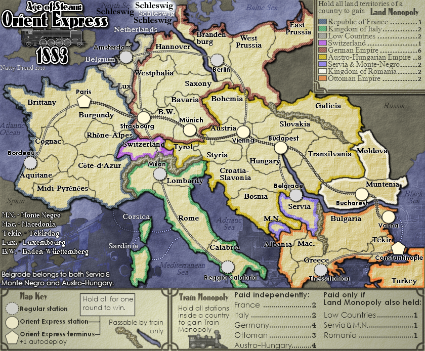
v21 update

I think this legend is the best so far.
- Click image to enlarge.

I think this legend is the best so far.
-
porkenbeans

- Posts: 2546
- Joined: Mon Sep 10, 2007 4:06 pm
Re: AOS: Orient Express 1883 <v21> p1,29 [GP] - moar new stu
The white text on Schleswig, Belgium, Netherlands, Corsica, and Sardinia, should be made to match the rest. Also while I'm on the text, The train stations are a different font from the other territs, this is good, but I would take it a step further, and make them a different color as well.

-
natty dread
- Posts: 12877
- Joined: Fri Feb 08, 2008 8:58 pm
- Location: just plain fucked
Re: AOS: Orient Express 1883 <v21> p1,29 [GP] - moar new stu
The white text was done because black text was hard to read on the ocean, with the font of the land territories. People complained about it so I made them white. I can try making them black again, but if people complain again I'll have to change them back...porkenbeans wrote:The white text on Schleswig, Belgium, Netherlands, Corsica, and Sardinia, should be made to match the rest.
You already suggested this before. Frankly I don't think this is a good idea - the land area is light so black text is the best in terms of legibility. They are already quite distinguishable from the land territories by having a different font and higher contrast.Also while I'm on the text, The train stations are a different font from the other territs, this is good, but I would take it a step further, and make them a different color as well.
Plus I don't think colourful text would really fit this map. It is fine for a futuristic map like Lunar War, but this is supposed to look like 19th century, and when people think of 19th century they usually think tones of sepia or black and white...
-
natty dread
- Posts: 12877
- Joined: Fri Feb 08, 2008 8:58 pm
- Location: just plain fucked
Re: AOS: Orient Express 1883 <v21> p1,29 [GP] - moar new stu
This is how the large version looks with the white text changed back to black:
- Click image to enlarge.

-
The Bison King

- Posts: 1957
- Joined: Thu Aug 27, 2009 5:06 pm
- Location: the Mid-Westeros
Re: AOS: Orient Express 1883 <v21> p1,29 [GP] - moar new stu
yeah... I think the white text worked better.

-
The Bison King
- Posts: 1957
- Joined: Thu Aug 27, 2009 5:06 pm
- Location: the Mid-Westeros
Re: AOS: Orient Express 1883 <v21> p1,29 [GP] - moar new stu
I think the land monopoly legend should be a little less tilted.
-
porkenbeans
- Posts: 2546
- Joined: Mon Sep 10, 2007 4:06 pm
Re: AOS: Orient Express 1883 <v21> p1,29 [GP] - moar new stu
You can play with the outside glow on that text. Maybe make the size larger and decrease the opacity so that it is less noticeable.
About the different color for the stations, I do not recommend anything striking, just a litle somethin-somethin to give it a slight contrast from the other. Maybe a rusty red tint on the territs, and leave the stations as they are.
About the different color for the stations, I do not recommend anything striking, just a litle somethin-somethin to give it a slight contrast from the other. Maybe a rusty red tint on the territs, and leave the stations as they are.
-
the.killing.44

- Posts: 4724
- Joined: Thu Oct 23, 2008 7:43 pm
- Gender: Male
- Location: now tell me what got two gums and knows how to spit rhymes
- Contact:
Re: AOS: Orient Express 1883 <v21> p1,29 [GP] - moar new stu
Italicize the station names.
Re: AOS: Orient Express 1883 <v21> p1,29 [GP] - moar new stu
Pork has a point about the glow: "Amsterdam" seems to have a brighter glow than the other text on the seas, and it is a little easier to read. That being said, I had no problem with the white text.
-
The Bison King
- Posts: 1957
- Joined: Thu Aug 27, 2009 5:06 pm
- Location: the Mid-Westeros
Re: AOS: Orient Express 1883 <v21> p1,29 [GP] - moar new stu
...I know you're going to hate me for saying this but I think the orientation of the Land Monopoly card looked better the first way you had it. It drew the eye into the image rather than how it is now where it leads your focus of attention out of the image.
-
ghirrindin

- Posts: 129
- Joined: Sat Jan 12, 2008 9:34 pm
- Location: Urbana, IL
Re: AOS: Orient Express 1883 <v20> p1,27 [GP] - new stuff do
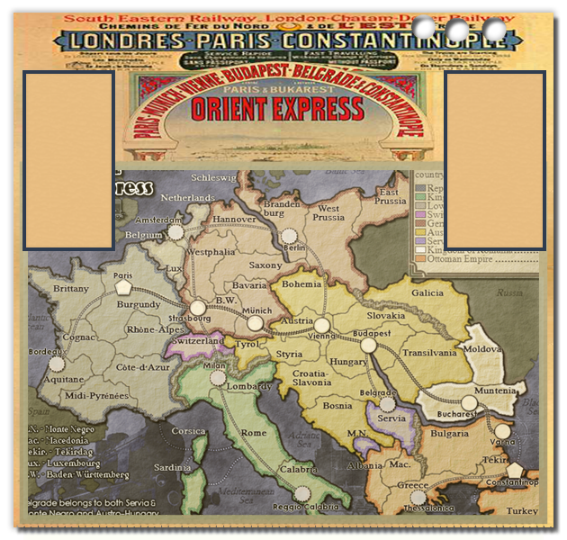
Well hold on here. Throwing away the ticket is your prerogative as the mapmaker, but there's something to be said for adding colors to the regions. Your map lacks the warmth of the contemporary print culture, which is essential if you want to convey the luxury and opulence commonly associated with the OE. I'd also suggest changing the color of the oceans so they don't look forbidding, cold, and murky. You went off on that really bizarre tangent about a time-traveling train-mogul and if that's truly the direction you want to take the map, wouldn't the train-mogul want to make the map, brochure, or whatever it is you have here attractive to potential investors and riders? Think of the train-mogul..porkenbeans wrote:Or maybe even better, Just make the map a ticket. Something along these lines.RedBaron0 wrote:It's the whole thing as it's put together. The elements are 19th century, but are just arranged in such a way that just does not convey that, at least for me. The way it is, it's just a MAP.
That new legend, in that orientation, would be a vast improvement. I get a sense of someone, traveling, holding their map seeing where they're going, with a ticket laying on top of their map.Besides not only looking unique from every other CC map, It allows you to drop the play area down closer to the action buttons.
- Click image to enlarge.

-
The Bison King
- Posts: 1957
- Joined: Thu Aug 27, 2009 5:06 pm
- Location: the Mid-Westeros
Re: AOS: Orient Express 1883 <v20> p1,27 [GP] - new stuff do
Disagreed. When I look at this map the last thing I think is that it needs to be more colorful.ghirrindin wrote:Well hold on here. Throwing away the ticket is your prerogative as the mapmaker, but there's something to be said for adding colors to the regions. Your map lacks the warmth of the contemporary print culture, which is essential if you want to convey the luxury and opulence commonly associated with the OE. I'd also suggest changing the color of the oceans so they don't look forbidding, cold, and murky. You went off on that really bizarre tangent about a time-traveling train-mogul and if that's truly the direction you want to take the map, wouldn't the train-mogul want to make the map, brochure, or whatever it is you have here attractive to potential investors and riders? Think of the train-mogul..porkenbeans wrote:Or maybe even better, Just make the map a ticket. Something along these lines.RedBaron0 wrote:It's the whole thing as it's put together. The elements are 19th century, but are just arranged in such a way that just does not convey that, at least for me. The way it is, it's just a MAP.
That new legend, in that orientation, would be a vast improvement. I get a sense of someone, traveling, holding their map seeing where they're going, with a ticket laying on top of their map.Besides not only looking unique from every other CC map, It allows you to drop the play area down closer to the action buttons.
- Click image to enlarge.
-
natty dread
- Posts: 12877
- Joined: Fri Feb 08, 2008 8:58 pm
- Location: just plain fucked
Re: AOS: Orient Express 1883 <v21> p1,29 [GP] - moar new stu
Various text styles

Land Territory labels that are on sea:
Belgium: same as the inland territories, black text
Schleswig: the old white text
Netherlands: black text, with a stronger glow
Station labels:
Amsterdam: current station text
Berlin: italic station text
Paris: rusty station text
I'm just a bit worried about the italic text, it may not work too well for the small version.
Last edited by natty dread on Mon Aug 23, 2010 5:29 pm, edited 1 time in total.
-
The Bison King
- Posts: 1957
- Joined: Thu Aug 27, 2009 5:06 pm
- Location: the Mid-Westeros
Re: AOS: Orient Express 1883 <v21> p1,29 [GP] - moar new stu
Schleswig, or Amsterdam
-
porkenbeans
- Posts: 2546
- Joined: Mon Sep 10, 2007 4:06 pm
Re: AOS: Orient Express 1883 <v20> p1,27 [GP] - new stuff do
Yes I did add color, but I also hue'd out everything, so as to tone down the vividness and brightness of the map. The problem as I see it is, the colors are too fresh and bright. Colorful is cool, and to the period. But you need to hue the tone down, to what that poster has. Also the white on the map should be yellowed to something like the poster.The Bison King wrote:Disagreed. When I look at this map the last thing I think is that it needs to be more colorful.ghirrindin wrote:Well hold on here. Throwing away the ticket is your prerogative as the mapmaker, but there's something to be said for adding colors to the regions. Your map lacks the warmth of the contemporary print culture, which is essential if you want to convey the luxury and opulence commonly associated with the OE. I'd also suggest changing the color of the oceans so they don't look forbidding, cold, and murky. You went off on that really bizarre tangent about a time-traveling train-mogul and if that's truly the direction you want to take the map, wouldn't the train-mogul want to make the map, brochure, or whatever it is you have here attractive to potential investors and riders? Think of the train-mogul..porkenbeans wrote:Or maybe even better, Just make the map a ticket. Something along these lines.RedBaron0 wrote:It's the whole thing as it's put together. The elements are 19th century, but are just arranged in such a way that just does not convey that, at least for me. The way it is, it's just a MAP.
That new legend, in that orientation, would be a vast improvement. I get a sense of someone, traveling, holding their map seeing where they're going, with a ticket laying on top of their map.Besides not only looking unique from every other CC map, It allows you to drop the play area down closer to the action buttons.
- Click image to enlarge.
-
porkenbeans
- Posts: 2546
- Joined: Mon Sep 10, 2007 4:06 pm
Re: AOS: Orient Express 1883 <v21> p1,29 [GP] - moar new stu
- Click image to enlarge.
-
natty dread
- Posts: 12877
- Joined: Fri Feb 08, 2008 8:58 pm
- Location: just plain fucked
Re: AOS: Orient Express 1883 <v21> p1,29 [GP] - moar new stu
No "or", there's 2 kinds of labels needed here...The Bison King wrote:Schleswig, or Amsterdam
Also, I seem to have missed some posts...
I appreciate your feedback but disagree entirely. Adding colour like was done in pork's suggestion would ruin the map. Take a look at some 19th century maps, they generally have colours used very sparingly.ghirrindin wrote:Well hold on here. Throwing away the ticket is your prerogative as the mapmaker, but there's something to be said for adding colors to the regions. Your map lacks the warmth of the contemporary print culture, which is essential if you want to convey the luxury and opulence commonly associated with the OE.
Also, for everyone who keeps mentioning the OE theme and the associations within it, I would remind that the map is also part of a larger thematic entity, which is the Age of Steam map pack. I want the maps in the pack to be somewhat consistent in style, so I cannot go overboard with the OE theme in this map; rather, I wish to stick to the more general 19th century rail theme.
I'm not going to hate you - in fact I sort of agree with you, but the counter-clockwise tilted one works better in terms of clarity and space constraints - to put it in simple terms, it fits the map better. So I think I will be going with that one - I might change my mind later on but for now I'm going with it.The Bison King wrote:...I know you're going to hate me for saying this but I think the orientation of the Land Monopoly card looked better the first way you had it. It drew the eye into the image rather than how it is now where it leads your focus of attention out of the image.
Now, back to deciding on the territory labels...
-
natty dread
- Posts: 12877
- Joined: Fri Feb 08, 2008 8:58 pm
- Location: just plain fucked
Re: AOS: Orient Express 1883 <v21> p1,29 [GP] - moar new stu
Ah, more posts while I was posting that last one...
And BTW pork, please stop digging up ancient versions and commenting on them. If you want to give feedback, please direct it towards the latest version. The colours of the latest version are not nearly as bright as the ones you were commenting on.

For a reminder, here's my options for the territory labels again (as it seems you may have missed them):
Go check the foundry guidelines - function before form. In this case, the colours cannot be faded down, they are needed to identify the bonus areas - think colourblind issues.Yes I did add color, but I also hue'd out everything, so as to tone down the vividness and brightness of the map. The problem as I see it is, the colors are too fresh and bright. Colorful is cool, and to the period. But you need to hue the tone down, to what that poster has.
And BTW pork, please stop digging up ancient versions and commenting on them. If you want to give feedback, please direct it towards the latest version. The colours of the latest version are not nearly as bright as the ones you were commenting on.
ok pork wtf is that thing on the schleswig label? Please don't rape my mapThe top Schleswig is the same as the bottom one, but has the opacity turned all of the way up, to show how I disguise the glow. The one to the left has no glow. The procedure is to widen out the size and pump up the spread to around 70 or 80. Then just turn down the opacity till you are happy.
For a reminder, here's my options for the territory labels again (as it seems you may have missed them):
-
porkenbeans
- Posts: 2546
- Joined: Mon Sep 10, 2007 4:06 pm
Re: AOS: Orient Express 1883 <v21> p1,29 [GP] - moar new stu
I just used the map that I had, to show you how to do the outerglow on the text.
OOOps, almost forgot. When you do the glow, make it with a blue tint instead of yellow. Very important to achieve the effect over a blue back.
OOOps, almost forgot. When you do the glow, make it with a blue tint instead of yellow. Very important to achieve the effect over a blue back.
-
natty dread
- Posts: 12877
- Joined: Fri Feb 08, 2008 8:58 pm
- Location: just plain fucked
Re: AOS: Orient Express 1883 <v21> p1,29 [GP] - moar new stu
porkenbeans wrote:OOOps, almost forgot. When you do the glow, make it with a blue tint instead of yellow. Very important to achieve the effect over a blue back.
edit: and still, if it's not too much to ask, please don't post even modified versions of old versions of my map. If you must show your ideas through modified images, please use the latest version for them, it helps keep us all on the same page.
-
RedBaron0
- Posts: 2657
- Joined: Sun Aug 19, 2007 12:59 pm
- Gender: Male
- Location: Pennsylvania
- Contact:
Re: AOS: Orient Express 1883 <v21> p1,29 [GP] - moar new stu
Text is probably fine as it, I do like the italicize look, maybe go a point or 2 bigger?