[Abandoned] Guatemala
Moderator: Cartographers
Forum rules
Please read the Community Guidelines before posting.
Please read the Community Guidelines before posting.
-
jleonnn
- Posts: 1808
- Joined: Tue Jan 06, 2009 5:11 am
- Gender: Male
- Location: The Communist Republic of Aoria
Re: guatemala(v11) UPDATED
on the updates guys, but thenobodies, what are the problems?
-
jleonnn
- Posts: 1808
- Joined: Tue Jan 06, 2009 5:11 am
- Gender: Male
- Location: The Communist Republic of Aoria
Re: guatemala(v12) UPDATED
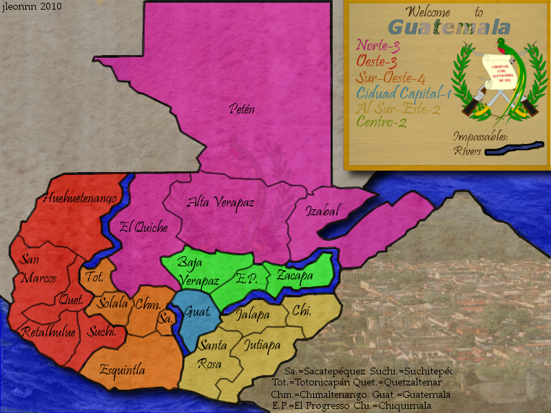
Guatemala v12
-I lowered opacity for the borders
-I made the borders thinner in certain areas
-I changed the border so it looked like peten was not bordering El quiche.
-I darkened the ocean
-I changed some borders to avoid touching the texts.
-I added some shadows for the land area and the legend
- Click image to enlarge.
-I made the borders thinner in certain areas
-I changed the border so it looked like peten was not bordering El quiche.
-I darkened the ocean
-I changed some borders to avoid touching the texts.
-I added some shadows for the land area and the legend
-
natty dread

- Posts: 12877
- Joined: Fri Feb 08, 2008 8:58 pm
- Location: just plain fucked

-
jleonnn
- Posts: 1808
- Joined: Tue Jan 06, 2009 5:11 am
- Gender: Male
- Location: The Communist Republic of Aoria
Re: guatemala(v12) UPDATED
So you want the colours to be slightly less bright?
-
natty dread
- Posts: 12877
- Joined: Fri Feb 08, 2008 8:58 pm
- Location: just plain fucked
Re: guatemala(v12) UPDATED
I also tweaked the colours slightly to make them more colourblind friendly. Then, I also added a gradient overlay with a very small opacity on top of everything, this will give the map a more "natural" feel.

-
jleonnn
- Posts: 1808
- Joined: Tue Jan 06, 2009 5:11 am
- Gender: Male
- Location: The Communist Republic of Aoria
Re: guatemala(v12) UPDATED
what's a graident overlay?
-
natty dread
- Posts: 12877
- Joined: Fri Feb 08, 2008 8:58 pm
- Location: just plain fucked
Re: guatemala(v12) UPDATED
You make a layer that goes over everything on your map (except the legend). On this layer, you'll draw a white-black radial gradient, it'll look like a spotlight (sort of), center it on that green bonus area as it is the brightest one. Then set that layer on very low opacity, like 20% or less, and set the blend mode to "hard light".
Key is making it very slight, not too noticeable. Subtle.
Key is making it very slight, not too noticeable. Subtle.
-
Victor Sullivan

- Posts: 6010
- Joined: Mon Feb 08, 2010 8:17 pm
- Gender: Male
- Location: Columbus, OH
- Contact:
Re: guatemala(v12) UPDATED
I have a few issues with a few things:
1. Looking at the Gulf of Mexico/Pacific Ocean, it appears that Guatemala is hovering above the water, while the rivers look completely flat.
2. The rivers are far too thick and look absurd.
3. You spelled "Ciudad Capital" wrong in the legend.
4. Does Péten really need to be one territory? It looks extremely awkward in comparison to the rest of the map, and I think it needs to be split up for gameplay reasons as MrBenn pointed out above.
5. Graphically overall, this map looks very plain and rather uninteresting, to be honest. You need to step it up a notch and go big and extravagant to define this map's identity, even if that means scrapping what you have now (which, I should clarify, you may not have to at all).
-Sully
Beckytheblondie: "Don't give us the dispatch, give us a mustache ride."
Scaling back on my CC involvement...
Scaling back on my CC involvement...
-
jleonnn
- Posts: 1808
- Joined: Tue Jan 06, 2009 5:11 am
- Gender: Male
- Location: The Communist Republic of Aoria
Re: guatemala(v12) UPDATED
on it, but sully, any suggestions on how to making the map less plain? And sorry, my Spanish ain't that good.
-
Victor Sullivan
- Posts: 6010
- Joined: Mon Feb 08, 2010 8:17 pm
- Gender: Male
- Location: Columbus, OH
- Contact:
Re: guatemala(v12) UPDATED
More texture, less flat colors. Stylize it to fit Guatemalan culture. And I took Spanish in high school, so I'll be able to help you with your Spanish to certain extent, at least, so no worriesjleonnn wrote:on it, but sully, any suggestions on how to making the map less plain? And sorry, my Spanish ain't that good.
Beckytheblondie: "Don't give us the dispatch, give us a mustache ride."
Scaling back on my CC involvement...
Scaling back on my CC involvement...
-
jleonnn
- Posts: 1808
- Joined: Tue Jan 06, 2009 5:11 am
- Gender: Male
- Location: The Communist Republic of Aoria
Re: guatemala(v12) UPDATED
mucho grassias senor
-
jleonnn
- Posts: 1808
- Joined: Tue Jan 06, 2009 5:11 am
- Gender: Male
- Location: The Communist Republic of Aoria
Re: guatemala(v12) UPDATED
what do you mean by "flat colours"
-
thenobodies80

- Posts: 5400
- Joined: Wed Sep 05, 2007 4:30 am
- Gender: Male
- Location: Milan
Re: guatemala(v11) UPDATED
I mostly agree with Victor Sullivanjleonnn wrote:on the updates guys, but thenobodies, what are the problems?
the shadow must go.Victor Sullivan wrote:I have a few issues with a few things:
1. Looking at the Gulf of Mexico/Pacific Ocean, it appears that Guatemala is hovering above the water, while the rivers look completely flat.
and i'm unsure about the existence of some..Victor Sullivan wrote:2. The rivers are far too thick and look absurd.
http://es.wikipedia.org/wiki/Archivo:Gu ... graphy.png
This is a important thing, probably the first one, you need to fix. Look this post for more suggestion about it --> http://www.conquerclub.com/forum/viewto ... 0#p2721590Victor Sullivan wrote:4. Does Péten really need to be one territory? It looks extremely awkward in comparison to the rest of the map, and I think it needs to be split up for gameplay reasons as MrBenn pointed out above.
Victor Sullivan wrote:5. Graphically overall, this map looks very plain and rather uninteresting, to be honest. You need to step it up a notch and go big and extravagant to define this map's identity, even if that means scrapping what you have now (which, I should clarify, you may not have to at all).
Here, Victor hit the nail on the the head. Your map "lacks of personality", what makes this different from this.Victor Sullivan wrote:More texture, less flat colors. Stylize it to fit Guatemalan culture.
What elements make Guatemala unique/famous in the world....the habitat? nature? Maya Ruins?
Work on colors, try to use something related with the country, maybe the flag colors (with different shades) are better than a red-purple-green-orange mix ?
Finally, why Izabal lake has become part of the ocean?
-
jleonnn
- Posts: 1808
- Joined: Tue Jan 06, 2009 5:11 am
- Gender: Male
- Location: The Communist Republic of Aoria
Re: guatemala(v12) UPDATED
k on it
-
jleonnn
- Posts: 1808
- Joined: Tue Jan 06, 2009 5:11 am
- Gender: Male
- Location: The Communist Republic of Aoria
Re: guatemala(v12) UPDATED
Though I'm not sure if I can fit a small map of the world in there
-
jleonnn
- Posts: 1808
- Joined: Tue Jan 06, 2009 5:11 am
- Gender: Male
- Location: The Communist Republic of Aoria
Re: guatemala(v12) UPDATED
What do you guys think would fit Mayan culture?
-
jleonnn
- Posts: 1808
- Joined: Tue Jan 06, 2009 5:11 am
- Gender: Male
- Location: The Communist Republic of Aoria
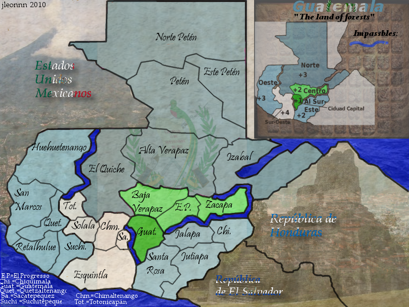
Re: guatemala(v13) UPDATED
version 13
This is the best I can do really.
suggestions will be appreciated
This is the best I can do really.
- Click image to enlarge.
-
Victor Sullivan
- Posts: 6010
- Joined: Mon Feb 08, 2010 8:17 pm
- Gender: Male
- Location: Columbus, OH
- Contact:
Re: guatemala(v13) UPDATED
Alright, lemme try to give you some more specific, doable changes:
Sully
- Drop the names of the surrounding countries completely.
- Ditch the black outlines of your rivers and make them thinner.
- Try a different font, it isnt quite working for me.
- Make sure your rivers are geographically accurate. If they are not, maybe consider putting a forest impassable in the place(s) where the river is inaccurate, to keep gameplay the same and justify your subtitle (the land of forests).
- Update the map year

- Try something different for the legend, as the information on the minimap is rather squished.
- Does your colour scheme come from the flag colours? If not, it should.
- Your abbreviation explanations at the bottom left need to be less smashed together.
- The images are nice, assuming they are relevant to Guatemala.
Sully
Beckytheblondie: "Don't give us the dispatch, give us a mustache ride."
Scaling back on my CC involvement...
Scaling back on my CC involvement...
-
the.killing.44

- Posts: 4724
- Joined: Thu Oct 23, 2008 7:43 pm
- Gender: Male
- Location: now tell me what got two gums and knows how to spit rhymes
- Contact:
Re: guatemala(v13) UPDATED
…are these the final graphics?
-
jleonnn
- Posts: 1808
- Joined: Tue Jan 06, 2009 5:11 am
- Gender: Male
- Location: The Communist Republic of Aoria
Re: guatemala(v13) UPDATED
The colours are from the Guatemalan flag and I'm on it
-
natty dread
- Posts: 12877
- Joined: Fri Feb 08, 2008 8:58 pm
- Location: just plain fucked
Re: guatemala(v13) UPDATED
If you want to give me the psd file, I can see if I can do a little touch up on your graphics..jleonnn wrote: This is the best I can do really.
-
jleonnn
- Posts: 1808
- Joined: Tue Jan 06, 2009 5:11 am
- Gender: Male
- Location: The Communist Republic of Aoria
Re: guatemala(v13) UPDATED
I do it on gimp. Or wait, you can change the format right?
-
natty dread
- Posts: 12877
- Joined: Fri Feb 08, 2008 8:58 pm
- Location: just plain fucked
Re: guatemala(v13) UPDATED
I thought you used PS... well, just give me the xcf file then (I also use gimp)
-
jleonnn
- Posts: 1808
- Joined: Tue Jan 06, 2009 5:11 am
- Gender: Male
- Location: The Communist Republic of Aoria
Re: guatemala(v13) UPDATED
oke but plz tell me what you did with it I wanna learn
-
natty dread
- Posts: 12877
- Joined: Fri Feb 08, 2008 8:58 pm
- Location: just plain fucked
Re: guatemala(v13) UPDATED
Sure... I'll also give you the edited xcf file back so you can see the changes for yourself.