France-Update 20=no texture
Moderator: Cartographers
Forum rules
Please read the Community Guidelines before posting.
Please read the Community Guidelines before posting.
-
spinwizard
- Posts: 5016
- Joined: Sun Dec 10, 2006 9:52 am


-
Ruben Cassar
- Posts: 2160
- Joined: Thu Nov 16, 2006 6:04 am
- Gender: Male
- Location: Civitas Invicta, Melita, Evropa
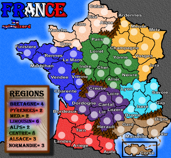
I think we should let the map maker experiment with this 'cartoonish' style. It's something fresh and I think he has done a very good job so stop bashing him about it.
In fact I am going to admit that personally I find the map visually stunning.
I am still not satisfied with Corsica though, but making it larger would involve redesigning the map since it was not considered at the start.
In fact I am going to admit that personally I find the map visually stunning.
I am still not satisfied with Corsica though, but making it larger would involve redesigning the map since it was not considered at the start.


Wisse wrote:ok here it comes:
-choose a different font for the title
-the legend looks ugly and needs a total make-over
SpinWizard....I myself think the title is quite OK as it is.
The legend is too glarish with all that red in it...if you changed it to my suggested colours it might look better. Perhaps change the font colour in the legend to that if the regions.
But the title and legend definitely have a "French" appeal.
I'd leave it, unless others require the change.
Perhaps if you also change to dashes to Corse to the same colour as those territories.
I think the "by SpinWizard" needs to be stylized more also, and consistent with colours in the title and legend.
Hope this helps!

* Pearl Harbour * Waterloo * Forbidden City * Jamaica * Pot Mosbi
-
spinwizard
- Posts: 5016
- Joined: Sun Dec 10, 2006 9:52 am
-
Ruben Cassar
- Posts: 2160
- Joined: Thu Nov 16, 2006 6:04 am
- Gender: Male
- Location: Civitas Invicta, Melita, Evropa
-
spinwizard
- Posts: 5016
- Joined: Sun Dec 10, 2006 9:52 am
-
Ruben Cassar
- Posts: 2160
- Joined: Thu Nov 16, 2006 6:04 am
- Gender: Male
- Location: Civitas Invicta, Melita, Evropa
-
spinwizard
- Posts: 5016
- Joined: Sun Dec 10, 2006 9:52 am
-
AndyDufresne

- Posts: 24935
- Joined: Fri Mar 03, 2006 8:22 pm
- Location: A Banana Palm in Zihuatanejo
- Contact:
-
spinwizard
- Posts: 5016
- Joined: Sun Dec 10, 2006 9:52 am
-
spinwizard
- Posts: 5016
- Joined: Sun Dec 10, 2006 9:52 am
-
spinwizard
- Posts: 5016
- Joined: Sun Dec 10, 2006 9:52 am
-
Contrickster
- Posts: 261
- Joined: Tue Jan 23, 2007 7:24 pm
Re: France-Update 9
Really like this map, advanced very quickly. Clear & colourful. I can imagine playing this map.
-
spinwizard
- Posts: 5016
- Joined: Sun Dec 10, 2006 9:52 am
Re: France-Update 9
Contrickster wrote:Really like this map, advanced very quickly. Clear & colourful. I can imagine playing this map.
thanks, it will be slower 4 the next week as i have skool but then pick up pace after that!
any improvements?
-
Mike Doherty

- Posts: 38
- Joined: Thu Nov 02, 2006 7:23 am
- Location: somewhere...in the deep Canadian woods
SpinWizard...I have to say sorry  but it is too obscured by everything else that is happening in the legend. Perhaps if you tried moving it into the background of one of the unused map areas like the sea, it would come up clearer and one would be able to tell what it is.
The perfect example of this is in Guiscard's Mongol Empire Map in development.
The perfect example of this is in Guiscard's Mongol Empire Map in development.
* Pearl Harbour * Waterloo * Forbidden City * Jamaica * Pot Mosbi
-
spinwizard
- Posts: 5016
- Joined: Sun Dec 10, 2006 9:52 am
cairnswk wrote:SpinWizard...I have to say sorry
The perfect example of this is in Guiscard's Mongol Empire Map in development.
it is not ment as a feature point in the map, only something nice in the background.
thanks 4 the complements!
-
spinwizard
- Posts: 5016
- Joined: Sun Dec 10, 2006 9:52 am