
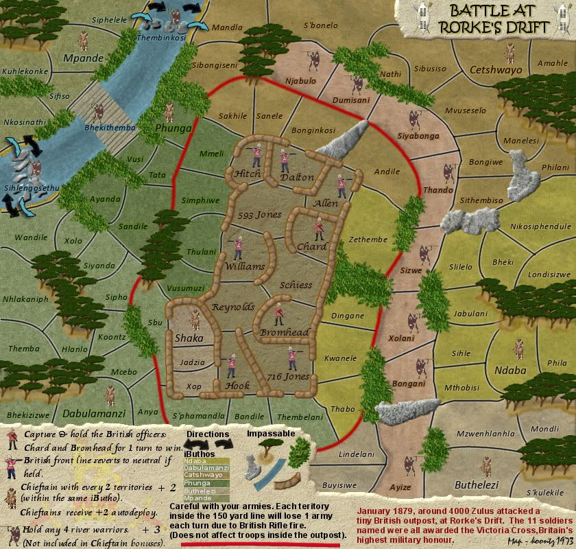
The top part of this rock looks as if it is floating above the ground where the dry river bed is. This is a minor concern as it could be overhanging the dry river.
Moderator: Cartographers

Done the arrows, will do that now, anything else?isaiah40 wrote:Um, now that I take another look, yes here:
The top part of this rock looks as if it is floating above the ground where the dry river bed is. This is a minor concern as it could be overhanging the dry river.

No problem Coleman, glad to see you look in.Coleman wrote:EDIT: Nevermind, sorry about that. My browser didn't refresh the topic properly and I responded to something long since resolved.
Why so many fonts in the legend? The font for the 'careful' warning portion stands out the most. Would prefer if everything were closer to the font used to explain the special territories.


I agree with this. Not all suggestions for change end up looking better than the original. Was still good to see what it would look like. I'd say change them back at this point.Gillipig wrote:I'm not sure I like the white edge around the borders! It's clearer but I don't think it goes well with the theme. It looks a bit like roads.
Go to first post, previous versions, the black line one is around half way down in big image tags so it is easy to spot. I took them off and everyone said to put them back so they will stay.Coleman wrote:I agree with this. Not all suggestions for change end up looking better than the original. Was still good to see what it would look like. I'd say change them back at this point.Gillipig wrote:I'm not sure I like the white edge around the borders! It's clearer but I don't think it goes well with the theme. It looks a bit like roads.


I don't think that really helped the problem.koontz1973 wrote:I probably will do, but will keep these for a day or two to see is anyone else comments on them.Sniper08 wrote:tree's dont look good like bushes , revert back to fix as nothin was wrong with old trees imo.
As I said on the previous page, I have no problem trying something new but I believe the need now for consistency till a mod comments. Lets see if lostinlimbo comes back to say something.
I modified the bushes but will have another crack at them today.lostatlimbo wrote:I don't think that really helped the problem.koontz1973 wrote:I probably will do, but will keep these for a day or two to see is anyone else comments on them.Sniper08 wrote:tree's dont look good like bushes , revert back to fix as nothin was wrong with old trees imo.
As I said on the previous page, I have no problem trying something new but I believe the need now for consistency till a mod comments. Lets see if lostinlimbo comes back to say something.
Allow me to clarify:
I think the old trees look fine. They have a sort of hand-drawn cartoon-y charm to them that matches the soldiers, warriors and chiefs.
The bushes however are a completely different style and POV. They don't fit the map. AT ALL.This one style of bush that DiM suggested is not the only option.
Did you draw the trees yourself? Why can't you draw some bushes in a similar style?
If you copied the trees from another source, it shouldn't be too difficult to modify them and make them look more like bushes IN THE SAME STYLE AS THE REST OF THE MAP.
You've already got a great overall theme/look to this map, but then you keep throwing in elements that just don't fit.
Then again, no one else seems to care, so... as you wish.
Those are some sweet looking arrows there DiM. If my current ones do not get the seal of approval, I may just nick them from you.DiM wrote:how about something like these arrows?if you want them, just import this image: http://i178.photobucket.com/albums/w250 ... arge-1.png
- Click image to enlarge.


Will dull the bushes a bit but they need contrast with the green iButhos because of the CB test.Sniper08 wrote:i like Dim's blue arrows, they looked great and fit in really well.
i think these bushes are too bright for the map and kinda look like green blobs
Nothing has happened with the text.Gillipig wrote:The bushes are getting better but still needs some work! I too like DiM's arrows! Your new arrows are nice but doesn't really fit the map. What has happen with the text explaining the autodecay? It looked better before!

Top Score:2403natty_dread wrote:I was wrong


Missed this when I came to read the posts. Not fixed but will be done.TaCktiX wrote:Quick nitpick on your legend: "Be careful with your armies. Each territory..."
And DiM's arrows pop more, but I would suggest if you take the idea, not to make them all black. It doesn't work with the earthy color palette you have.


