Jewel of the Empire coordinates & xml (new xml?)

Have an idea for a map? Discuss ideas and concepts here.

Moderator: Cartographers

Forum rules
Please read the Community Guidelines before posting.

Would you like me to continue with this map?

 
Total votes: 0

User avatar
PimpCaneYoAss
Posts: 185
Joined: Fri Feb 16, 2007 3:04 pm
Location: Connecticut

Post by PimpCaneYoAss »

Neilhouse wrote:
PimpCaneYoAss wrote:I find it weird how you call it an ocean passage when there is no ocean. Also a title is drastically needed. the legend text seems slightly blured too. I would sharpen that up a bit.


If a cartographer needs good reason to not implement the change suggested to him/her then a suggester should also have a good reason why he/she is suggesting what they do.

I understand the ocean passage comment, but why does this map drastically need a title? Expand some, please?


I feel that without a title the map is just a map. It needs that tittle to help add more flavor and give it the extra boost. I like the map but i feel that a title is needed
Image
Contrickster
Posts: 261
Joined: Tue Jan 23, 2007 7:24 pm

Post by Contrickster »

I feel that without a title the map is just a map. It needs that tittle to help add more flavor and give it the extra boost. I like the map but i feel that a title is needed


A want not a need. A map does not need a title as the existing title-less maps demonstrate. Whether a map can survive without a title depends on the map.

The reason why I have agreed to removed the title on this map is because with the picture background a title is needed less to make it interesting.

The title makes the map look cluttered; the titles I have experimented most recently were faded-style for that reason. Might as well remove it altogether.


Does anyone else think I should remove "Ocean passage?"
User avatar
DiM
Posts: 10415
Joined: Wed Feb 14, 2007 6:20 pm
Gender: Male
Location: making maps for scooby snacks

Post by DiM »

Contrickster wrote:Does anyone else think I should remove "Ocean passage?"


i do. i think it's clear that the dots connect those teritories so no need to explain that those are ocean passages, like there's no need to explain the mountains and desert are impassable. :wink:
“In the beginning God said, the four-dimensional divergence of an antisymmetric, second rank tensor equals zero, and there was light, and it was good. And on the seventh day he rested.”- Michio Kaku
Contrickster
Posts: 261
Joined: Tue Jan 23, 2007 7:24 pm

Post by Contrickster »

DiM wrote:
Contrickster wrote:Does anyone else think I should remove "Ocean passage?"


i do. i think it's clear that the dots connect those teritories so no need to explain that those are ocean passages, like there's no need to explain the mountains and desert are impassable. :wink:


Okay.

Now, does anyone think the continents are essential?

The legend?

How about the colours?

:wink:
KEYOGI
Posts: 1632
Joined: Tue Oct 10, 2006 6:09 am

Post by KEYOGI »

Large Map? - 599 high
Image

Small Map? - 499 high
Image

I think these sizes work. I know it's hard given your geography, but there seems to be an abundance of tall maps recently and I have no understanding why. Our peripheral vision is wider than it is vertical and when you think of a computer monitor tall maps just don't make much sense.

The issue is up for discussion, it's just how I view the situation and base my opinion.
User avatar
DiM
Posts: 10415
Joined: Wed Feb 14, 2007 6:20 pm
Gender: Male
Location: making maps for scooby snacks

Post by DiM »

Contrickster wrote:
DiM wrote:
Contrickster wrote:Does anyone else think I should remove "Ocean passage?"


i do. i think it's clear that the dots connect those teritories so no need to explain that those are ocean passages, like there's no need to explain the mountains and desert are impassable. :wink:


Okay.

Now, does anyone think the continents are essential?

The legend?

How about the colours?

:wink:


don't be mean. if you want a clean look (the lack of title and explanation for mountains and desert) why not go and clean all the way by removing the ocean passage text.

this way you'll have an even cleaner look. with the bare necesities like continents and legend.
“In the beginning God said, the four-dimensional divergence of an antisymmetric, second rank tensor equals zero, and there was light, and it was good. And on the seventh day he rested.”- Michio Kaku
Contrickster
Posts: 261
Joined: Tue Jan 23, 2007 7:24 pm

Post by Contrickster »

KEYOGI wrote:Large Map? - 599 high
Image

Small Map? - 499 high
Image

I think these sizes work. I know it's hard given your geography, but there seems to be an abundance of tall maps recently and I have no understanding why. Our peripheral vision is wider than it is vertical and when you think of a computer monitor tall maps just don't make much sense.

The issue is up for discussion, it's just how I view the situation and base my opinion.


Since there is no fine text on this map - it's been removed - we could possibly get away with reducing the size of the image. Innovatively. The above look okay... but I think the small map is a little small. I can read the text but I'm not everyone.

I would press for 624 high for large - 25 pixels more than present - for the large map. That would be 50% size of the original image. It also would give player's eyesight a little more help. Incidently 624 would make the large map almost identical in height with the existing Phillipines map.


DiM "ocean passage" is gone 8)
User avatar
DiM
Posts: 10415
Joined: Wed Feb 14, 2007 6:20 pm
Gender: Male
Location: making maps for scooby snacks

Post by DiM »

i think the above images are a tad too small. :shock:

if you are too lazy to scroll a bit then you have no place on this site.

i mean before you take your turn you also scroll to see the game log and the chat, so what's the problem with some extra scrolling since you already do it?
“In the beginning God said, the four-dimensional divergence of an antisymmetric, second rank tensor equals zero, and there was light, and it was good. And on the seventh day he rested.”- Michio Kaku
Contrickster
Posts: 261
Joined: Tue Jan 23, 2007 7:24 pm

Post by Contrickster »

DiM wrote:i think the above images are a tad too small. :shock:

if you are too lazy to scroll a bit then you have no place on this site.

i mean before you take your turn you also scroll to see the game log and the chat, so what's the problem with some extra scrolling since you already do it?


On this map, which is simple, it would be unnecessary to do a lot of scrolling. Just need to have one look, and bam.

A more complex large map would require more careful perusal. Such a map probably would suit scrolling more as players would take more time looking before they move.

I do agree though, the maps could be a little larger, though not too much.
Contrickster
Posts: 261
Joined: Tue Jan 23, 2007 7:24 pm

Post by Contrickster »

599 high
Image

624 high
Image


Looking at it now, there's not really much difference between the two. I'd settle with 599. Any strong objections? Can everyone read the text in the 599 image?
KEYOGI
Posts: 1632
Joined: Tue Oct 10, 2006 6:09 am

Post by KEYOGI »

I don't really mind, it's just that height is one of the first things I notice in a map. You just need to keep in mind those players that have smaller monitors and lower resolutions.
Contrickster
Posts: 261
Joined: Tue Jan 23, 2007 7:24 pm

Post by Contrickster »

It was suggested I needed to change colours and "redesign the map". The latter wasn't specified and nobody else has requested that, so, sorry, the map hasn't been redesigned. I've have got some other colour choices, however.

(The large size I've settled on is half-way between the two we had before - so it's going to be 612 pixels high instead of 599 or 624.) The small map is 499 high, as suggested by KEYOGI.

1)
408/499
Image
500/612
Image

2)
408/499
Image
500/612
Image

3)
408/499
Image
500/612
Image
User avatar
DiM
Posts: 10415
Joined: Wed Feb 14, 2007 6:20 pm
Gender: Male
Location: making maps for scooby snacks

Post by DiM »

i like the siggy on the elephant. nice touch :wink:
“In the beginning God said, the four-dimensional divergence of an antisymmetric, second rank tensor equals zero, and there was light, and it was good. And on the seventh day he rested.”- Michio Kaku
User avatar
mibi
Posts: 3350
Joined: Thu Mar 01, 2007 8:19 pm
Location: The Great State of Vermont
Contact:

Post by mibi »

why are the mountains in Hindus green?
User avatar
haoala
Posts: 295
Joined: Tue Feb 27, 2007 7:58 am
Location: Directly opposite the South of Napo

Post by haoala »

shouldnt the sikh's continent have 3 or 4 bonus?
Gain the upper hand
User avatar
DiM
Posts: 10415
Joined: Wed Feb 14, 2007 6:20 pm
Gender: Male
Location: making maps for scooby snacks

Post by DiM »

mibi wrote:why are the mountains in Hindus green?


they aren't as tall as himalayas so no snow for them :D
“In the beginning God said, the four-dimensional divergence of an antisymmetric, second rank tensor equals zero, and there was light, and it was good. And on the seventh day he rested.”- Michio Kaku
User avatar
Ruben Cassar
Posts: 2160
Joined: Thu Nov 16, 2006 6:04 am
Gender: Male
Location: Civitas Invicta, Melita, Evropa

Post by Ruben Cassar »

Contrickster wrote:
Ruben Cassar wrote:I think you should start afresh, redesign the map maybe and change the colour schemes because they just do not work as they are right now...


I can change the colours (what do you suggest?) but redesign the map? Can you elaborate on what you mean by "redesign"?


The background colour and the continent colours need to be changed. Basically I can barely look at the map without hurting my eyes.

I think you need to completely change the colour scheme. That is what I meant with redesign.
ImageImageImageImageImage
Contrickster
Posts: 261
Joined: Tue Jan 23, 2007 7:24 pm

Post by Contrickster »

Ruben wrote:I think you need to completely change the colour scheme. That is what I meant with redesign.


Which of the new colours do you like best? Of course they all will look a bit different with armies on them.

The territory colours are already dimmed after a comment earlier. With 7 continents it's going to be hard to get 7 different colours that go well together. I don't think a map with 7 colours all of the same shade of brown (eg. Middle East map) would suit.

No, it's not perfect.


haoala wrote:shouldnt the sikh's continent have 3 or 4 bonus?


No, I've addressed most of the continent bonuses already. They are based on the map as a whole. It would be absurd to have 3 or 4 bonus for a 3 territory continent on a small map, anyway, because in some games someone will start with all three territories. 2 bonus armies is plenty.

DiM wrote:i like the siggy on the elephant. nice touch :wink:


Thanks!

mibi wrote:why are the mountains in Hindus green?


Do an image search on Western Ghats/Eastern Ghats. They're not snow capped!
Contrickster
Posts: 261
Joined: Tue Jan 23, 2007 7:24 pm

Post by Contrickster »

I think the colours look better with the cloud - return to the Fantasy feel to "Jewel in the Empire". I'm liking the below.

Image

Are the clouds in the right place?
User avatar
Guiscard
Posts: 4103
Joined: Fri Dec 08, 2006 7:27 pm
Location: In the bar... With my head on the bar

Post by Guiscard »

The background looks OK now, apart from the small rectangular map in the bottom right which seems out of place, but it does seem very dark. It seems something of a contradiction. The background is dark, almost nightmarish (seems to tie in with the pretty horrendous colonial imagery of books like Burmese Days and Heart of Darkness). The actual playable area, on the other hand, seems bright, cheerful and almost child-like in its simplicity.

I like both elements but I don't think they mesh well together, and that's why this map makes me feel a little uneasy. One or the other needs to be changed.
qwert wrote:Can i ask you something?What is porpose for you to open these Political topic in ConquerClub? Why you mix politic with Risk? Why you not open topic like HOT AND SEXY,or something like that.
Contrickster
Posts: 261
Joined: Tue Jan 23, 2007 7:24 pm

Post by Contrickster »

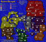
Guiscard wrote:The background looks OK now, apart from the small rectangular map in the bottom right which seems out of place, but it does seem very dark. It seems something of a contradiction. The background is dark, almost nightmarish (seems to tie in with the pretty horrendous colonial imagery of books like Burmese Days and Heart of Darkness). The actual playable area, on the other hand, seems bright, cheerful and almost child-like in its simplicity.

I like both elements but I don't think they mesh well together, and that's why this map makes me feel a little uneasy. One or the other needs to be changed.


Very perspective. Perspective? Wrong word...

Might the player look at the contradictory elements as the designer's commentary on the world... (So long as the elements are done correctly).

What is Risk but a game? How can we play a game, to enjoy ourselves in a cheerful, lighthearted way (okay, that does not describe all of us) about death and destruction?

Risk is a contradiction! There is your philosophical basis for the above map.

I could try out different coloured backgrounds, but the "Nightmare amidst Fantasy" look appeals to my intellectual vanity. :wink:

Original, distinctive, eye-catching... makes you think.

Ed: I wanted a piece of a map of india on the map. The map in the bottom right hand corner is a little light... I could easily darken it but then you don[t see the map so well. It draws the eye to the legend... is it something you could get use to?
Contrickster
Posts: 261
Joined: Tue Jan 23, 2007 7:24 pm

Post by Contrickster »

Any more comments on the map, especially in the light of Guiscard's comments?

Namely, the map in the lower right? Is it too light? Or does it not matter, since it is the bottom right, is near the legend and shows a map?

What about the Fantasy/Nightmare dichotomy? That's a fantastic, perspicaious (yeh, I looked it up) observation. Now it's out in the open I kind of like it that way from a philosophical POV; does anyone mount strong objections why despite this reason I should not maintain this look?

Later I plan to get a finished version back up with coordinates so I'd like to give people a chance to make any comments they may have before I do that! If any! Thanks in advance!
User avatar
DiM
Posts: 10415
Joined: Wed Feb 14, 2007 6:20 pm
Gender: Male
Location: making maps for scooby snacks

Post by DiM »

i'm not disturbed by the contrast between the background and the map in fact i quite like it, but i am disturbed by the rectangle in the bottom right corner. make it as dark as the other areas.
“In the beginning God said, the four-dimensional divergence of an antisymmetric, second rank tensor equals zero, and there was light, and it was good. And on the seventh day he rested.”- Michio Kaku
Contrickster
Posts: 261
Joined: Tue Jan 23, 2007 7:24 pm

Post by Contrickster »

Map part of the image darkened.

Image

Image
User avatar
DiM
Posts: 10415
Joined: Wed Feb 14, 2007 6:20 pm
Gender: Male
Location: making maps for scooby snacks

Post by DiM »

perfect. i thimn the himalayas corner is absolutely gorgeous because of the clouds.

btw i've been meaning to ask. how did you do the clouds?
“In the beginning God said, the four-dimensional divergence of an antisymmetric, second rank tensor equals zero, and there was light, and it was good. And on the seventh day he rested.”- Michio Kaku
Post Reply

Return to “Melting Pot: Map Ideas”