I understand, and believe me, I think this is a great idea. I'd play this map all day long.
Are you planning to put highways on the map? I think it's a good idea, especially considering how Jersey has sort-of a highway culture...
New Jersey [Quenched]
Moderator: Cartographers
Forum rules
Please read the Community Guidelines before posting.
Please read the Community Guidelines before posting.
-
bigblueXLII
- Posts: 12
- Joined: Thu Apr 14, 2011 11:08 am
- Gender: Male
- Location: NYC
-
StuckinMoran
- Posts: 4
- Joined: Tue Mar 01, 2011 7:49 pm
Re: New Jersey [UPDATE 03.28.2012, p11]
Make Belvidere, NJ a territory with a +1 autodeploy. I'm not from there or anything  ...
...
-
Anthrax821
- Posts: 386
- Joined: Thu Sep 02, 2010 1:14 pm
- Gender: Male
- Location: Dirty Jersey
Re: New Jersey [UPDATE 03.28.2012, p11]
HA! Belvidere! omg
can we make that a -3 auto? j/k
I thought we were done nitpicking about names and territories...I think the map ORIGINALLY started with counties (check version 1.0), but it was seen quickly that was problematic as well. Names/locations/ect will never be perfect, especially in NJ where there is so many "large" or city like areas. I had my gripes in the past and still dont fully agree but it becomes what is functional and still somewhat accurate vs the chaos that becomes full reality.
-
chaos32679

- Posts: 340
- Joined: Fri Sep 03, 2010 6:02 am
- Gender: Male
- Location: PA
Re: New Jersey [UPDATE 03.28.2012, p11]
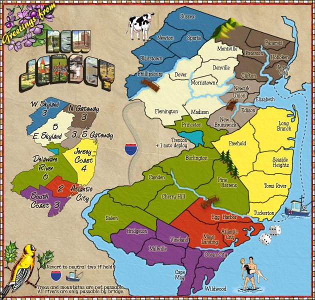
*** UPDATE ***
Small Img created...
Small
Small Img created...
Small
- Click image to enlarge.
-
happy2seeyou

- Posts: 4022
- Joined: Mon Jan 22, 2007 2:59 pm
- Gender: Female
- Location: A state that is in the shape of a mitten!
- Contact:
Re: New Jersey [UPDATE 04.20.2012, p11]
The cartoon couple shouldn't be white, they should be orange. Also, that girl is wearing way too less makeup and animal print.

-
chaos32679
- Posts: 340
- Joined: Fri Sep 03, 2010 6:02 am
- Gender: Male
- Location: PA
Re: New Jersey [UPDATE 04.20.2012, p11]
LMFAO!!!!!! very true, n she probably needs bigger hairhappy2seeyou wrote:The cartoon couple shouldn't be white, they should be orange. Also, that girl is wearing way too less makeup and animal print.
-
happy2seeyou
- Posts: 4022
- Joined: Mon Jan 22, 2007 2:59 pm
- Gender: Female
- Location: A state that is in the shape of a mitten!
- Contact:
Re: New Jersey [UPDATE 04.20.2012, p11]
Bigger hair for sure!chaos32679 wrote:LMFAO!!!!!! very true, n she probably needs bigger hairhappy2seeyou wrote:The cartoon couple shouldn't be white, they should be orange. Also, that girl is wearing way too less makeup and animal print.
-
AndyDufresne

- Posts: 24935
- Joined: Fri Mar 03, 2006 8:22 pm
- Location: A Banana Palm in Zihuatanejo
- Contact:
Re: New Jersey [UPDATE 04.20.2012, p11]
When I first saw the idea for a New Jersey map when this started, I was pretty skeptical about wanting to play on the map. But it has a fun graphic theme to it and some nice simple gamepaly, that I'd probably consider adding it to my rotation.
Keep up the good work.
--Andy
Keep up the good work.
--Andy
-
RedBaron0

- Posts: 2657
- Joined: Sun Aug 19, 2007 12:59 pm
- Gender: Male
- Location: Pennsylvania
- Contact:
Re: New Jersey [UPDATE 04.20.2012, p11]
If the girl gets bigger hair, then the guy gets bigger pecs and more chiseled abs... 


Re: New Jersey [UPDATE 04.20.2012, p11]
I'd say more of a tan also. (:RedBaron0 wrote:If the girl gets bigger hair, then the guy gets bigger pecs and more chiseled abs...
Everything look good?
Re: New Jersey [UPDATE 04.20.2012, p11]
Everything is looking good. Can you please update the OP with your color blind check, and version with the 888's on them. Now stickied!

Re: New Jersey [UPDATE 04.20.2012, p11]
My .02
Nice work on the map
I feel like the highway blends in with the background too much
I also think cow stands out a little awkwardly
The mountains could be slightly improved looks wise
Keep up the good work!
Nice work on the map
I feel like the highway blends in with the background too much
I also think cow stands out a little awkwardly
The mountains could be slightly improved looks wise
Keep up the good work!
-
chaos32679
- Posts: 340
- Joined: Fri Sep 03, 2010 6:02 am
- Gender: Male
- Location: PA
Re: New Jersey [UPDATE 04.20.2012, p11]
Don't talk about the mountains, Tisha may murder you! They are definitely staying as is, lol...Jippd wrote:My .02
Nice work on the map
I feel like the highway blends in with the background too much
I also think cow stands out a little awkwardly
The mountains could be slightly improved looks wise
Keep up the good work!
-
BigBallinStalin

- Posts: 5151
- Joined: Sun Oct 26, 2008 10:23 pm
- Location: crying into the dregs of an empty bottle of own-brand scotch on the toilet having a dump in Dagenham
- Contact:
Re: New Jersey [UPDATE 04.20.2012, p11]
Since the water is cold in New Jersey, shouldn't that guy's package be smaller?
Not to be a stickler, but I'm very anal about these things. Sorry.
-
happy2seeyou
- Posts: 4022
- Joined: Mon Jan 22, 2007 2:59 pm
- Gender: Female
- Location: A state that is in the shape of a mitten!
- Contact:
Re: New Jersey [UPDATE 04.20.2012, p11]
They also seem to be standing straight up, in reality they would be holding on to someone because they are drunk. Also, I really think them being more orange is a must! That couple is seriously too whiteBigBallinStalin wrote:
Since the water is cold in New Jersey, shouldn't that guy's package be smaller?
Not to be a stickler, but I'm very anal about these things. Sorry.
-
chaos32679
- Posts: 340
- Joined: Fri Sep 03, 2010 6:02 am
- Gender: Male
- Location: PA
Re: New Jersey [UPDATE 05.01.2012, p13]
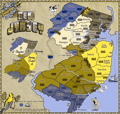
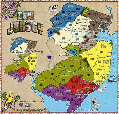
*** UPDATED ***
888 Version
Colorblind Check
888 Version
- Click image to enlarge.

- Click image to enlarge.
Re: New Jersey [UPDATE 05.01.2012, p13]
Looks like you should switch some around atlantic city and delaware river maybe for the color blind?
Perhaps make west skyland the color of atlantic city
Make atlantic city white like east skyland is now
Make East skyland the color that west skyland is currently
Perhaps make west skyland the color of atlantic city
Make atlantic city white like east skyland is now
Make East skyland the color that west skyland is currently
Re: New Jersey [UPDATE 05.01.2012, p13]
you can't tell the difference by looking at the mini map?Jippd wrote:Looks like you should switch some around atlantic city and delaware river maybe for the color blind?
Perhaps make west skyland the color of atlantic city
Make atlantic city white like east skyland is now
Make East skyland the color that west skyland is currently
I wouldn't completely switch colors.. just change the hues.
..But I thought it was obvious where the borders were by looking at the mini map.
-
AndyDufresne
- Posts: 24935
- Joined: Fri Mar 03, 2006 8:22 pm
- Location: A Banana Palm in Zihuatanejo
- Contact:
Re: New Jersey [UPDATE 05.01.2012, p13]
The borders are pretty obvious, but if you can adjust the hues as Tisha mentioned, that might work out fine.
--Andy
--Andy
Re: New Jersey [UPDATE 05.01.2012, p13]
I effed with them.. I think they are more obvious than they previously were

Re: New Jersey [UPDATE 05.01.2012, p13]
I can definitely see the difference. **NOTE** I'm not color blind. To me I am fine with how it is. I was only merely offering the suggestion since it was a solution to avoid having two browns next to each other.
-
RedBaron0
- Posts: 2657
- Joined: Sun Aug 19, 2007 12:59 pm
- Gender: Male
- Location: Pennsylvania
- Contact:
Re: New Jersey [UPDATE 05.01.2012, p13]
Yeah it is awfully close... A whole sale flip of colors might be best, say E Skyland for AC? A red right next to green is just gonna look virtually identical to the color blinded in most cases. But if you can fiddle with the hues some more and make it work, that'll be fine too.
Re: New Jersey [UPDATE 05.01.2012, p13]
so you're telling me that I have to switch colors around so that in the colorblind image two "browns" are not next to each other... even though they are noticeably different?
-
AndyDufresne
- Posts: 24935
- Joined: Fri Mar 03, 2006 8:22 pm
- Location: A Banana Palm in Zihuatanejo
- Contact:
Re: New Jersey [UPDATE 05.01.2012, p13]
I am not sure I'd say the colors are 'noticeably' different, as I don't think they are 'remarkably' different as is in the definition of noticeable. The 'Gateway' bonus zones probably fall under noticeably different, however.
--Andy
--Andy
Re: New Jersey [UPDATE 05.01.2012, p13]
I'm not familiar with the effort that goes into map making but how hard is it to change the background colors? Is it like in microsoft paint where you click the fill bucket and can just click the region to change the color and then save the background as an underlaid texture?