- Click image to enlarge.

- Click image to enlarge.

Moderator: Cartographers


Sorry to here that. Not everyone will.Nola_Lifer wrote:I got to be honest here, don't like the texture at all
Thought I had it a few versions ago with different colours but the CB test ruled that out. The playable area has to be different enough to be distinguished from the background. With the new shading that was put on, people hated it, so in the end it got taken of. I am going to keep it as is.and the map just seems to be floating in the air can you make it blend in better with the background at all?


Yes! Bring me the sacrificial virgin!koontz1973 wrote:Anything else oh mighty mod gods in blue.
Sent via courier so you should get it some time over the weekend. Use her wisely oh mighty blue god.Yes! Bring me the sacrificial virgin!


I somewhat feel this way as well, and I think one or two others pointed this out as well previously.natty dread wrote:The issues I brought up last time I posted here have not been addressed at all. Frankly, it looks like another mediocre map with shitty graphics has slipped through because no one really gives a bleep about it. If I were in charge here, I'd strip the graphics stamp and put this thing back in the main foundry to be developed properly. I'm not, so I'm just going to enter some criticism.
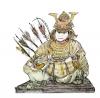
Firstly, the map image is a bland, ambiguous blur of similar colours - there's no contrast. It's like someone poured a can of mushroom soup on the table and arranged it into a map... The playable area gets lost in the middle of that sea of bland, drab colours. The lack of any outline, any kind of visual clues where the playable area begins makes it horrible to watch - your eyes aren't drawn towards it, in fact it's completely opposite, it attempts to slip away from your gaze.
I tend to agree.And the canvas texture is too strong
I think the title looks fine.The title doesn't look like it belongs on. Why is the title more prominent than the playable area? It should be the other way around. Currently the only thing that draws my eye in this picture is the title. It shouldn't be like that.
Why should the map be made up of bright colours? We have other maps that are drab (as it has been said for this) with similar colours throughout. As for the playing area having a outline, it had one up to a couple of updates ago. Took it out to stop the floating map syndrome as pointed out by some. As for anyone mistaking the background for the playing area, I very much doubt any player will come in and say why the could not play the head of the statue. You go from a mass of colours to solid blocks of colour. They where a lot closer to the backgrounds colours in the past but with the CB test fails, brighter and different colours had to be found. These work.AndyDufresne wrote:I somewhat feel this way as well, and I think one or two others pointed this out as well previously.
The canvas texture may be a tad strong in some peoples opinion, and when this was pointed out by yourself and Nola_Lifer, it was made less so for the large (the small in peoples opinion was good). Right now, it is not bad and fits in with the maps style so it is going to stay.I tend to agree.
Thank you.I think the title looks fine.
--Andy
No, this doesn't work. Also no one said the map should be made of bright colours. But the thing is you have no contrast between the playable area and the background. It's all a mess, an unrecognizable soup of colours. It's not intuitive to the players, it's not easy to look at. Functionality must be paramount when considering map graphics.koontz1973 wrote:Why should the map be made up of bright colours? We have other maps that are drab (as it has been said for this) with similar colours throughout. As for the playing area having a outline, it had one up to a couple of updates ago. Took it out to stop the floating map syndrome as pointed out by some. As for anyone mistaking the background for the playing area, I very much doubt any player will come in and say why the could not play the head of the statue. You go from a mass of colours to solid blocks of colour. They where a lot closer to the backgrounds colours in the past but with the CB test fails, brighter and different colours had to be found. These work.
The canvas texture only worsens the problem with the overall look of the map. It doesn't look good because the map under it doesn't look good.koontz1973 wrote:The canvas texture may be a tad strong in some peoples opinion, and when this was pointed out by yourself and Nola_Lifer, it was made less so for the large (the small in peoples opinion was good). Right now, it is not bad and fits in with the maps style so it is going to stay.
Well that's no surprise because you apparently don't really CARE about the foundry standards or ensuring that maps are made as good as they can be... after all, you'd rather push important maps through a special process behind closed doors so that it will be on the site FASTER, no matter the quality...AndyDufresne wrote:I don't think I'd say it is unacceptable
No, the Final Forge is about making the Final tweaks to a map that it needs to be a good map. Ironing out the last wrinkles, fixing the last details and such. This map needs more than little details fixed, the entire composition of the image is just plain wrong. The map looks worse than the original Quad Cities map, when it first came to FF - and that map was required a complete redraw before it was accepted for beta. I think this is going to need the same.AndyDufresne wrote: I think there is still room for improvement, which is what Final Forge is all about!
Andy, thanks for your polite comments. As always, more than happy to work on the map if asked. Let me know what you want to see improved and will work on it.AndyDufresne wrote:I don't think I'd say it is unacceptable, but I think there is still room for improvement, which is what Final Forge is all about!
--Andy