Some GP issues I see:
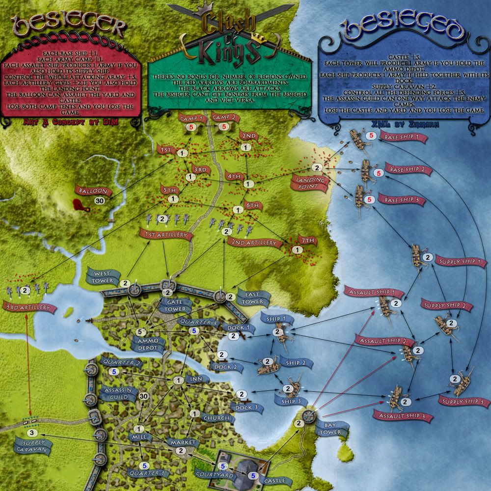
Supply Caravan yields +2 and its conceivable blue doesn't have even have to deploy there to grab that bonus first turn. Use the 5 auto from courtyard to take out 3 neutrals and he already has it. Additionally, Quarter 3 attacks directly to Ammo Depot which then has the ability to attack all three towers. I need to take 8 neutrals total to get a +3 (not including the additional +1 from Bay Tower, which can be assaulted directly from Castle starting position). If I drop all 5 on Quarter 3 to start with 10, and use the 5 auto's from Courtyard and Castle, I could, with below average dice, take +6 after one turn (20 starting troops vs. 13 neutrals).
Meanwhile, red has to go through 12 total neutrals for a +3 for the ship bonuses (each with separate attack routes, instead of a centralized attack point like Ammo Depot), and an additional 12 neutrals to get +6 for artillery (with two separate attack routes). Blue then takes advantage of his 11 drop second turn and parks a couple of stacks on red's artillery, or moves further and takes 5th and 6th, sealing off that bonus from red. That's pretty much the game right there. Red is focused on defending his base camps and can't even attempt to go for his own bonuses via the ships.
I think the problem is solved with increasing the neutrals on Ammo Depot to at least a 5, and also increasing the neutral on either Supply Caravan or Market to make it more difficult to grab Supply Caravan too easily first turn, at least make blue think about deploying some troops there.
The ship bonuses all look pretty even.
Also, I would move the Balloon attack route from 3rd to 1st, or even to Camp 1. Red has one more n1 to go thru to get Balloon than blue does to get Assassin Guild. The Balloon is also significantly less protected than Assassin Guild is. You will probably need to make Assassin Guild harder to grab for blue, or make Balloon easier to grab (and defend) for red.
[Vacation until Dec] Clash of Kings - [14.03.14] - V18.1
Moderator: Cartographers
Forum rules
Please read the Community Guidelines before posting.
Please read the Community Guidelines before posting.
-
nolefan5311
- Posts: 1768
- Joined: Mon Nov 22, 2010 11:51 am
- Gender: Male
- Location: Florida
-
DiM

- Posts: 10415
- Joined: Wed Feb 14, 2007 6:20 pm
- Gender: Male
- Location: making maps for scooby snacks
Re: Clash of Kings [03.May.12] - 1v1 map - V14 - p1&12
red can deploy 1 on each of his base ships and has 3 chances of 51.2% of getting 3 bonuses of +1.
he can use the 2 other deployment troops he has to advance his camp armies towards the artillery but realistically speaking he won't be able to take any other bonuses.
on the other hand blue has the caravan which is a 5v1,2 and that's a 52.1% chance of winning for a +2 bonus.
he can also deploy 1 troop on quarter 4 to get a dock+ship. that's a 6v2,2 = 51.2% chance for a +1.
he still has 4 troops to deploy which if he puts on quarter 3 means he has a 51.4% chance of getting the ammo depot and 2 towers.
add to this the 5v2 attack from castle to bay tower and we see he has a total of 3 extra troops compared to red.
so i'm thinking this.
increase the market from neutral 1 to neutral 2 and the caravan from 2 to 3.
that means that in order to get the +2 for the caravan blue has to deploy at least 2 troop on the yard and attack 7v2,3 which has a chance of 53.5%
he'll also use a troop on quarter 4 to get a dock and his ship for 51.2% chance for a +1.
so he has just 2 more troops to deploy
the connection from quarter 3 to the ammo depot is a big advantage for blue so i'll take out that connection and make quarter 3 connect to the inn.
this way quarter 4, the yard and the castle become the starting points of the expansion (like the ships) while quarter 1 and 3 become support points (like the camps)
i've also increased the ammo depot from 2 to 5 and changed quarter 4 to quarter 3 and quarter 3 to quarter 2 and connected balloon to 1st infantry instead of 3rd.
alternatively blue can deloy 2 on yard to get the caravan, then take the bay tower, then use his 3 troops that he has to deploy to put on quarter 3 (former quarter4) and take the ammo depot and one wall tower. the chance of doing this 8v5,2 attack is 45.8%.but if he makes it (along with the 5v2 attack for the bay tower) he can get up to +4. but this is a double risk. not only the odds aren't in his favour but he also allows red to strengthen his bay area position.
V15:
*renamed quarter 4 to quarter 3 and quarter 3 to quarter 2
*connected balloon to 1st infantry instead of 3rd
*connected quarter 2 to inn instead of ammo depot
*changed ammo depot from 2 neutral to 5
*changed market from 1 neutral to 2
*changed caravan from 2 neutral to 3.
- Click image to enlarge.

“In the beginning God said, the four-dimensional divergence of an antisymmetric, second rank tensor equals zero, and there was light, and it was good. And on the seventh day he rested.”- Michio Kaku
-
nolefan5311
- Posts: 1768
- Joined: Mon Nov 22, 2010 11:51 am
- Gender: Male
- Location: Florida
Re: Clash of Kings [04.May.12] - 1v1 map - V15 - p1&12
Am I completely missing a Quarter? I only see 3 (two of which are labeled Quarter 2). Looking back at the previous version I don't see a Quarter 2 either.
I will get with ian about the changes, see if everything is good to go.
I will get with ian about the changes, see if everything is good to go.
-
koontz1973

- Posts: 6960
- Joined: Thu Jan 01, 2009 10:57 am


Re: Clash of Kings [04.May.12] - 1v1 map - V15 - p1&12
the quarter 2 next to dock 1 used to be quarter 4, while the one on the left was quarter 3.
ian.
ian.

-
DiM
- Posts: 10415
- Joined: Wed Feb 14, 2007 6:20 pm
- Gender: Male
- Location: making maps for scooby snacks
Re: Clash of Kings [04.May.12] - 1v1 map - V15 - p1&12
fixed:
- Click image to enlarge.
“In the beginning God said, the four-dimensional divergence of an antisymmetric, second rank tensor equals zero, and there was light, and it was good. And on the seventh day he rested.”- Michio Kaku
Re: Clash of Kings [04.May.12] - 1v1 map - V15 - p1&12
i like all of the latest changes, which seem to have neutralised blue's previous clear advantage. are u able to do something about the red background for the besieger legend, against which the black text doesn't stand out well?
ian.
ian.
-
DiM
- Posts: 10415
- Joined: Wed Feb 14, 2007 6:20 pm
- Gender: Male
- Location: making maps for scooby snacks
Re: Clash of Kings [04.May.12] - 1v1 map - V15 - p1&12
what?iancanton wrote:i like all of the latest changes, which seem to have neutralised blue's previous clear advantage. are u able to do something about the red background for the besieger legend, against which the black text doesn't stand out well?
ian.
you're telling me you can't read this?
it's clear as daylight. there must be something wrong with your monitor's brightness if you can't read it.
“In the beginning God said, the four-dimensional divergence of an antisymmetric, second rank tensor equals zero, and there was light, and it was good. And on the seventh day he rested.”- Michio Kaku
-
AndyDufresne

- Posts: 24935
- Joined: Fri Mar 03, 2006 8:22 pm
- Location: A Banana Palm in Zihuatanejo
- Contact:
Re: Clash of Kings [04.May.12] - 1v1 map - V15 - p1&12
Ian I think can read it, but I think he was saying it could be less straining with an adjustment.
--Andy
--Andy
Re: Clash of Kings [04.May.12] - 1v1 map - V15 - p1&12
This. I can read it myself but with a tad bit of straining. Maybe increase the line spacing a tad bit might help.AndyDufresne wrote:Ian I think can read it, but I think he was saying it could be less straining with an adjustment.
--Andy
-
DiM
- Posts: 10415
- Joined: Wed Feb 14, 2007 6:20 pm
- Gender: Male
- Location: making maps for scooby snacks
Re: Clash of Kings [04.May.12] - 1v1 map - V15 - p1&12
ah, but the line spacing has nothing to do with the background colour. no problem the spacing can be fixed and i'll also work with the glow on the text. but i'd like to keep the colour.
“In the beginning God said, the four-dimensional divergence of an antisymmetric, second rank tensor equals zero, and there was light, and it was good. And on the seventh day he rested.”- Michio Kaku
-
AndyDufresne
- Posts: 24935
- Joined: Fri Mar 03, 2006 8:22 pm
- Location: A Banana Palm in Zihuatanejo
- Contact:
Re: Clash of Kings [04.May.12] - 1v1 map - V15 - p1&12
I think this sounds like an acceptable plan!DiM wrote:ah, but the line spacing has nothing to do with the background colour. no problem the spacing can be fixed and i'll also work with the glow on the text. but i'd like to keep the colour.
--Andy
Re: Clash of Kings [04.May.12] - 1v1 map - V15 - p1&12
Please don't mess with the color!! It fits well with the rest of the map!DiM wrote:ah, but the line spacing has nothing to do with the background colour. no problem the spacing can be fixed and i'll also work with the glow on the text. but i'd like to keep the colour.
-
DiM
- Posts: 10415
- Joined: Wed Feb 14, 2007 6:20 pm
- Gender: Male
- Location: making maps for scooby snacks
Re: Clash of Kings [04.May.12] - 1v1 map - V15 - p1&12
tweaked the shadow and the glow. it should be easier on the eye and thus easier to read.
old..........................................................new
old..........................................................new
“In the beginning God said, the four-dimensional divergence of an antisymmetric, second rank tensor equals zero, and there was light, and it was good. And on the seventh day he rested.”- Michio Kaku
Re: Clash of Kings [04.May.12] - 1v1 map - V15 - p1&12
That is a bit better for me.

Re: Clash of Kings [04.May.12] - 1v1 map - V15 - p1&12
although i have no problem with reading either of them (i have a pretty good monitor) the new one is indeed a little easier on the eyes because the glow on the other one is a bit distracting.DiM wrote:tweaked the shadow and the glow. it should be easier on the eye and thus easier to read.
old..........................................................new
- Click image to enlarge.

-
DiM
- Posts: 10415
- Joined: Wed Feb 14, 2007 6:20 pm
- Gender: Male
- Location: making maps for scooby snacks
Re: Clash of Kings [04.May.12] - 1v1 map - V15 - p1&12
ok, this settles it. the new style for the legend stays. but what about the gameplay? can i get that badge?
“In the beginning God said, the four-dimensional divergence of an antisymmetric, second rank tensor equals zero, and there was light, and it was good. And on the seventh day he rested.”- Michio Kaku
-
nolefan5311
- Posts: 1768
- Joined: Mon Nov 22, 2010 11:51 am
- Gender: Male
- Location: Florida
Re: Clash of Kings [04.May.12] - 1v1 map - V15 - p1&12
Let's get this one moved on up...

-
DiM
- Posts: 10415
- Joined: Wed Feb 14, 2007 6:20 pm
- Gender: Male
- Location: making maps for scooby snacks
Re: Clash of Kings [04.May.12] - 1v1 map - V15 - p1&12
any graphic issues?
V16:
*changed legend text as demanded
*small map
large:
small:
V16:
*changed legend text as demanded
*small map
large:
- Click image to enlarge.

- Click image to enlarge.

“In the beginning God said, the four-dimensional divergence of an antisymmetric, second rank tensor equals zero, and there was light, and it was good. And on the seventh day he rested.”- Michio Kaku
-
AndyDufresne
- Posts: 24935
- Joined: Fri Mar 03, 2006 8:22 pm
- Location: A Banana Palm in Zihuatanejo
- Contact:
Re: Clash of Kings [14.May.12] - 1v1 map - V16 - p1&13
I think things look pretty good! If it doesn't mess up the legends, putting a box outline around the +1's and +5's etc, might make those numbers stand out a little more.
Bullets in the legend might also help the flow of information, but they may not be necessary.
Keep up the good work,
--Andy
Bullets in the legend might also help the flow of information, but they may not be necessary.
Keep up the good work,
--Andy
-
DiM
- Posts: 10415
- Joined: Wed Feb 14, 2007 6:20 pm
- Gender: Male
- Location: making maps for scooby snacks
Re: Clash of Kings [14.May.12] - 1v1 map - V16 - p1&13
the box outline is hard to do because it would mean stretching the space between the rows of text and i don't want that.AndyDufresne wrote:I think things look pretty good! If it doesn't mess up the legends, putting a box outline around the +1's and +5's etc, might make those numbers stand out a little more.
Bullets in the legend might also help the flow of information, but they may not be necessary.
Keep up the good work,
--Andy
bullets can be done but they won't look good. bullets are best used when the text is aligned to the left and all the bullets form a nice column. i have the text centered so the bullets won't form a nice column.
i could bold those parts if needed.
“In the beginning God said, the four-dimensional divergence of an antisymmetric, second rank tensor equals zero, and there was light, and it was good. And on the seventh day he rested.”- Michio Kaku
-
AndyDufresne
- Posts: 24935
- Joined: Fri Mar 03, 2006 8:22 pm
- Location: A Banana Palm in Zihuatanejo
- Contact:
Re: Clash of Kings [14.May.12] - 1v1 map - V16 - p1&13
Mmhm. It just seems like those bonus items could use some extra emphasis---of any kind, since those are what people will be looking back for, after they read each legend once and get the general gist of things.
--Andy
--Andy
-
DiM
- Posts: 10415
- Joined: Wed Feb 14, 2007 6:20 pm
- Gender: Male
- Location: making maps for scooby snacks
Re: Clash of Kings [14.May.12] - 1v1 map - V16 - p1&13
AndyDufresne wrote:Mmhm. It just seems like those bonus items could use some extra emphasis---of any kind, since those are what people will be looking back for, after they read each legend once and get the general gist of things.
--Andy
how about something like this:
“In the beginning God said, the four-dimensional divergence of an antisymmetric, second rank tensor equals zero, and there was light, and it was good. And on the seventh day he rested.”- Michio Kaku
-
koontz1973
- Posts: 6960
- Joined: Thu Jan 01, 2009 10:57 am
Re: Clash of Kings [14.May.12] - 1v1 map - V16 - p1&13
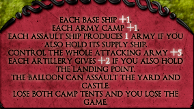
That sort of looks like fingerprints. How would it look if the bonuses where in white?DiM wrote:how about something like this:

-
DiM
- Posts: 10415
- Joined: Wed Feb 14, 2007 6:20 pm
- Gender: Male
- Location: making maps for scooby snacks
Re: Clash of Kings [14.May.12] - 1v1 map - V16 - p1&13
koontz1973 wrote:That sort of looks like fingerprints. How would it look if the bonuses where in white?DiM wrote:how about something like this:
“In the beginning God said, the four-dimensional divergence of an antisymmetric, second rank tensor equals zero, and there was light, and it was good. And on the seventh day he rested.”- Michio Kaku