
Updated list:
Flags:
Unit_2
dominationnation
wrightfan123
casper
Ninja-Town
haoala
Guiscard
Molacole
fluffybunnykins
Gozar
No Flags:
DiM
t.e.c
MR. Nate
wiggybowler
ruthlessontogeny
joeyjordison
luckywar
Gilligan
The Great Lakes -- [Quenched]
Moderator: Cartographers
Forum rules
Please read the Community Guidelines before posting.
Please read the Community Guidelines before posting.

-
wiggybowler
- Posts: 1414
- Joined: Wed Feb 21, 2007 9:40 pm


Unit_2 wrote:Updated list:
Flags:
Unit_2
dominationnation
wrightfan123
casper
Ninja-Town
haoala
Guiscard
Molacole
fluffybunnykins
Gozar
No Flags:
DiM
t.e.c
MR. Nate
wiggybowler
ruthlessontogeny
joeyjordison
luckywar
Gilligan
I didn't vote because I only like the two flags I mentioned, but not enough to vote for flags. I'm leaning more towards no flags, but not enough to contribute to the voting process because I like both...


-
Kugelblitz22

- Posts: 496
- Joined: Fri Dec 29, 2006 9:36 pm
- Location: Canton
-
WidowMakers
- Posts: 2774
- Joined: Mon Nov 20, 2006 9:25 am
- Gender: Male
- Location: Detroit, MI
I am going to let the poll go for several more days. I would like to see a much more lopsided poll to determine a winner. If not I will decide.
Aside from the flags, are there any other things people see that need to be changed? If not then I will start working on the XML. And since the army numbers are centered then I don't see a problem with that aspect.
Aside from the flags, are there any other things people see that need to be changed? If not then I will start working on the XML. And since the army numbers are centered then I don't see a problem with that aspect.

-
pancakemix

- Posts: 7973
- Joined: Wed Jan 31, 2007 3:39 pm
- Gender: Male
- Location: The Grim Guzzler
I've decided not to maul everyone to death over the territory names. I would prefer it the other way, but it's fine the way it is, and frankly, I don't want this map in the foundry forever.
And boo flags.
And boo flags.
Epic Win
"Always tell the truth. It's the easiest thing to remember." - Richard Roma, Glengarry Glen Ross
"Always tell the truth. It's the easiest thing to remember." - Richard Roma, Glengarry Glen Ross
aage wrote:Never trust CYOC or pancake.

-
Evil DIMwit

- Posts: 1616
- Joined: Thu Mar 22, 2007 1:47 pm
- Gender: Male
- Location: Philadelphia, NJ

-
WidowMakers
- Posts: 2774
- Joined: Mon Nov 20, 2006 9:25 am
- Gender: Male
- Location: Detroit, MI
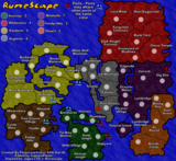
Well it looks like the flags won. Here are the pics with and without armies. Thanks to Coleman for doing the XML.
Large


Small


Thanks again Coleman
http://members.cox.net/gyrigo/CC/TheGreatLakes_01.xml
Large
Small
Thanks again Coleman
http://members.cox.net/gyrigo/CC/TheGreatLakes_01.xml

-
WidowMakers
- Posts: 2774
- Joined: Mon Nov 20, 2006 9:25 am
- Gender: Male
- Location: Detroit, MI
-
musicman_379

- Posts: 141
- Joined: Sat Apr 07, 2007 2:22 pm
- Location: SW Kansas
- Contact:

WidowMakers wrote:Why do we need to get rid of 1? So what if there are 49. I added 1 to Illinois and kept all of the rest. There were 48 before that.
well neutrals in every single game type versus neutrals only in a 5 man game.
If no one thinks its a big deal, then i guess whatever, but I think you should have a reason for having 49.
Like you said, you added one to Illinois so why not just take it out?
What's wrong with neutrals? 
Okay, I went through and checked the history, the 49 occurred when Ohio had a split. Illinois was split earlier to make it 48. I am not sure why Ohio or Illinois were split though. I am assuming it had something to do with continent/bonus balancing or the like.
Oh, and the current breakdown:
3 Players
16 per player
1 Neutral
4 Players
12 per player
1 Neutral
5 Players
9 per player
4 Neutral
6 Players
8 per player
1 Neutral
Futurama wrote:Tell my wife, hello.
Okay, I went through and checked the history, the 49 occurred when Ohio had a split. Illinois was split earlier to make it 48. I am not sure why Ohio or Illinois were split though. I am assuming it had something to do with continent/bonus balancing or the like.
Oh, and the current breakdown:
3 Players
16 per player
1 Neutral
4 Players
12 per player
1 Neutral
5 Players
9 per player
4 Neutral
6 Players
8 per player
1 Neutral
Warning: You may be reading a really old topic.
-
AndyDufresne

- Posts: 24935
- Joined: Fri Mar 03, 2006 8:22 pm
- Location: A Banana Palm in Zihuatanejo
- Contact:
Well, I've been following the production of this map from when it first started out, and I must say I am pretty impressed, especially by the visuals.
I think going with the flags like a number of other people suggested was an interesting and unique way to go. I like it.
The color scheme is also very pleasing to the eye. The colors don't stand out too much and strain my eye...I like that!
And I think the lakes being playable will make this map very interesting, somewhat similar to Alexander the Great's Empire map, but as the lakes are a central figure, I think they will play much more of a strategic role for everyone than the seas in that map.
And I recall you mentioning a long while back ago in the post that eventually you'd fix up the names and align them, or at least I think I recall reading that
Hm, I'm jumping around, but the way the Title is currently, looks a little odd. It hink it may be the graphics...it feels a little out of place and pasted on almost like. The rest of the map blends nicely together, but I don't get that same meshing feel. The same may be true of the Mini-map also.
And the non-gameboard water also looks a little odd when comparing it to the lakes, but that may not be a bad thing, it just caught my eye.
Something to consider, perhaps making the 'hold' descriptions a little more noticeable. How? I am not sure, maybe the use of some colors could do that. Maybe a blue on the 'lake' words...I don't know. Just a small idea.
Hm and lastly, the compass also looks and feels a little odd to me. I'm not sure why, I can't quite put my finger on it...Ah oh well!
Keep up the good work!
--Andy

AndyDufresne wrote:And I think the lakes being playable will make this map very interesting, somewhat similar to Alexander the Great's Empire map, but as the lakes are a central figure, I think they will play much more of a strategic role for everyone than the seas in that map.
Just on a side note - I would disagree that the seas in Alex's empire aren't strategic - on the contrary, med and aegean seas are very hotly contested territories for control of Ptolemy and Kassander (unsurprisingly due to their significant reduction of borders).