Battle for the Spice Islands
Moderator: Cartographers
Forum rules
Please read the Community Guidelines before posting.
Please read the Community Guidelines before posting.

Re: Battle for the Spice Islands - 5/26/2013 - Version: 11 -
I'm happy for any help - thanks. I sort of like having it in Dutch - it was your colony.
-
nolefan5311
- Posts: 1768
- Joined: Mon Nov 22, 2010 11:51 am
- Gender: Male
- Location: Florida
Re: Battle for the Spice Islands - 5/26/2013 - Version: 11 -
This is just a beautiful map vaughn. I will do whatever I can to help you through the process, even though I'm not blue anymore. I really, really want to see this in play.

Re: Battle for the Spice Islands - 5/26/2013 - Version: 11 -
http://www.dafont.com/bahasa-indonesia.font try a font like that... See how that looks
Highest Rank: 26 Highest Score: 3480

Re: Battle for the Spice Islands - 5/26/2013 - Version: 11 -
I'll give it a try. If I don't have to work all weekend, I'll get it up.
Thanks. Any ideas about 'tying' the bottom together? Someone said something about it not feeling cohesive down there, I think...
Thanks. Any ideas about 'tying' the bottom together? Someone said something about it not feeling cohesive down there, I think...
Re: Battle for the Spice Islands - 5/26/2013 - Version: 11 -
Try to shrink down those paper sheets to fit under the map rather than overlap it.
Highest Rank: 26 Highest Score: 3480
Re: Battle for the Spice Islands - 7/29/2013 - Version: 12 -
NEW CHANGES: Fixed a couple names again - this may go on forever. Enlarged troop circles, Sea Passages, Lesser and Major Ports. Modified Legend - tried to 'unify' and make better use of space. Changed font to Bahasa Indonesia, that HAS to be right... Size of Map was approved LONG AGO... Would still like it to be bigger...
Re: Battle for the Spice Islands - 7/29/2013 - Version: 12 -
Over 2 weeks - no feedback..? Next step or..?

Re: Battle for the Spice Islands - 7/29/2013 - Version: 12 -
I use to see like a monkey claw coming out of the title of the map - now all I see is a monkey's face...
Though the claw gave the map more of an edge...
Oh wait, that was your profile avatar - oh, well ... never mind...
Though the claw gave the map more of an edge...
Oh wait, that was your profile avatar - oh, well ... never mind...
Re: Battle for the Spice Islands - 7/29/2013 - Version: 12 -
Hmmmm... Uh. Thanks..?
Maybe next map can feature flying monkeys if I ever get through this one..?
Maybe next map can feature flying monkeys if I ever get through this one..?
Re: Battle for the Spice Islands - 7/29/2013 - Version: 12 -
Hmmmm ....vaughn03 wrote:Hmmmm... Uh. Thanks..?
Maybe next map can feature flying monkeys if I ever get through this one..?
You'll get this one through, now that summer is winding down. I'll give iancanton and koontz1973 a little nudge!


Re: Battle for the Spice Islands - 7/29/2013 - Version: 12 -
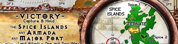
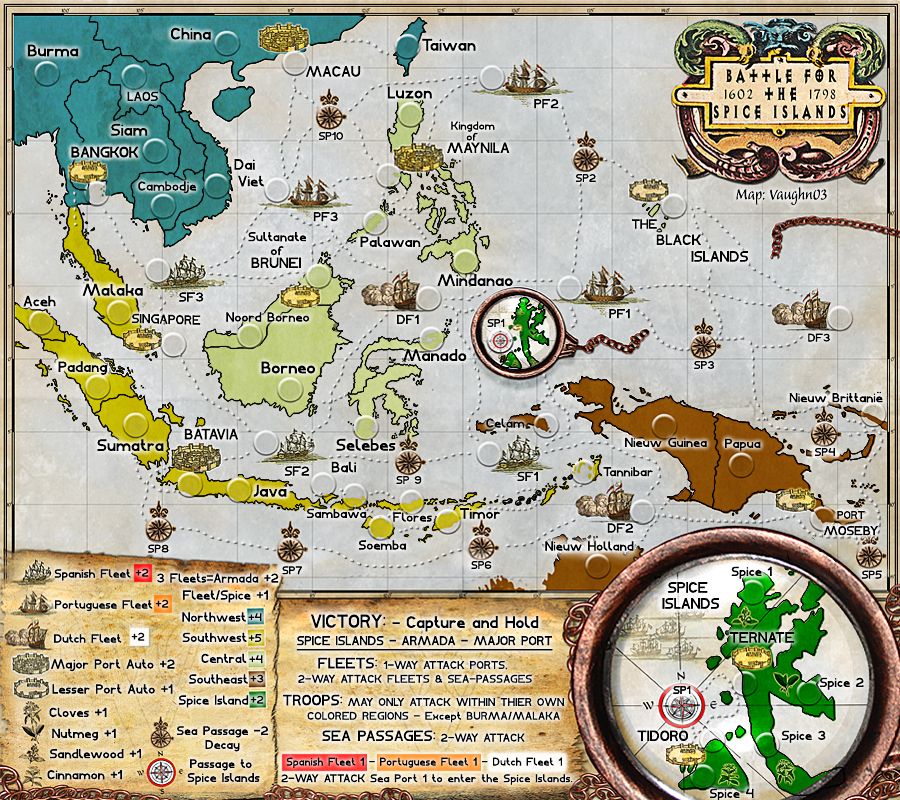
the legend is very confusing because it apparently uses fleet to refer to, for example, SF1, but it also uses fleet to refer to the bonus consisting of SF1, SF2 and SF3. am i right? if so, then the legend must be changed so that a different word is used in one of these cases.
for the armada bonus, does a player need to hold all three fleets, being the spanish, portuguese and dutch fleets, a total of 9 ships?
what regions will start neutral to prevent players from starting with bonuses? please list these in the first post.
ian.
for the armada bonus, does a player need to hold all three fleets, being the spanish, portuguese and dutch fleets, a total of 9 ships?
what regions will start neutral to prevent players from starting with bonuses? please list these in the first post.
ian.


Re: Battle for the Spice Islands - 7/29/2013 - Version: 12 -
I think you have way too much white outer glow on all the text.

Re: Battle for the Spice Islands - 7/29/2013 - Version: 12 -
Thanks guys - I will try and address both of these issues in the next couple 3 days... Anything else anyone..?

Re: Battle for the Spice Islands - 7/29/2013 - Version: 12 -
vaughn03...on your next update...SP8 text is sitting over the external map...it needs to move back onto its' own map properlyvaughn03 wrote:Thanks guys - I will try and address both of these issues in the next couple 3 days... Anything else anyone..?
I'd still like to see something done with those lower maps and the design around them as i mentioned before...perhaps using the chain as the outline to capture the legend all in one.

* Pearl Harbour * Waterloo * Forbidden City * Jamaica * Pot Mosbi
Re: Battle for the Spice Islands - 8/19/2013 - Version: 13 -
I like the 'tears' though... I tried boss... I guess I could tuck them - chains - under..?
I'll fix SP8 - every time I move stuff, I risk other stuff as I'm sure you're aware. Poor excuse, I know...
I'll fix SP8 - every time I move stuff, I risk other stuff as I'm sure you're aware. Poor excuse, I know...
Re: Battle for the Spice Islands - 8/19/2013 - Version: 13 -
there is no need to get rid of the 'tears'...and there is plenty of space to move SP8 around in (as opposed to the area around SP5 by comparison)vaughn03 wrote:I like the 'tears' though... I tried boss... I guess I could tuck them - chains - under..?
I'll fix SP8 - every time I move stuff, I risk other stuff as I'm sure you're aware. Poor excuse, I know...
if you simply ran the big chain effect across the top of the VICTORY map, and then underneath but around the top edge of the "Fleet" map, it might make a world of difference and "combine" all that area into the legend design-wise.
then leave the fllet map sitting atop the chain and the tears would still be visible.
* Pearl Harbour * Waterloo * Forbidden City * Jamaica * Pot Mosbi
Re: Battle for the Spice Islands - 8/19/2013 - Version: 13 -
Will do - probably tonight. Anything else - a lot easier to do at once. I have built this large for print and have to do a 2 step process for web...
Re: Battle for the Spice Islands - 8/19/2013 - Version: 13 -
vaughn, many of these are simply "better text placements" that can be achievedvaughn03 wrote:Will do - probably tonight. Anything else - a lot easier to do at once. I have built this large for print and have to do a 2 step process for web...
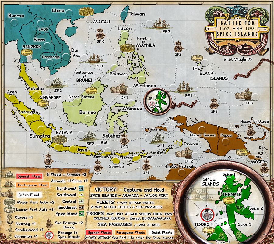
there seems to be a difference in size of text for SP# and SF# and DF# - is this deliberate?
also, TROOPS in legend overlaps the tears of left map, and Spanish and 2-WAY go close also
is Selebes bolded?
can Malaka and its army holder move up away from Singapore
no able to read quite what the island name is above SF1...is it Celam?
can you move SF2 underneath its army holder to the left of the left of the ship image please...it is causing confusion with Bali...same with SF1 could be similarly placed...
in the spice islands map bottom right...Spice 4 needs to move right a fraction so that the 4 is more visible
can you look at better placing the text for Mindanao...perhaps above the army holder....it interfers with the dotted line too much
i also think The Black Islands text could be better placed i.e. not across those dotted lines...there is plenty of room there
MACAU text may need to move - for 888 reasons...same with Timor needs to move above it army holder
can BANGKOK go to the left of its army holder...confusion with SIAM....same with TAIWAN
move Dai Viet and its army holder up away from PF3
these should make things a lot better
* Pearl Harbour * Waterloo * Forbidden City * Jamaica * Pot Mosbi
Re: Battle for the Spice Islands - 8/21/2013 - Version: 14-P
I think it's better - thanks for help. It's a lot more 'fine tuned' now which I was a little reluctant to do until I thought everything was getting close to final. I am getting close to final, no..? Don't really know for sure how it will play, I tried to make it different and hope this does not lead to unfair advantages or ??? Thinking that's what BETA is for..? I'm only a Lt...
What next Boss..?
Last edited by vaughn03 on Wed Aug 21, 2013 10:42 pm, edited 1 time in total.
Re: Battle for the Spice Islands - 8/21/2013 - Version: 14-P
vaugh03...that to me looks a lot clearer.
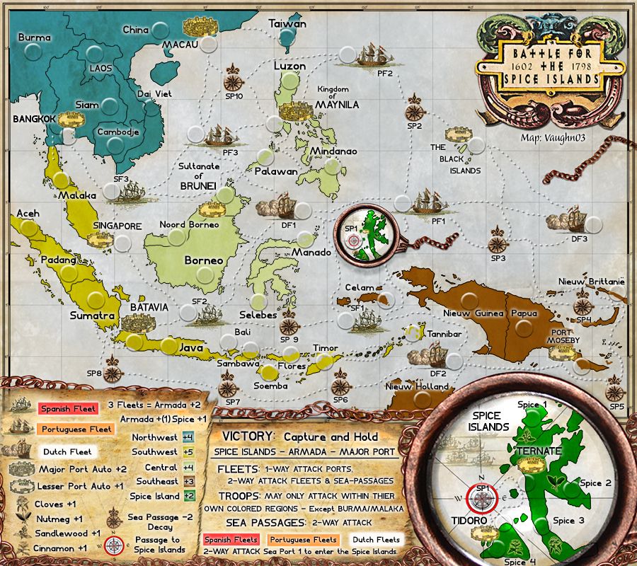
1. just 2 text placements - MACAU and Dai Viet - these need to move from right of army holder to above/below/left of army holder unless you can show that 888s will not interfere with the text.
2. just check the kerning on Celam - it looks a little squashy
Next...get the gameplay stamp.
After that, i'd produce the small and adjust the text size so it is legible, then do a version with 888s on it to see how it looks....unless someone else has offerings/adjustments
but for me, that seems a lot better and the chain ties it more together
* Pearl Harbour * Waterloo * Forbidden City * Jamaica * Pot Mosbi
Re: Battle for the Spice Islands - 8/21/2013 - Version: 14-P
I said you were right - good call.
You don't have a 'cartography' designation..? I'll make your corrects - then I get The Gameplay Stamp or someone official has to give it to me..? Or..? And if I get it then..? Start coding? SOrry I may have read all this but it's been a long process...
You don't have a 'cartography' designation..? I'll make your corrects - then I get The Gameplay Stamp or someone official has to give it to me..? Or..? And if I get it then..? Start coding? SOrry I may have read all this but it's been a long process...