OK sempai,
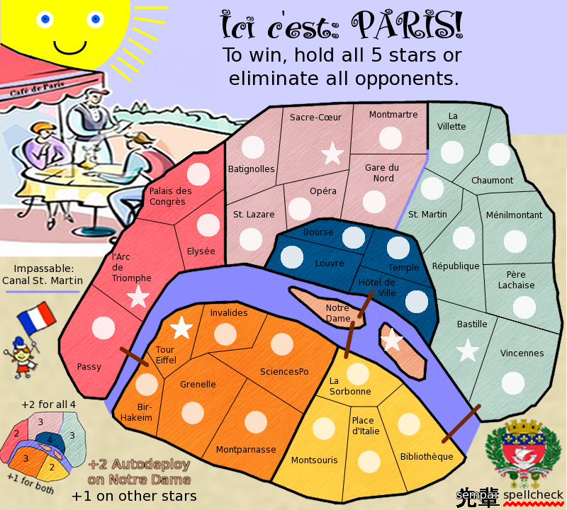
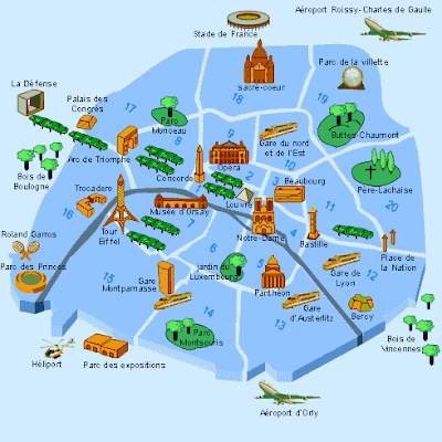
Game play, this does look pretty solid and I would not touch it till you get to that stage, but do remove the canal. We can put it back in later.
Graphics. Here is the killer. After a year, have you been practising much? Or did this sit on the back burner over the winter and only spent a few hours on it. Not much has changed since last summer when you had this out and about then.
What really kills this map is the background.
Images in the background are all out of focus. When you copy/paste art over, you cannot scale it so much. Either find one that fits or draw it yourself.
The title, boring. Black text, no matter how good the font is is just bloody awful. Jazz it up.
Your legend is squeezed into all available spaces around the map. This forces everyone to go looking for it. Legend items need to go together. Same font, same size. And should not really be larger than the region fonts.
Colours, here is a palette chart. This is for the map and background. When you do the colours for the background, find a colour a little darker or lighter so the map stands out.
- Click image to enlarge.
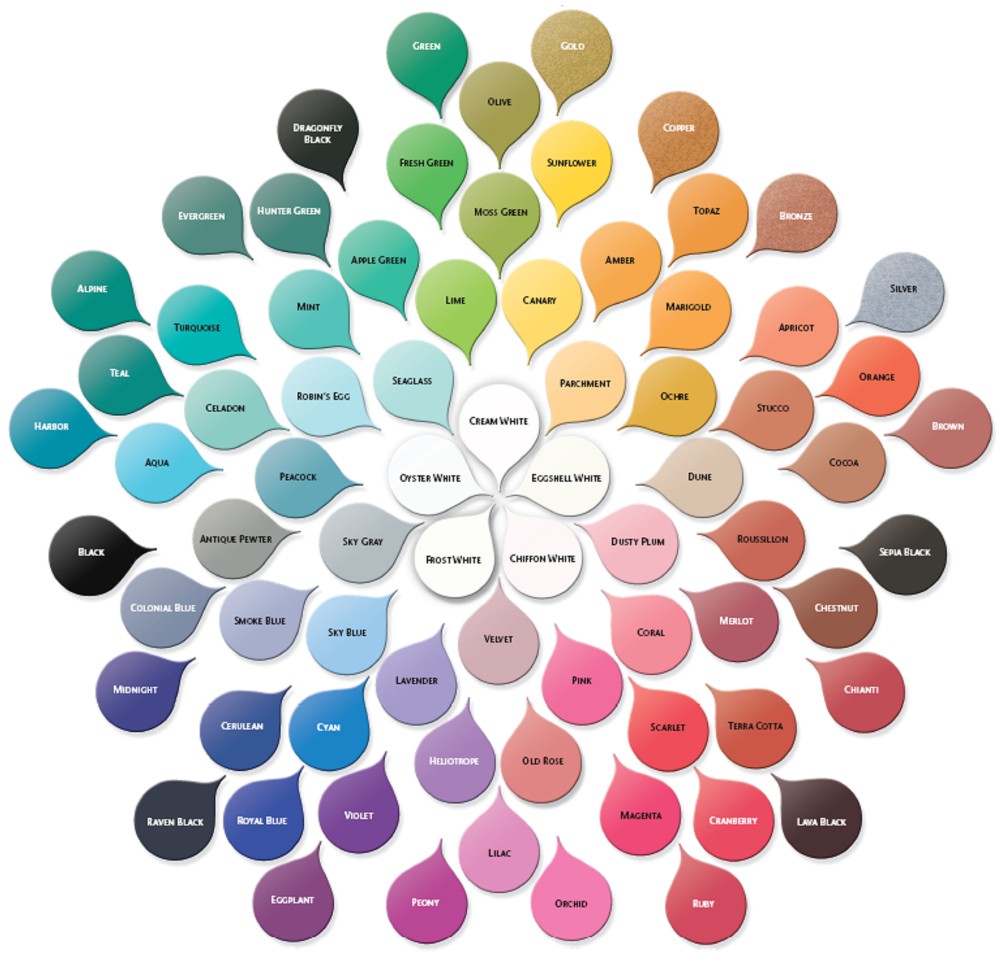
Choose colours at the same distance from the centre, not from all over the place.
I will say this though, you lines are a lot better than last year so even though I come across as harsh here sempai, you have improved.