new GAME FINDER format
Moderator: Community Team
Forum rules
Please read the community guidelines before posting.
Please read the community guidelines before posting.

new GAME FINDER format
With apologies to whomever spent the time and effort to redesign the GAME FINDER format, but I find it much more cumbersome to sort through. I much prefer the previous format.
Re: new GAME FINDER format
agree completely. new game finder is unusable.basic ui principles much better in old. cannot easily scan, cannot see minutes in speed game. bad enough for me to stop using site.

Re: new GAME FINDER format
What changed? I don't see it...
Bollocks.
Bollocks.
CONFUSED? YOU'LL KNOW WHEN YOU'RE RIPE
saxitoxin wrote:Serbia is a RUDE DUDE
may not be a PRUDE, but he's gotta 'TUDE
might not be LEWD, but he's gonna get BOOED
RUDE
-
Derek the Great

- Posts: 83
- Joined: Thu May 29, 2008 2:25 am
- Location: Perth, Western Australia
Re: new GAME FINDER format
Sorry administrators, but I am finding the new format very difficult.
I don't want to have games show up that are already full.
I don't want to have to count how many players are already signed in and compare to how many players are asked for... and frustrates me even more when I have to scroll down to count the number of players already logged in.
I don't want to sign in to a game and then press back button to return to my search, only to find that I have to re-enter all the details once again.
This is the first time I have lodged a complaint, as I normally do not wish to make fuss, and I'm even more adverse to doing it knowing that there was a good chance that a lot of time went into the changes, but it just doesn't work for me and I'm getting frustrated. Sorry.
-
ds.obsidian
- Posts: 6
- Joined: Tue May 01, 2007 9:41 pm
- Location: Australia
Re: new GAME FINDER format
At least for the moment the old finder is still available at http://www.conquerclub.com/player.php?mode=find just remove 2 from the end of the new url
-
WingCmdr Ginkapo

- Posts: 1225
- Joined: Thu Sep 26, 2013 3:57 pm
Re: new GAME FINDER format
There is a "waiting for players" option to avoid that one.Derek the Great wrote: I don't want to have games show up that are already full.
Re: new GAME FINDER format
I dont see any change either
-
TimWoodbury
- Posts: 206
- Joined: Fri Jun 26, 2015 6:06 pm
Re: new GAME FINDER format
check it out http://www.conquerclub.com/player.php?mode=find2xroads wrote:I dont see any change either

Re: new GAME FINDER format
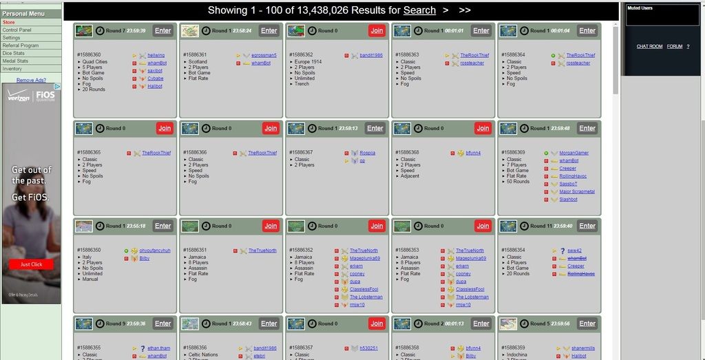
Presenting information on individual cards that take up a lot of space, are difficult to scan through, and offer severely limited sorting options?
Way to stay on top of the latest trends in user interface technology!

Way to stay on top of the latest trends in user interface technology!
-
Ronaldinho
- Posts: 3069
- Joined: Sat May 27, 2006 5:35 pm
- Gender: Male
- Location: Dorset, England.
Re: new GAME FINDER format
TimWoodbury wrote:check it out http://www.conquerclub.com/player.php?mode=find2xroads wrote:I dont see any change either
I feel like smacking my head against the wall. Whyyyyy does the game finder need to be changed again? I didn't see a problem with it.
Infact I compare CC's top guys to those fuckers at work who get a list to do. a 1-10 list. 1 being important. They do the list 3-4-7-6 etc because instead of doing whats needed they do what they feel like doing/want to do/easiest.

-
WingCmdr Ginkapo
- Posts: 1225
- Joined: Thu Sep 26, 2013 3:57 pm
Re: new GAME FINDER format
To be honest, apart from the black box at the bottom I dont see any difference. Its still all the same stuff.TimWoodbury wrote:check it out http://www.conquerclub.com/player.php?mode=find2xroads wrote:I dont see any change either
Re: new GAME FINDER format
Did you actually try a search?WingCmdr Ginkapo wrote:To be honest, apart from the black box at the bottom I dont see any difference. Its still all the same stuff.TimWoodbury wrote:check it out http://www.conquerclub.com/player.php?mode=find2xroads wrote:I dont see any change either
- Click image to enlarge.
-
WingCmdr Ginkapo
- Posts: 1225
- Joined: Thu Sep 26, 2013 3:57 pm
Re: new GAME FINDER format
Ooof it doesnt hide repeats, thats a pain. Otherwise not really any different other than graphics.
Re: new GAME FINDER format
it briefly was all messed up. its back to almost the same as before now.
-
Cakebatter
- Posts: 17
- Joined: Sat Jul 10, 2010 10:28 am
- Location: Calgary (Canada)
Re: new GAME FINDER format
Not a fan of game finder as it is right now. I suppose i will adjust.
I just did a search, the only criteria i used was eurasia, 24 hours, waiting, public.
One of the games it gave me was #15884317 which is an 8 player game which currently displays 8 game registrants.
#15884317
Eurasia
8 Players
Quadruples
Flat Rate
Parachute
Fog
Trench
MajorAung Oakkar
ColonelTigR
MajorCaptn B
Majorcooney
ColonelTviorr
MajorTuffyLess
MajorCump Sherman
Sergeant 1st ClassMelkor52
Re: new GAME FINDER format
i spoke too soon, it went back to all fucked up.
(can somebody un-up-f*ck it please?)
(can somebody un-up-f*ck it please?)

Re: new GAME FINDER format
Yeah, this is kinda terrible.
-
Silly Knig-it

- SoC Training Adviser
- Posts: 3009
- Joined: Sat May 28, 2011 12:21 am
- Gender: Male
- Location: Everett, WA
Re: new GAME FINDER format
I played with it and I kind of like it I think.
But I really don't like not being able to display results in a list format.
For tournament purposes that is horrible.
Anybody have a workaround?
If I am the creator of a tournament, why can I not see who I reserved a spot for?
But I really don't like not being able to display results in a list format.
For tournament purposes that is horrible.
Anybody have a workaround?
If I am the creator of a tournament, why can I not see who I reserved a spot for?
Last edited by Silly Knig-it on Thu Aug 13, 2015 12:26 pm, edited 1 time in total.
[img]AC1D5A83-79DE-4FED-840B-B4778D0189E5_1_105_c%20(1).jpeg[/img]
-
TimWoodbury
- Posts: 206
- Joined: Fri Jun 26, 2015 6:06 pm
Re: new GAME FINDER format
take the 2 off the end of the new urll and u will use the old one that or go to it from the forums and it will use the old finder

Re: new GAME FINDER format
One word....donkey!! Its neither user friendly nor is it aesthetically pleasing, another change for change sake.
Highest score 3372 02/08/12
Highest position 53 02/08/12
Highest position 53 02/08/12
Re: new GAME FINDER format
I think this change was made because the list format did not work well on small screens. But if that's the case, then this should only be used for the mobile version of the site.
-
ironsij0287

- Posts: 379
- Joined: Tue Nov 09, 2010 2:30 pm
- Gender: Male
- Location: Dubuque
Re: new GAME FINDER format
Am I dumb or can I not join a doubles game without being added to the next open slot as opposed to picking the slot I want to be in. Basically I want to join Team 3 and invite my partner but it just lets me "JOIN" and sticks me as a partner on Team 2.
-
owenshooter

- Posts: 13325
- Joined: Wed Mar 07, 2007 6:01 pm
- Gender: Male
- Location: Deep in the Heart of Tx
Re: new GAME FINDER format
can you point me to this mobile version? i can't get CC to work effectively on my iphone or ipad mini... if there is some alleged mobile version, i would love to try it... thank you in advance...-Jésus noirdegaston wrote:I think this change was made because the list format did not work well on small screens. But if that's the case, then this should only be used for the mobile version of the site.

Thorthoth,"Cloaking one's C&A fetish with moral authority and righteous indignation
makes it ever so much more erotically thrilling"
Re: new GAME FINDER format
Oh - you weren't given access to the mobile version? Interesting.owenshooter wrote:can you point me to this mobile version? i can't get CC to work effectively on my iphone or ipad mini... if there is some alleged mobile version, i would love to try it... thank you in advance...-Jésus noirdegaston wrote:I think this change was made because the list format did not work well on small screens. But if that's the case, then this should only be used for the mobile version of the site.
-
owenshooter
- Posts: 13325
- Joined: Wed Mar 07, 2007 6:01 pm
- Gender: Male
- Location: Deep in the Heart of Tx
Re: new GAME FINDER format
like one you download? an app? not the crappy one that is unplayable on the ipad or iphone...-Jésus noirdegaston wrote:Oh - you weren't given access to the mobile version? Interesting.
Thorthoth,"Cloaking one's C&A fetish with moral authority and righteous indignation
makes it ever so much more erotically thrilling"