Netherlands [Quenched]
Moderator: Cartographers
Forum rules
Please read the Community Guidelines before posting.
Please read the Community Guidelines before posting.
-
Ninja-Town

- Posts: 107
- Joined: Thu Jan 04, 2007 1:33 pm
-
bonobo`s son
- Posts: 420
- Joined: Thu Jan 04, 2007 11:27 am
- Location: Amsterdam - Artis
you got three eyes so it ain`t a problemDiM wrote:freak87 wrote:because it was ready to be played, and to me this one is ready to, nut that's up to andy to decide....
this one isn't ready. it still has graphical issues. look at the borders for example. some are very blurry while some are very crisp. it hurts the eye.


-
Ruben Cassar
- Posts: 2160
- Joined: Thu Nov 16, 2006 6:04 am
- Gender: Male
- Location: Civitas Invicta, Melita, Evropa
DiM wrote:freak87 wrote:because it was ready to be played, and to me this one is ready to, nut that's up to andy to decide....
this one isn't ready. it still has graphical issues. look at the borders for example. some are very blurry while some are very crisp. it hurts the eye.
This map is a classic example of how we will never be able to play a decent map because of some trivial issue which really doesn't affect the gameplay in any way.
Who cares about the crispness of the borders when everything else is fine. I would rather play the map than see it get scrapped because of crispness and bluriness...


-
DiM

- Posts: 10415
- Joined: Wed Feb 14, 2007 6:20 pm
- Gender: Male
- Location: making maps for scooby snacks
Ruben Cassar wrote:DiM wrote:freak87 wrote:because it was ready to be played, and to me this one is ready to, nut that's up to andy to decide....
this one isn't ready. it still has graphical issues. look at the borders for example. some are very blurry while some are very crisp. it hurts the eye.
This map is a classic example of how we will never be able to play a decent map because of some trivial issue which really doesn't affect the gameplay in any way.
Who cares about the crispness of the borders when everything else is fine. I would rather play the map than see it get scrapped because of crispness and bluriness...
yes it does not affect gameplay but if this map is quenched with the current graphic issues then in no time we'll have maps made in paint. i've had some pixels (3 pixels) that were out of places and i had to correct them. just 3 pixels. the main thing that separates CC from landgrab are the maps. nice quality maps are the trademark of CC. if the decicion to follow this path was made then we must stick to it.
“In the beginning God said, the four-dimensional divergence of an antisymmetric, second rank tensor equals zero, and there was light, and it was good. And on the seventh day he rested.”- Michio Kaku
-
thegeneralpublic
- Posts: 126
- Joined: Fri Mar 09, 2007 9:49 pm
- Location: In front of my computer screen.
- Contact:
Holland map
I am from Holland, so naturally I am biased, but I like the map so far, though I think it would be better to also include capital cities, similar to how world 2.1 differs from the classic map.
-
lt_oddball

- Posts: 364
- Joined: Mon Mar 05, 2007 11:17 am
- Location: Fortress Europe
-
lt_oddball
- Posts: 364
- Joined: Mon Mar 05, 2007 11:17 am
- Location: Fortress Europe
Also, a bit late perhaps:
We already have a Benelux map as it is geographically today.
So Netherlands alone as it is today is not interesting.
BUT if you would take the Netherlands of 1670 in which it was attacked by english, french, German bisdoms THEN it would be exciting.
It is not too late to make these alterations...!
We already have a Benelux map as it is geographically today.
So Netherlands alone as it is today is not interesting.
BUT if you would take the Netherlands of 1670 in which it was attacked by english, french, German bisdoms THEN it would be exciting.
It is not too late to make these alterations...!

The holland map
I amalready looking forward to playing this map for almost a half year ! Of course there is a benelux map but that is a stupid argument for not having this map !!( we would still playing only classic with a argument like tis)
I wanna play this map soon !
I wanna play this map soon !
-
Lone.prophet
- Posts: 1467
- Joined: Thu Oct 12, 2006 4:37 pm
- Location: Your basement Muahaha

-
DiM
- Posts: 10415
- Joined: Wed Feb 14, 2007 6:20 pm
- Gender: Male
- Location: making maps for scooby snacks
Lone.prophet wrote:any gameplay related objections?
nope gameplay is fine, just go on and solve the graphic issues and get this quenched
“In the beginning God said, the four-dimensional divergence of an antisymmetric, second rank tensor equals zero, and there was light, and it was good. And on the seventh day he rested.”- Michio Kaku
-
Lone.prophet
- Posts: 1467
- Joined: Thu Oct 12, 2006 4:37 pm
- Location: Your basement Muahaha
-
Lone.prophet
- Posts: 1467
- Joined: Thu Oct 12, 2006 4:37 pm
- Location: Your basement Muahaha
-
Lone.prophet
- Posts: 1467
- Joined: Thu Oct 12, 2006 4:37 pm
- Location: Your basement Muahaha


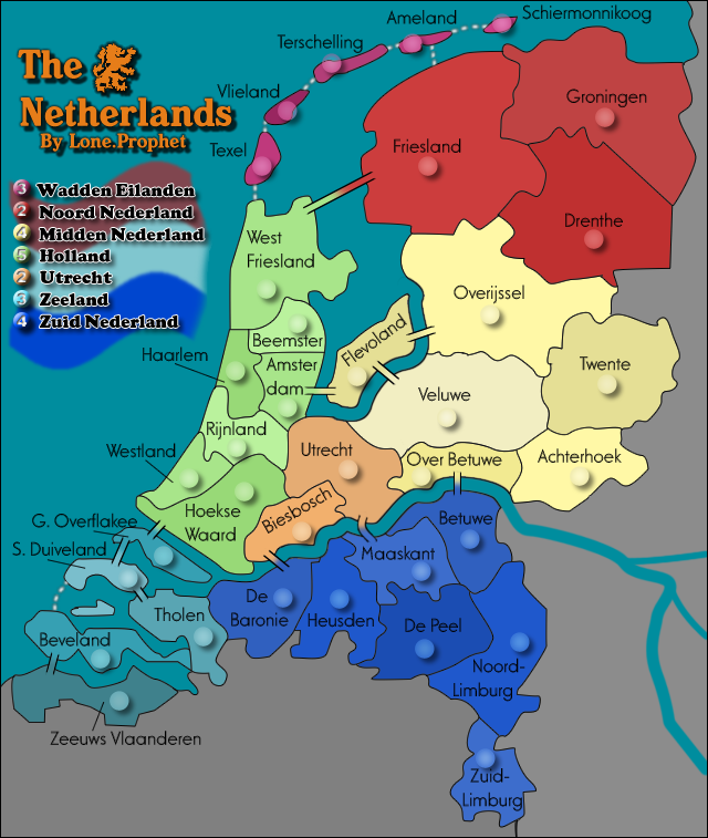
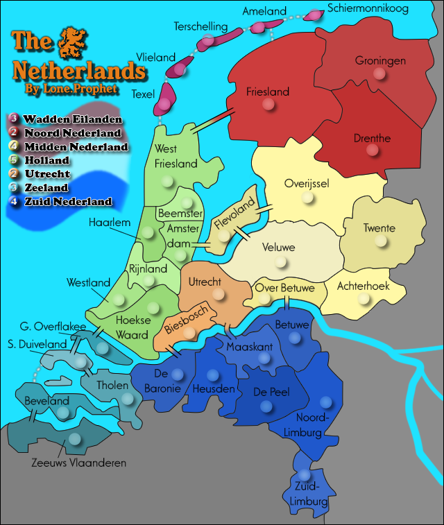
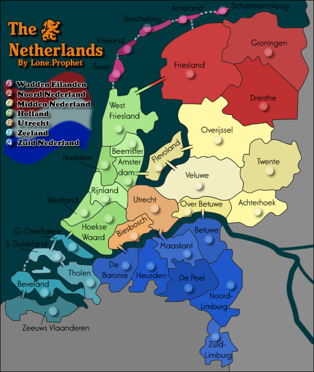
I like this style. Make sure those circles can fit army numbers in them. If not then increase the size obvously.
I don't like that the water and one of the continents have almost the same colour. Maybe use a tan/brownish colour. I know it has to be 'pasty' to match the rest of the map but you need a new colour there.
What's with the black mark at the bottom under zuid-limburg?
I don't like that the water and one of the continents have almost the same colour. Maybe use a tan/brownish colour. I know it has to be 'pasty' to match the rest of the map but you need a new colour there.
What's with the black mark at the bottom under zuid-limburg?
-
Lone.prophet
- Posts: 1467
- Joined: Thu Oct 12, 2006 4:37 pm
- Location: Your basement Muahaha
edbeard wrote:I like this style. Make sure those circles can fit army numbers in them. If not then increase the size obvously.
I don't like that the water and one of the continents have almost the same colour. Maybe use a tan/brownish colour. I know it has to be 'pasty' to match the rest of the map but you need a new colour there.
What's with the black mark at the bottom under zuid-limburg?
i agree with all that as well
-
Lone.prophet
- Posts: 1467
- Joined: Thu Oct 12, 2006 4:37 pm
- Location: Your basement Muahaha
I say remove that because it just looks strange. No one will complain if it is not there. You could even just cut off a tiny bit more of the bottom of the map so the actual border would barely be on the map anyway, and you wouldn't need to put the black line there.
Do that and change the colour of Zeeland, fix those circles (if they need fixing) and maybe make the shadow on the title slightly smaller.
How does the river look if you put a border around it? (the part that goes onto the dead territory) I'd just like to see the difference from how it looks now.
Do that and change the colour of Zeeland, fix those circles (if they need fixing) and maybe make the shadow on the title slightly smaller.
How does the river look if you put a border around it? (the part that goes onto the dead territory) I'd just like to see the difference from how it looks now.
-
Lone.prophet
- Posts: 1467
- Joined: Thu Oct 12, 2006 4:37 pm
- Location: Your basement Muahaha
-
Lone.prophet
- Posts: 1467
- Joined: Thu Oct 12, 2006 4:37 pm
- Location: Your basement Muahaha