There are some light yellow areas in the picture, so you may need to throw a drop shadow on that text.
Napoleonic Europe 1812 - Ver 41/44 [Quenched]
Moderator: Cartographers
Forum rules
Please read the Community Guidelines before posting.
Please read the Community Guidelines before posting.
-
porkenbeans

- Posts: 2546
- Joined: Mon Sep 10, 2007 4:06 pm
Re: Napoleonic Europe 1812 - Version33 [Gp] waiting for GR stamp
The picture is NOT recognizable. It is only serving as some washed out pattern that clashes with, and obscures the text. If you are going to use it, you may just want to try and see if it is any better, by bringing it back into focus, Make it darkish, and change the text to a contrasting, light color. Please try this, for me.  I just have to tell you that the way it is now, I do not understand what the attachment is to the picture. You can NOT see it anyway. I am told that it is some recognizable painting of Napoleon. It would be cool to see what it looks like.
There are some light yellow areas in the picture, so you may need to throw a drop shadow on that text.
There are some light yellow areas in the picture, so you may need to throw a drop shadow on that text.

-
natty dread

- Posts: 12877
- Joined: Fri Feb 08, 2008 8:58 pm
- Location: just plain fucked
Re: Napoleonic Europe 1812 - Version33 [Gp] waiting for GR stamp
Here's something you could try: Change the picture into black and white. Run in through an emboss filter, and set it on overlay or multiply, this way you can make it into a nice texture under the text.
Not really sure if it will work, but could be worth a shot...
Not really sure if it will work, but could be worth a shot...

-
lt_oddball

- Posts: 364
- Joined: Mon Mar 05, 2007 11:17 am
- Location: Fortress Europe
Re: Napoleonic Europe 1812 - Version33 [Gp] waiting for GR stamp
The "Sw" is obscured by the 888 in Swiss Federation.
Also "Sx" for Saxony is very very hard to read when it is encircled by psychedelically coloured 888s and a Shield in and around Saxony and the "c" border left of "Sx".
The "L" of Lisbon is hard to detect as it runs along the coastline.
The "D" of Dk may be confused by an "O" (runs over the coastline) and should probably be moved in closer proximity to the Denmark 888.
The "W" of Ws of Wales runs over the coastline and could be confused with a large "N".
Oporto or Oporta ? Both the "O" and the small "o" are hindered by the borderline.
Move some of these names or 888's around to improve legibiliy.
(as we are supposed to give great concern over a minute group of colourblind people, so too should you not assume all players have great geographical and/or historical knowledge...there should be no question about (il)legibility.)
Kabanellas wrote:ok, I've tested with 888 on the 2 best version:
- Click image to enlarge.
Barbarus hic ego sum, quia non intellegor ulli.
-
Kabanellas
- Posts: 1482
- Joined: Fri Feb 27, 2009 12:21 pm
- Gender: Male
- Location: Porto, Portugal
Re: Napoleonic Europe 1812 - Version33 [Gp] waiting for GR stamp
I will take care of all those details oddball. 


-
Kabanellas
- Posts: 1482
- Joined: Fri Feb 27, 2009 12:21 pm
- Gender: Male
- Location: Porto, Portugal
Re: Napoleonic Europe 1812 - Version33 [Gp] waiting for GR stamp
here some tests:
#1
#2
#1
- Click image to enlarge.

- Click image to enlarge.

-
natty dread
- Posts: 12877
- Joined: Fri Feb 08, 2008 8:58 pm
- Location: just plain fucked
Re: Napoleonic Europe 1812 - Version33 [Gp] waiting for GR stamp
I know it's heresy but I'd vote for #2 or the picture to go. It's a very busy map already. I have to admit though anything Kab touches seems to come out golden so I hesitate to criticize.
-
Kabanellas
- Posts: 1482
- Joined: Fri Feb 27, 2009 12:21 pm
- Gender: Male
- Location: Porto, Portugal
Re: Napoleonic Europe 1812 - Version33 [Gp] waiting for GR stamp
thanks Dan
-I would like to keep the picture actually even if in a very faded mode......
-I would like to keep the picture actually even if in a very faded mode......
-
porkenbeans
- Posts: 2546
- Joined: Mon Sep 10, 2007 4:06 pm
Re: Napoleonic Europe 1812 - Version33 [Gp] waiting for GR stamp
With it faded out, the text IS legible. I think that it may even go to help your cause, if you nixed the outer-glo on the icons. Make them more like the icons on the legend next to it. Make them stand up in relief. By making the two images on two different focal planes, it will better allow your eyes to focus on the image that you are looking at. Be it the text, or the picture.Kabanellas wrote:thanks Dan
-I would like to keep the picture actually even if in a very faded mode......
-
Kabanellas
- Posts: 1482
- Joined: Fri Feb 27, 2009 12:21 pm
- Gender: Male
- Location: Porto, Portugal
Re: Napoleonic Europe 1812 - Version33 [Gp] waiting for GR stamp
I could lower the glow on the icons... but by relief in them, you mean some kind of bevel?porkenbeans wrote:With it faded out, the text IS legible. I think that it may even go to help your cause, if you nixed the outer-glo on the icons. Make them more like the icons on the legend next to it. Make them stand up in relief. By making the two images on two different focal planes, it will better allow your eyes to focus on the image that you are looking at. Be it the text, or the picture.
I don't want to over complicate it.... and really not keen on creating a tri-dimensional feel there.
-
Industrial Helix

- Posts: 3462
- Joined: Mon Jul 14, 2008 6:49 pm
- Gender: Female
- Location: Ohio
Re: Napoleonic Europe 1812 - Version33 [Gp] waiting for GR stamp
I can hardly tell what the pictures is on the small map. I saw run with very faded for the sake of the text and continuity between small and large map.
Sketchblog [Update 07/25/11]: http://indyhelixsketch.blogspot.com/
Living in Japan [Update 07/17/11]: http://mirrorcountryih.blogspot.com/
Russian Revolution map for ConquerClub [07/20/11]: http://www.conquerclub.com/forum/viewto ... 1&t=116575
Living in Japan [Update 07/17/11]: http://mirrorcountryih.blogspot.com/
Russian Revolution map for ConquerClub [07/20/11]: http://www.conquerclub.com/forum/viewto ... 1&t=116575
-
porkenbeans
- Posts: 2546
- Joined: Mon Sep 10, 2007 4:06 pm
Re: Napoleonic Europe 1812 - Version33 [Gp] waiting for GR stamp
No, just so that they are the same, as the icons in the next box over. instead of outer glow on dark text, make it the other way around. This will allow your picture to be darker/saturated, while your icons are a lighter shade with a drop shadow. You will have to play with the size and spread to make them look just like the other icons. Nothing drastic or different from what is already on the map.Kabanellas wrote:I could lower the glow on the icons... but by relief in them, you mean some kind of bevel?porkenbeans wrote:With it faded out, the text IS legible. I think that it may even go to help your cause, if you nixed the outer-glo on the icons. Make them more like the icons on the legend next to it. Make them stand up in relief. By making the two images on two different focal planes, it will better allow your eyes to focus on the image that you are looking at. Be it the text, or the picture.
I don't want to over complicate it.... and really not keen on creating a tri-dimensional feel there.

Re: Napoleonic Europe 1812 - Version33 [Gp] waiting for GR stamp
If you could make the bottom right one a bit more legible then I'm happy...
Perhaps the image behind that one could be lessened a bit.
C.
Perhaps the image behind that one could be lessened a bit.
C.

Highest score : 2297
-
Kabanellas
- Posts: 1482
- Joined: Fri Feb 27, 2009 12:21 pm
- Gender: Male
- Location: Porto, Portugal
Re: Napoleonic Europe 1812 - Version33 [Gp] waiting for GR stamp
guys, I really really think that they are working great in this example. Both the legend in the left and the legend in the right.
- Click image to enlarge.

Re: Napoleonic Europe 1812 - Version33 [Gp] waiting for GR stamp
This map is a work of art. Worthy and ready for the graphics stamp. Needs to go to beta.
This post was made by jefjef who should be on your ignore list.

drunkmonkey wrote:I'm filing a C&A report right now. Its nice because they have a drop-down for "jefjef".
-
army of nobunaga

- Posts: 1989
- Joined: Sat Oct 13, 2007 10:06 pm
- Gender: Male
- Location: www.facebook.com/armyofnobu and Houston.
- Contact:
Re: Napoleonic Europe 1812 - Version33 [Gp] waiting for GR stamp
Kabanellas wrote:guys, I really really think that they are working great in this example. Both the legend in the left and the legend in the right.
- Click image to enlarge.
I have to agree with you actually... I am using my mini laptop with small map atm.. my eyes are old and im slightly colorblind, I can read it. Its not like its super easy. But I have no complaints right now.
I have to say man.. I personally dont love another europe map, but you guys have done like everything that has been asked of you and have a beautiful map with solid gameplay. Dont know how much more should/can be asked of you.
Maps Maps Maps!
Take part in this survey and possibly win an upgrade -->
https://docs.google.com/spreadsheet/emb ... OHRFZnc6MQ
Take part in this survey and possibly win an upgrade -->
https://docs.google.com/spreadsheet/emb ... OHRFZnc6MQ
Re: Napoleonic Europe 1812 - Version33 [Gp] waiting for GR stamp
Hmmm - it's much less clear on this version...
Compared to this version
This is probably due to screen capture software losing detail...
However - when a map is uploaded Lack tends to tune down the JPG sizes - this could cause you a difficulty if the quality is detuned and that small legend gets a bit corrupted - like above.
EDIT : Or am I comparing 2 different versions? - the second one has a less vivid legend on the left.
C.
- Click image to enlarge.
- Click image to enlarge.
However - when a map is uploaded Lack tends to tune down the JPG sizes - this could cause you a difficulty if the quality is detuned and that small legend gets a bit corrupted - like above.
EDIT : Or am I comparing 2 different versions? - the second one has a less vivid legend on the left.
C.
Highest score : 2297
-
Kabanellas
- Posts: 1482
- Joined: Fri Feb 27, 2009 12:21 pm
- Gender: Male
- Location: Porto, Portugal
Re: Napoleonic Europe 1812 - Version33 [Gp] waiting for GR stamp
Yes Yeti, those are 2 different versions. I'm talking about the one below, which I think is working great:
- Click image to enlarge.
Re: Napoleonic Europe 1812 - Version33 [Gp] waiting for GR stamp
Can we have the full image to compare.Kabanellas wrote:Yes Yeti, those are 2 different versions. I'm talking about the one below, which I think is working great:
- Click image to enlarge.
C.
Highest score : 2297
-
Kabanellas
- Posts: 1482
- Joined: Fri Feb 27, 2009 12:21 pm
- Gender: Male
- Location: Porto, Portugal
Re: Napoleonic Europe 1812 - Version33 [Gp] waiting for GR s
Here it is yeti:
I'll reiterate what I said - both legends are working great to me now.
- Click image to enlarge.

Re: Napoleonic Europe 1812 - Version33 [Gp] waiting for GR s
In an ideal world it could be a little bit clearer - but I think it's suitable and clear enough.
C.
C.
Highest score : 2297
-
Industrial Helix
- Posts: 3462
- Joined: Mon Jul 14, 2008 6:49 pm
- Gender: Female
- Location: Ohio
Re: Napoleonic Europe 1812 - Version33 [Gp] waiting for GR s
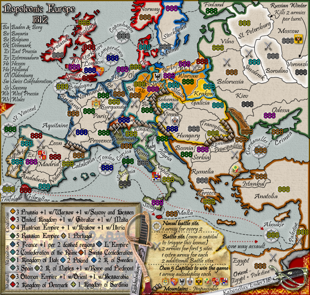
Hopefully this list will give you something concrete to work with Kab:
I think the borders around the Berlin emblem need to be altered so that the emblem fits within the borders... so lose that nub of land on Hessen and move the emblem up.
Fix Hessen and Saxony so that their borders are clear and the numbers clearly belong to one and the other. I see no reason for that border to be a giant S and the most convenient border, something like a C or even a straightish line would do much better.
Move Bavaria and its numbers down into that area of open land and alter the border on Baden so the numbers fit within the territory.
Move Silesia down and a bit to the left and lower the numbers as well to the widest point in the territory.
Fix Warsaw so that Berlins numbers fit within Berlin.
East Prussia's numbers could probably fit more above the territory rather than run on into Russia. Move West Prussia's border slightly east so everything fits there.
Move Krakow's numbers onto Krakow.
Move the word Paris to beneath its numbers, move the border of Burgundy west and scoot those swords over to where the word Paris used to be. Now fix that pointy nose of Switzerland so its more rounded and houses the numbers better. The Sw., rather that just w, ought to be visible now.
Provence numbers left and down.
Aquitaine numbers down.
Swap word Valencia with the numbers and let the numbers run into the sea. The a in Valencia ought to come up to Catalonia's territory.
Expand Madrid's border at the expense of Leon so the numbers fit.
Drop Stockholm's numbers to closer proximity to the word Stockholm. Alter Malmo's border so that the numbers can get off that color. Perhaps you can straighten the word Malmo as well.
Move DK up to the numbers.
Lower OL's numbers. I'd prefer you changed the border here as well to house things better but can live without.
Change the London/sussex border so that it goes between the sets of numbers.
Malta and its numbers need to be a bit more compact and not overlap attack lines.
Can you change the naval battle icons? Or at least shrink them? Boulogne is the worst offender, perhaps unacceptably so, and Trafalgar is in a close second.
You are inconsistent in the relationship between sea battles and the names describing them. I think they ought to all wrap around the top like the ones int he North Sea.
Sketchblog [Update 07/25/11]: http://indyhelixsketch.blogspot.com/
Living in Japan [Update 07/17/11]: http://mirrorcountryih.blogspot.com/
Russian Revolution map for ConquerClub [07/20/11]: http://www.conquerclub.com/forum/viewto ... 1&t=116575
Living in Japan [Update 07/17/11]: http://mirrorcountryih.blogspot.com/
Russian Revolution map for ConquerClub [07/20/11]: http://www.conquerclub.com/forum/viewto ... 1&t=116575
-
Kabanellas
- Posts: 1482
- Joined: Fri Feb 27, 2009 12:21 pm
- Gender: Male
- Location: Porto, Portugal
Re: Napoleonic Europe 1812 - Version33 [Gp] waiting for GR s
Thanks Helix! That's exactly what I was expecting. I really want (and need) to be completely objective here, or I'll just keep on changing and changing, moving forward and backwards without really getting nowhere. And honestly... I'm getting a little tired and out of time.
Industrial Helix wrote:Hopefully this list will give you something concrete to work with Kab:
I think the borders around the Berlin emblem need to be altered so that the emblem fits within the borders... so lose that nub of land on Hessen and move the emblem up.
-Done
Fix Hessen and Saxony so that their borders are clear and the numbers clearly belong to one and the other. I see no reason for that border to be a giant S and the most convenient border, something like a C or even a straightish line would do much better.
-Done. Must say that we were trying to make this borders as close as possible to the historical ones, that's why that giant S. But I do know that we'll need to re-adapt them.
Move Bavaria and its numbers down into that area of open land and alter the border on Baden so the numbers fit within the territory.
-Done
Move Silesia down and a bit to the left and lower the numbers as well to the widest point in the territory.
-Done
Fix Warsaw so that Berlins numbers fit within Berlin.
-Done
East Prussia's numbers could probably fit more above the territory rather than run on into Russia. Move West Prussia's border slightly east so everything fits there.
-Done
Move Krakow's numbers onto Krakow.
-Done
Move the word Paris to beneath its numbers, move the border of Burgundy west and scoot those swords over to where the word Paris used to be. Now fix that pointy nose of Switzerland so its more rounded and houses the numbers better. The Sw., rather that just w, ought to be visible now.
-Done
Provence numbers left and down.
-Done
Aquitaine numbers down.
-Done
Swap word Valencia with the numbers and let the numbers run into the sea. The a in Valencia ought to come up to Catalonia's territory.
-Done
Expand Madrid's border at the expense of Leon so the numbers fit.
-Done
Drop Stockholm's numbers to closer proximity to the word Stockholm. Alter Malmo's border so that the numbers can get off that color. Perhaps you can straighten the word Malmo as well.
-Done
Move DK up to the numbers.
-Done
Lower OL's numbers. I'd prefer you changed the border here as well to house things better but can live without.
-Done. Rearranged inner borders.
Change the London/sussex border so that it goes between the sets of numbers.
-Done
Malta and its numbers need to be a bit more compact and not overlap attack lines.
-Can't do it here... I jut don't have any more room. But I don't see any big problem there.
Can you change the naval battle icons? Or at least shrink them? Boulogne is the worst offender, perhaps unacceptably so, and Trafalgar is in a close second.
-Sent Boulogne to a lower layer. Moved Trafalgar up a bit.
You are inconsistent in the relationship between sea battles and the names describing them. I think they ought to all wrap around the top like the ones int he North Sea.
-Can't wrap in every one. Honestly I'm happy the way they are now.
- Click image to enlarge.

Last edited by Kabanellas on Sat May 15, 2010 6:44 pm, edited 1 time in total.
-
Industrial Helix
- Posts: 3462
- Joined: Mon Jul 14, 2008 6:49 pm
- Gender: Female
- Location: Ohio
Re: Napoleonic Europe 1812 - Version33 [Gp] waiting for GR s
I hear your frustration... 13 Colonies was in graphics development for like 6 months. I guess you gotta be patient and still work towards clarifiying the map. Time definitely helps to come up with some innovative changes... Japan being the most ready example coming to mind.
The changes seem good but there's no way of telling without the numbers on the map.
The changes seem good but there's no way of telling without the numbers on the map.
Sketchblog [Update 07/25/11]: http://indyhelixsketch.blogspot.com/
Living in Japan [Update 07/17/11]: http://mirrorcountryih.blogspot.com/
Russian Revolution map for ConquerClub [07/20/11]: http://www.conquerclub.com/forum/viewto ... 1&t=116575
Living in Japan [Update 07/17/11]: http://mirrorcountryih.blogspot.com/
Russian Revolution map for ConquerClub [07/20/11]: http://www.conquerclub.com/forum/viewto ... 1&t=116575

Re: Napoleonic Europe 1812 - Version33 [Gp] waiting for GR s
Another set of map image files with the opaque ovals would help me update the XML coordinates to match these latest changes. (I feel better centering on a oval I can easily see.) It might be better to send them by PM rather than posting them here so no one thinks that those white spots will appear on the final product. (natty got a scare last time.)