- Click image to enlarge.

- Click image to enlarge.

Moderator: Cartographers


ok, just to not gettin misunderstand here , this is not to offend you. What is ther to work out for this gameplayarmy of nobunaga wrote:Just seen this... incredible texture.
trying to workout the gameplay.. ill post tomorrow.

Thanks cairnswk, AoN is always after the next gold. Will have to play this trench style then.cairnswk wrote:^^ trying to work out the gameplay so aon can see how to win many more gold medals
koontz1973...amazing texture but the borders aren't doing it for me, sorry. everything seems blended together almost...not much contrast is what i'm probably referring to.
also, there was a version previously on this page - small map only i saw it on - that had a gold touch to the title. imho, the title is better in that gold (thread) that it is now.
only my opinions though.
if you're going for a cloth/fabric look, check this out, it might give inspiration.


Can do.AndyDufresne wrote:I think the mention of reinforcements should probably be even leveled, in stead of the slant. I know it'd obscure a little of your image, but I think it is worth it.
The image overall is soft, not blurred but is less noticeable in the small because of the size.Overall, this is pretty interesting map. I think I like the small map better than the large, since it seems things overall just seem bigger and blurry with the large!
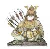
Can do.I'd probably suggest softening the image of the Buddha, just so it is less on the level of the gameboard.
No room in a couple of the territs for a larger text but will have a try at something.The text for the small could also maybe use a bump in size if possible.
Best of luck.
--Andy


That's how I was thinking of it...paintings have depth!koontz1973 wrote: The background, do not want it on another level, think of the map as a large canvas that someone has painted on, not a map drawn on a computer.
Just tried to see how much depth they have. Wife not happy I put my fist through her favourite painting.AndyDufresne wrote:That's how I was thinking of it...paintings have depth!koontz1973 wrote: The background, do not want it on another level, think of the map as a large canvas that someone has painted on, not a map drawn on a computer.
--Andy


I think things appear / are sharper on the smaller map, since I thought something similar.Nola_Lifer wrote:Why is it that the small map looks better than the bigger one?
Because I only play the small one so saved the best for me.Nola_Lifer wrote:Why is it that the small map looks better than the bigger one?